HOME | DD
 tayleaf — 002
Published: 2012-07-09 20:58:06 +0000 UTC; Views: 2258; Favourites: 20; Downloads: 1
Redirect to original
Description
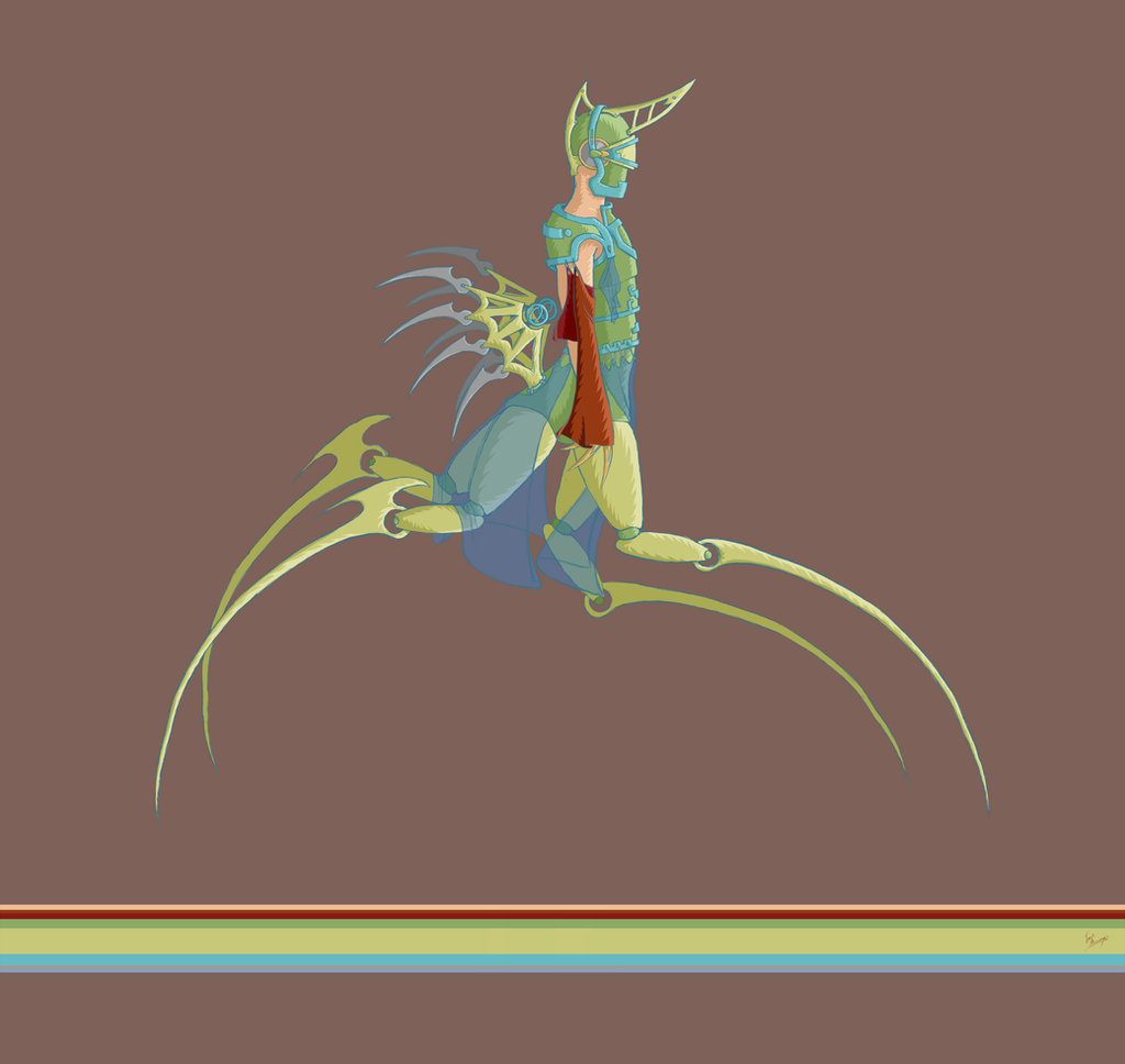
Number two?
")
The inspiration for this one is NOT spider, I simply reversed the legs around from what had been a giraffe idea, and the helmet is rhinoceros inspired.
True doodles lol. no reference used for anything
This one makes me very happy, it doesn't have hooves sadly, but I made up for it by giving it double the epic joints.
 (Smile)")
Tonkropod Series
Related content


Comments: 58


👍: 0 ⏩: 1
 (Wink)")


I love your style 
👍: 0 ⏩: 1

Not sure what i'm looking at, but i love how it looks! Helmet and wings especially!
👍: 0 ⏩: 1
Ha ha! Whee! I love confusing people! Ha ha! Thanks so much!
👍: 0 ⏩: 1


This is freakin cool! Great job! I love how unique it is!
👍: 0 ⏩: 1


Actually i would rather give some more dark , "evil" colours. To me this creature looks evil and a rainbow-pastel colours doesnt apply imo :/ I like its original project (As well as other things you make)
👍: 0 ⏩: 1
👍: 0 ⏩: 0

Ha ha thank you! I'm getting so much mixed feedback about the colors! Some say it is good this way, and others say they feel darker more sinister colors would be better. I'm not sure if I'll change it or not though.
I AM working on 004 right now though, and I'm aiming for it to be even better than all 3 of these combined!

👍: 0 ⏩: 0


Interesting character design
I think the background doesn't do it enough justice, maybe change the colour or make a new background entirely to make him stand out more. Hope this helps!
👍: 0 ⏩: 1
Wow! Thanks for such a constructive comment! Thank you! I've gotten a few comments now about the colors, I think maybe I will alter the colors a bit after all. Thanks again!
👍: 0 ⏩: 1

Very cool concept, the legs look too delicate though but I love the detail on the armour
👍: 0 ⏩: 1

Oh this is cool, nice take on the whole centaur idea
👍: 0 ⏩: 1

Nice concept. I also like the streamlined design; there are just as many lines as needed. Cool!
👍: 0 ⏩: 1
Whoa! Cool comment! Thanks so much! I'm planning on doing the fourth one tonight if I have time!
👍: 0 ⏩: 0

Quite weird, but oh so creative, really cool drawing
👍: 0 ⏩: 1
| Next =>