HOME | DD
 TehAngelsCry — Shadow Text - CSS Style
Published: 2010-03-17 17:10:23 +0000 UTC; Views: 5918; Favourites: 117; Downloads: 399
Redirect to original
Description
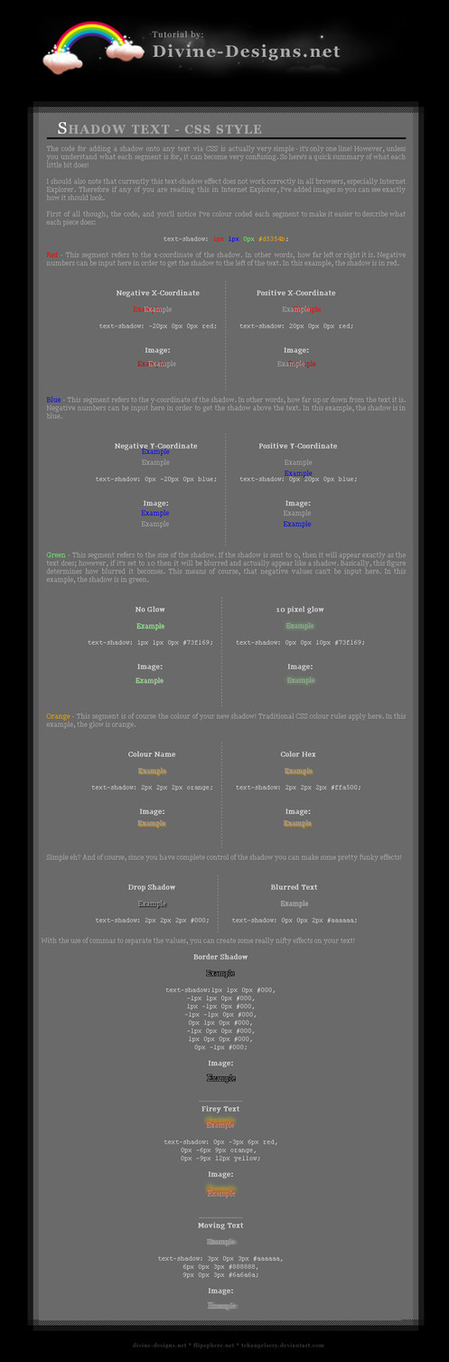
A tutorial which allows you how to add a drop-shadow or a glow to any text using CSS2. Perfect for ensuring that your text retains the ability to be modified.Note: As this uses CSS2, it won't always look perfect on your screen. To deduce whether this works for you, click [here] . The link takes you to where the tutorial is located on my own website.
For the record, I use Google Chrome
 (Smile)")
Edit: Added additional examples as hinted by @dxd !
Comments and criticisms greatly appreciated
 if you find this useful at all!
Related content


Comments: 25


Being new to CSS styling, this has quickly become my favorite tutorial. I'd done basic text-shadow editing before but never realized it's full potential. I refer to this tutorial with every single skin I've since created after it's discovery. Sad that poor IE users cannot experience this awesomeness.
My only real problem with this would be the legibility. The fullsize is so small, you actually need to go to the outgoing link in order to read the tutorial.
Otherwise, the descriptions, examples and instructions are perfect and help us re-imagine how we incorporate text into our designs. Perhaps someday, IE will catch up with the rest of us and get all the best CSS effects to work as well.
This tutorial was simple enough to give a novice like me an expert look to the skins I've created. It transforms just plain text into extraordinary and dynamic text, without the need for tons of images and such which will just clog up load times.
Thanks for your hard work that went into figuring out all the effects you can achieve.
👍: 0 ⏩: 1

Whooo! My first critique XD Haha - thank you~!
In regards to the full size problem, do you refer to when you click on the thumbnail to enlarge it? For some reason that's dA being weird T_T Or do you refer to the size when you hit download? Since I made this tutorial from screenshots of the written tutorial on my site XD haha.
Thank you again for the review~! And I'm glad you use this tutorial so often!
👍: 0 ⏩: 1
You know, I didn't hit download o_O lols!
👍: 0 ⏩: 1
Wahahah! Well yes, the download is a lot clearer ")
👍: 0 ⏩: 0

No problem! If you have any questions, don't hesitate to ask
👍: 0 ⏩: 0

Awesome! I was looking for how to do this yesterday, I'd completely forgotten how to do it!
👍: 0 ⏩: 1
No problem ")
👍: 0 ⏩: 0

I entered the html but it isn't working.
Are there spaces included between each px?
👍: 0 ⏩: 1
Can you copy and past the code here for me to see? Also, how isn't it working - what do you see? Which browser are you using?
Do note, it's CSS diplayed here, and not HTML.
👍: 0 ⏩: 0

Noooo problemo ~ ;D glad you think it's useful! XD
👍: 0 ⏩: 0

KEWL! Very helpful, clear, and easy to understand!
👍: 0 ⏩: 1
I'm glad you find it easy!
👍: 0 ⏩: 1
Well, I do have a little experience, but I think a novice would find it clear as well.
👍: 0 ⏩: 1
Nevertheless, thank you for re-iterating it! I never know if my work is clear for beginners XD
👍: 0 ⏩: 1


Cool tutorial, I think it might also be worth pointing out that you can add shadow on all 4 "sides" using commas. Like this:
text-shadow:1px 1px #000,-1px 1px #000, 1px -1px #000, -1px -1px #000,
0px 1px #000,-1px 0px #000, 1px 0px #000, 0px -1px #000;
That would give you a complete stroke effect.
👍: 0 ⏩: 1
Ouh, thanks for pointing this out to me! I'll definitely incorporate that tomorrow! ^_^
👍: 0 ⏩: 1
I've added your example, along with some new ones of my own! ^_^
👍: 0 ⏩: 1

