HOME | DD
 The-Future1 — Ariel (redesign)
by-nd
The-Future1 — Ariel (redesign)
by-nd

Published: 2019-09-29 21:03:07 +0000 UTC; Views: 2215; Favourites: 18; Downloads: 0
Redirect to original
Description
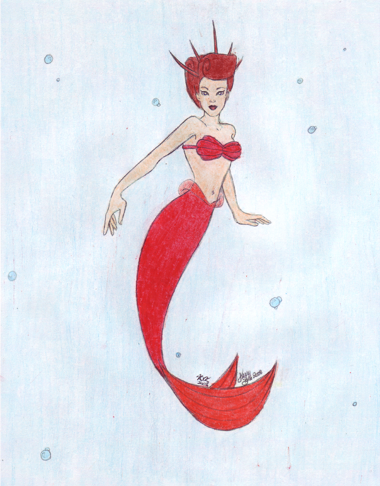
I decided to create a more fantasy infused and surreal version of ariel. For this one, I decided to increase the fish elements of the character. Tell me what you thinkRelated content


Comments: 12

👍: 0 ⏩: 0

👍: 0 ⏩: 0

👍: 0 ⏩: 1

Really cause creepy wasnt what i was going for. What exactly is it that makes her look creepy. Or are you just naturally creeped out by fish.
👍: 0 ⏩: 1
👍: 0 ⏩: 0

HEya,Im from ProjectComment and have some comments that I hope would be hopeful for you^^. I love her Ariel's design. And her color scheme matches her a lot. I love her expression.
My comments is that, some of the lines are a bit jagged. Especially around her chest and arms. The anatomy is a bit stiff. Try to give some more dynamic to the character. To give a more free look on the anatomy. Her hand should be slightly longer too. The hair needs a little improving. Since she's underwater, her hair should be in a motion, like ariel's hair. The background is plain,I suggest you add some darker colors at the endges and lighter color (light resource) around the mermaid since there are highlights on her. ^^
Btw, It would be nice if u added more color variation on the mermaid. The color is monotonous so it kinda looks dull. Your color is nice but it's not enough to make ur piece pop. Try adding some blue, orange, darker color would make it POP. XD Bright colors could use as the highlights.OOOOOh, try using orange as highlights, they're beautiful on red.But don't use the bright orange, just light orange. Blue or purple as the shadow, but do choose the darker shades.
I hope my comment would help you, keep up the good work friend^^
👍: 0 ⏩: 0

👍: 0 ⏩: 1

Hi! I'm here from your post in , here to give a critique!
First off, I really like your inclusions of more fishy traits without going too overboard with them! I especially like how her hair looks a bit more like a fin from the texturing, and the design is still relatively simple with a good color balance that doesn't hurt the eyes. I feel that it captures enough of Ariel to be recognizable, while still being plenty unique, and it definitely feels like you got the feel you were looking for in the design! Now onto the critiques- pardon if it's ever a bit all over the place.
I do see a few problems with the art techniques themselves, however. For starters, your line quality is a bit weak, with sketchy chicken-scratching and weird line overlap/disconnect. For example, the sketchiness of the line is most prevalent on Ariel's torso, and the overlap and disconnected lines more seen on the texturing on the tail. I would try to do some practice runs doing some more bold, clean lines to get some practice in on that. Also, if your art program has it in their brush settings, experiment with different line weights and anti-aliasing on bigger canvases! Starting big when drawing and then shrinking the image for upload helps a whole lot with line quality too, and makes other things a little less pixel-y.
Also, a neat trick that's helped me when lining textures, especially things like rings or intersecting lines- after inking the outline on your main layer, to create a new layer for the textures. Then, on that layer, draw your texture lineart without really caring if it does some weird overlapping with your main lineart. It's a bit hard to explain, so I'll just put a few example images to demonstrate what I mean-
So just to show what I mean, here's my trick with a circle I want to give a fishnet-ish pattern, that contours the shape of the object a lot like the patterns you gave Ariel's tail.
On a separate layer, I'm going to start drawing the directional curves, trying to get the same line weight I did with the outline. It looks a little messy at the moment, but by not worrying too much about staying within the "outline" lineart, the intersections generally look cleaner and crisp.
From here you can do one of two things- one, erase the parts of the second layer that go out of the lineart area before merging the two areas, or another simple thing that's a lot faster. On a layer below both of the lineart layers, hide the texture layer and use the fill tool to create a filled portion below your un-textured lineart, and if your art program allows bumping up the fill tolerance to get rid of any spare white pixels. Then set the texture lineart to clipping mode over this filled portion, and now the lineart looks clean like nothing happened!
Here's an example of the filled area that the second lineart layer will clip onto-
And with clipping turned on-
Both of these options will help you to varying degrees depending on your process and familiarity with your art program, but I just want my main takeaway to be to abuse layers and clipping, because in my own experience it has seriously upped the quality of my linework. Sorry for going on a long tangent about it, currently I think your linework could use the most improvement and your future art would grow leaps and bounds if the lines were more confident.
Only a couple more things that I have to say on this. Your lighting on Ariel seems to be coming from inconsistent sources, and keeping the lighting coming from one direction would add a lot of visual clarity. Your anatomy isn't too bad either, but your hands could have definitely benefited from some good references to look from. Every artists hears it all the time, but references are great and are fantastic for helping fix things in your art, especially when it comes to anatomy and lighting. And finally, the background- the flat color doesn't really make sense for an ocean, since water usually has light filtering through it to give the effect, and said lighting would also reflect on the color. This piece of art would be fine with just a flat color as the background, but those colors are usually best heavily desaturated to put more focus onto the character themselves.
Sorry if I come across as overly blunt or rude at any point, it was certainly not my intention. I hope to see your future art in Project Comment and see your growth! Thanks for reading this to the end if you did, and I hope you have a fantastic day!
👍: 0 ⏩: 0


👍: 0 ⏩: 0