HOME | DD
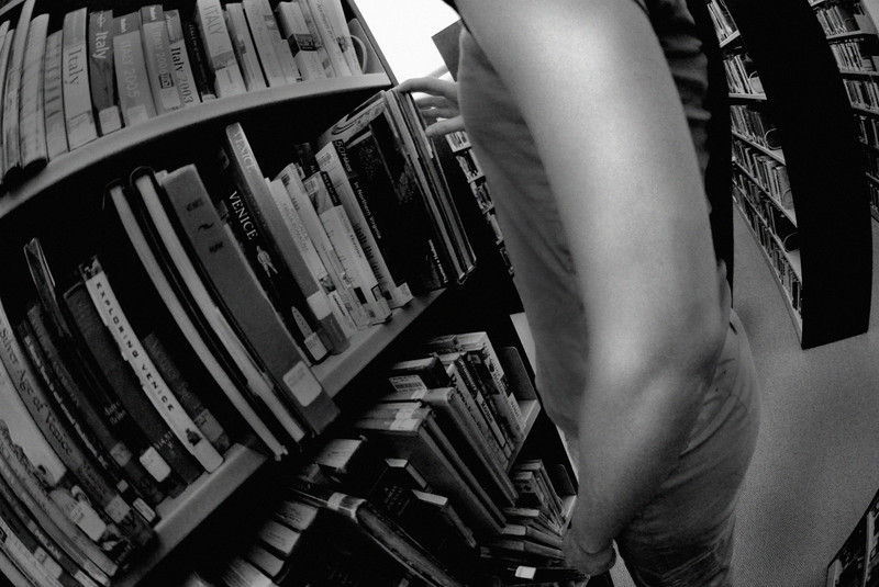
 the-weas — Take me to Italy
Published: 2007-03-23 17:31:09 +0000 UTC; Views: 47; Favourites: 1; Downloads: 1
Redirect to original
Description
Downtown library.I think I should scrap it, because I couldn't get any separation of darks and lights. I burned it and upped the contrast, but I still don't like it very much. :/
Let me know what you think.
Model:
Related content


Comments: 8

this might have been better if you went to a different book section, like childrens or somthing.... with different toned colors. and the arm looks akwardly positioned. its a concept with potential.
👍: 0 ⏩: 1

Thanks.  (Smile)")
I didn't think about trying a different section. All my shots were really just quick snapshots that day though, didn't spend much time thinking about it.
I appreciate the advice.
")
👍: 0 ⏩: 0

ha.. booooooring
just kidding, you should have done what I told you to do, but NOOOOOOo... 
👍: 0 ⏩: 1
Maybe next time, Sweet Tea!
👍: 0 ⏩: 1

It's alright. I like the perspective, but it's just kind of boring.
👍: 0 ⏩: 1
I think so too, there's way to much middle grey, not enough good darks or lights. Plus I think the job I did burning is bad, I'm not to good with Photoshop.
👍: 0 ⏩: 1
But at least you know the importance of simple tools. I swear way too many people get caught up in the filters to realize you can do SO much with just dodge and burn.
👍: 0 ⏩: 0