HOME | DD
 theCHAMBA — If I wasn't so Lazy. . .
Published: 2006-06-01 21:31:55 +0000 UTC; Views: 6149; Favourites: 66; Downloads: 2435
Redirect to original
Description
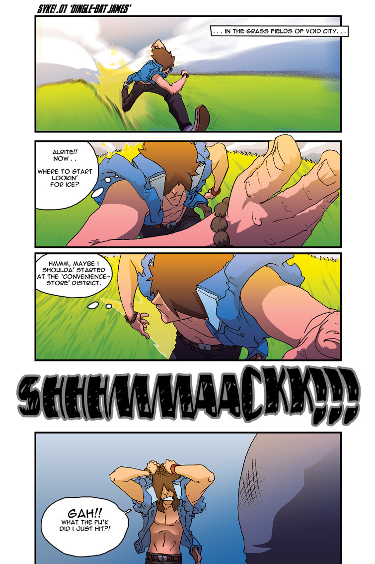
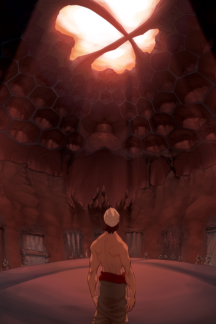
.. i'da had me 1st void battle in colourbut i am..
hahah
still, i think if i had spent an extra 3 or so more hours on that battle, it woulda all been in colour..
bleh..
-tools-
4h.hb-pencils/printerPaper > Photoshop7/OpticalMouse
Related content


Comments: 40

I really like the running angle on that first panel.
👍: 0 ⏩: 0


hope to C more mattle from U ... I think u should have won that one ...
B T W i'll check it out now
Goodluck
")
👍: 0 ⏩: 0
")

haha! i always thought he had blonde hair and an orange jacket...lol! not sure why!?
👍: 0 ⏩: 0


great art, cool layout, cool colors! totaly awesome!
👍: 0 ⏩: 0

lol! Awwww that's great lovin! Great work here.
👍: 0 ⏩: 0


nonoononononoononononoononoonononoononon ononnnnnnnnnooooooOOOOOOO.
keep it red and white, blue and white, green and white etc. i like that much much better.
don't get me wrong, good coloring job on this and all. but i want to see MORE. NOW. and coloring will slow you down.
👍: 0 ⏩: 0

COOL SCENES HAHA as i told ya once u the dinamics doc! i dunno why ..this scenes on the running panels reminds me of that goofy flick KUNG FU HUSTLE lol...theyre both insanely cool lol
👍: 0 ⏩: 0

Godammnnn you're good. Your style kicks soo much ass with your dynamic perspective and movement...I envy your kickass skilll.
 (Smile)")
👍: 0 ⏩: 0

I don't know about you dude, but I like the choice of composition and perspective, it gives the audience an easy time keeping up with the storyline.
👍: 0 ⏩: 0


wow, man., the angles n' everything's jus' awesome! for some reason it makes me think of samurai champloo
👍: 0 ⏩: 0

To be honest I enjoyed it more without colour, not that you're colouring sucks, I just find black and white (i.e. manga-ish) more attracting, ifyou know what i mean.
👍: 0 ⏩: 1

yes
i totally agree
that was the look i was going for ..
the whole 'manga' feel
this was jst for shits and giggles
👍: 0 ⏩: 0


It looks great in color, don't get me wrong. But I think the B&W version had more appeal.
So, basically, you can go ahead and be lazy, and I'll like it either way.
👍: 0 ⏩: 0

i notice you don't seem to like doing any hatching...
👍: 0 ⏩: 1
i don;t hatch, nor do i do any lineweights
not anymore anyway
👍: 0 ⏩: 1

lol it looks great in colour; I voted on that battle (my first vote as a member)

👍: 0 ⏩: 0


better in B&W
only i thought the guy was blond lol
*
👍: 0 ⏩: 0

yup,those be somemighty fine poses and angles me mano! though I must say I kinda like the toned page better! XD
👍: 0 ⏩: 0

Pretty sweet. Like someone said, hella nice work with the running scenes
👍: 0 ⏩: 0


Hehe then i would have been utterly and completely pwned, instead of just owned. lol
👍: 0 ⏩: 0

Ha, i saw the battle on entervoid, i think you're kicking asses
👍: 0 ⏩: 0


badass, I bow before those running poses, so hard to do!!
👍: 0 ⏩: 0


wow
awsome in color, but i dig it either way!
XD
hope you win!
im rooting for ya!
👍: 0 ⏩: 0


haHA!YES! SYKE! I love it, Jeff! This has incredible motion to it, and I love the angles you display him at. For a crit.--it just seems in the last panel he should seem more bent over or wobbly-looking since he just bashed into somethin'. But that's just me--the four panels you have here really gives the "feel" to the reader. Then again, Syke rules baby. (Wink)")
👍: 0 ⏩: 0

I just joined that site! Isn't it awesome? Hehehe... this is hilarious. Can't wait to see more of your work there.
👍: 0 ⏩: 0

dig the running scenes. has a great sense of speed and movement.
👍: 0 ⏩: 1

Concur, another good example of how well he can portray dynamic action. I barely read any comics, but I don't think there's many comic artists that can draw motion as freely as lastscionz does, from my impression, they're all really hard and stiff.
You know I would love to see an animation done in the style of lastscionz.
👍: 0 ⏩: 0