HOME | DD
 TheEclipse — Dystopian Link
Published: 2008-04-15 20:46:04 +0000 UTC; Views: 3835; Favourites: 83; Downloads: 65
Redirect to original
Description
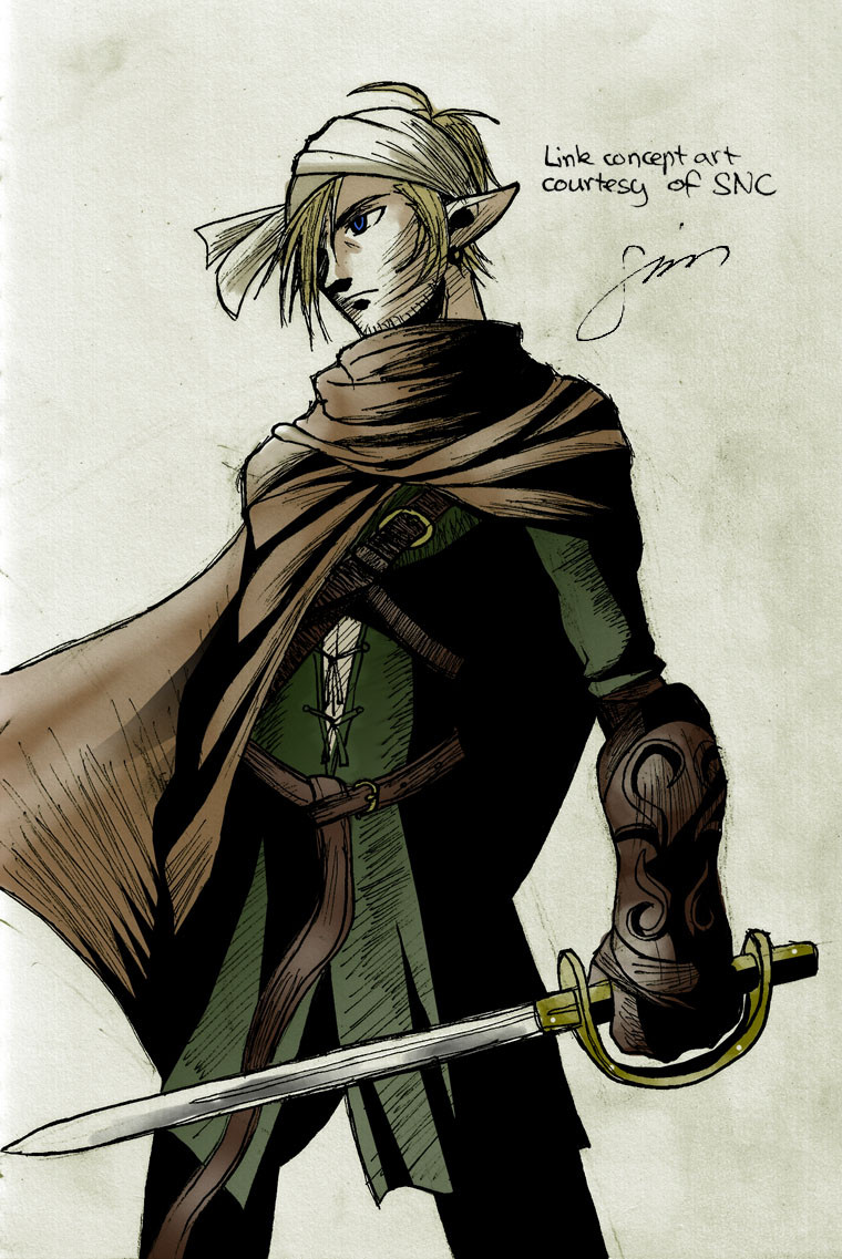
Character redesign by me, ~turky , ~wiseman2 and ~zipzog and illustrated by me. It was completed on March the 10th, but I only got around to submitting it now.")
It was for a game/competition to make a new look for Link. We tied dead last.

Edit: Oh, and SNC is my other screenname.
Related content


Comments: 44


Awesome! The face reminds me just a little of Solid Snake.
👍: 0 ⏩: 0

A dystopian Link... This could be an interesting concept for a new Zelda game! (I love dystopian societies!)
👍: 0 ⏩: 0


Dude, wtf last place? DDD< This is an incredibly awesome version of Link! He's all epicly heroic n'stuff, and he doesn't look like he's cosplaying Cloud, unlike a lot of Link-redesigns I've seen.
👍: 0 ⏩: 1

Well, it was only out of 3 teams. x]
👍: 0 ⏩: 0

still effin hot. dead last? who got 1st??
and did he kill raphael for the sword? >.< (SCII)
i give this an B+
👍: 0 ⏩: 1
It's the Rapier in the LoZ title screen. x]
👍: 0 ⏩: 0

 (Wink)")

Woah. Awesome. Hey by the way once i have read all my DA mail i am going to upload some more random stuff i have done. PLZ look!!!
👍: 0 ⏩: 0

")
I only started thinking that after DL said he didn't give us 1st place so we wouldn't have too much of a head start.
👍: 0 ⏩: 0

Wow, this is really cool! I like the high-contrast shadow coupled with the hatching- one of my favourite shading styles and really cool way of blending western and eastern looking effects. The clothing feels a little stiff though, particularly when hatching can be used to show movement and flow. Still, really nice stuff. c:
👍: 0 ⏩: 1
Yeah, I've always loved hatching for ink work. Plus that way it doesn't matter as much when I don't spend much time CGing. And yeah, I'm not really all that advanced with hatching since I'm used to cel-shading so I didn't really have the confidence to tackle that much surface area on the clothes.
👍: 0 ⏩: 0

The style of this one makes it something I could totally see as being official art ")
👍: 0 ⏩: 1
The ironic thing is that I only went with this style because it takes less time than properly cel-shading it and cleaning the lineart.
👍: 0 ⏩: 0


MAN this is sexy. I like the unshaven look, it adds gruff to his personality.
👍: 0 ⏩: 1
Yeah, me and ~wiseman2 were thinking of going for a Mad Max look with the leather and chains but knew the rest of our team would kill us. So we went with that instead. xD
👍: 0 ⏩: 0

Very nice  (Smile)")
👍: 0 ⏩: 1
The one on Wii dropped the cartoony look that you're talking about.
👍: 0 ⏩: 1
Yeeeeah, but I don't have a Wii XD ^^
👍: 0 ⏩: 1
Well, it was on GCN too, not that I'm trying to convince you to buy the game or anything.
👍: 0 ⏩: 0

Very cool design. It keeps what people recognize in Link, but at the same time, it looks pretty new and fresh. Nice work.
I dunno why, but I especially like the sword...
👍: 0 ⏩: 2
Oh, and I based the sword off the rapier from the original LoZ title/logo so that could be why.
👍: 0 ⏩: 0
Yeah, we were told to redesign Link but still make him look like Link, so, awesome that it shows.
👍: 0 ⏩: 0

OMG! OMG! OMG!!! THAT IS SOOOOOOOOO COOL! I LOVE IT SO MUCH!! I love the way you did the lines for it it looks so gritty yet so STYLISH! Fantastic! I think this is your best work ever!
👍: 0 ⏩: 1
Yep, I'm pretty proud of this one myself since it's rare that I'd do anime in a darker style.
👍: 0 ⏩: 0

I LOVE the inkiness of this >|D It makes it kinda look like official art!
I also like how you made him look older |'3 <33
👍: 0 ⏩: 1
In the backstory that ~turky wrote up for him, he has an older friend and I got them two mixed up so now we have an older Link. xD
👍: 0 ⏩: 0


Funny I thought the same thing.
👍: 0 ⏩: 0