HOME | DD

theinsidenoob — Meshuga Monkeys

Published: 2008-09-21 14:35:09 +0000 UTC; Views: 3818; Favourites: 22; Downloads: 0
Redirect to original
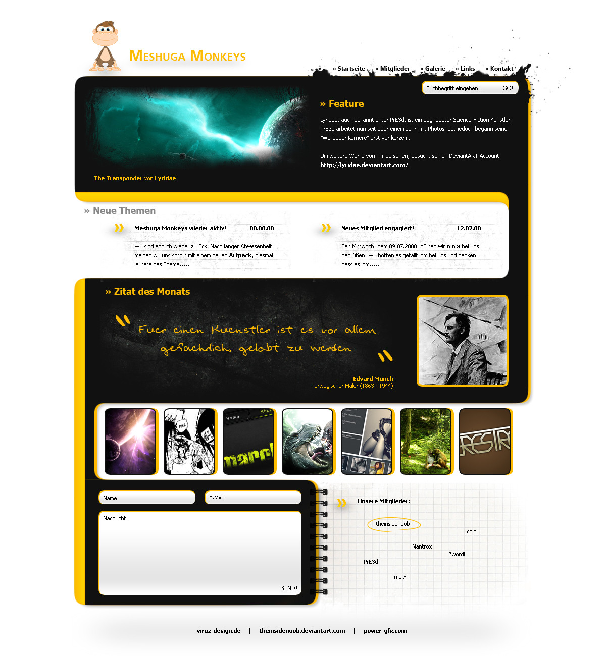
Description Info:
Design inspired by my Artgroup on viruz-design.de
I like it, fresh colors and also a new style i tryed...
for sale if you wanna have it


Credits:
- ~Nikeos
- viruz-design.de
- my Artgroup for the features
- ~Lyridae (also in my artgroup)
Related content
Comments: 54

theinsidenoob In reply to ??? [2009-08-31 18:05:03 +0000 UTC]

thanks.
the logo is no real logo, just a "place holder".

👍: 0 ⏩: 0

karsten [2008-11-13 03:13:11 +0000 UTC]

Cool design man!
What does Meshuga means, is it crazy or something like that? so this is a website for crazy apes?

👍: 0 ⏩: 1

theinsidenoob In reply to karsten [2008-11-14 16:56:12 +0000 UTC]

yes, something like crazy
we thinked about a good name for our artgroup....and i think every "designer" is a bit crazy, so why not meshuaga monkeys?

👍: 0 ⏩: 0

koenigpersoenlich [2008-10-17 04:07:06 +0000 UTC]

sehr nice und deshalbt haste dir auch den

👍: 0 ⏩: 1

theinsidenoob In reply to koenigpersoenlich [2008-10-17 12:13:38 +0000 UTC]

danke
btw ist es gerade beim coden für unsere Artgroup

👍: 0 ⏩: 0

RamBoCore [2008-09-24 14:07:00 +0000 UTC]

👍: 0 ⏩: 2

theinsidenoob In reply to RamBoCore [2008-09-24 14:16:13 +0000 UTC]

btw danke fürn fav + watch xD

👍: 0 ⏩: 1

RamBoCore In reply to theinsidenoob [2008-09-24 17:20:56 +0000 UTC]

ups hab den text vergessen xP

-> is geil, aber der BG zu hell...würd den mit verläufen e.t.c aufwerten

btw thx for watch

👍: 0 ⏩: 1

theinsidenoob In reply to RamBoCore [2008-09-24 21:52:51 +0000 UTC]

ist noch immer wip xD
aber da schon mehrere wegen bg gemeckert haben werd ich mal bissl rumspielen, danke

👍: 0 ⏩: 1

RamBoCore In reply to theinsidenoob [2008-09-30 18:59:47 +0000 UTC]

hau inne tasten <3

👍: 0 ⏩: 0

theinsidenoob In reply to RamBoCore [2008-09-24 14:15:23 +0000 UTC]

?

👍: 0 ⏩: 0

Qupie89 [2008-09-24 13:23:38 +0000 UTC]

Looks awesome!

👍: 0 ⏩: 1

theinsidenoob In reply to Qupie89 [2008-09-24 13:36:43 +0000 UTC]

thank you

👍: 0 ⏩: 0

zephon22 [2008-09-23 19:46:37 +0000 UTC]

Sehr schlichtes und deswegen auch schönes Layout, doch was mir nicht gefällt sind die Schlagschatten. Es würde einen noch eindeutigeren Stil erhalten, wenn sie entfernt würden. Zumindest bei den Pfeilformen im oberen Teil.

Ich will nicht zuviel loben, es könnte ja gefählrich werden.

Das Layout verkörpert zumindest auch die Idee von Logo und Name bzw. passt sich gut ein.

Ebenfalls bin ich mir aber nicht sicher ob das nun von mehreren Personen (so wie es scheint) erschaffen wurde oder von einer Person umgesetzt, mit Ideen von vielen verschiedenen...

Aber es gefällt, bis auf einige überflüssige Schlagschatten. Weiter so !

👍: 0 ⏩: 1

theinsidenoob In reply to zephon22 [2008-09-23 23:12:50 +0000 UTC]

mir gefällt das mit den schlagschatten, muss ich dich leider enttäuschen.
wurde von mir erschaffen, .psd hat kein anderer....

👍: 0 ⏩: 0

Torsten85 [2008-09-22 16:40:21 +0000 UTC]

gefällt mir verdammt gut aber ich finde es ist 2 much nikeos!

👍: 0 ⏩: 1

theinsidenoob In reply to Torsten85 [2008-09-22 18:24:07 +0000 UTC]

Credits:
- ~Nikeos

👍: 0 ⏩: 2

Nikeos In reply to theinsidenoob [2008-10-08 03:46:39 +0000 UTC]

👍: 0 ⏩: 0

Torsten85 In reply to theinsidenoob [2008-09-22 18:47:28 +0000 UTC]

ups...LOL...ja ok !

👍: 0 ⏩: 1

theinsidenoob In reply to Torsten85 [2008-09-22 18:56:57 +0000 UTC]

egal

👍: 0 ⏩: 0

Terame [2008-09-22 05:39:09 +0000 UTC]

Great 'fun' layout with a nice flow to the sections and colour flow

👍: 0 ⏩: 1

theinsidenoob In reply to Terame [2008-09-22 18:23:56 +0000 UTC]

thanks for the

👍: 0 ⏩: 0

shecro [2008-09-21 21:25:51 +0000 UTC]

das äffchen passt auch nur vom namen her rein oder? =/ aber die farben find ich toll und die anordnung und blickführung sind auch gut (:
gefällt mir!

👍: 0 ⏩: 1

theinsidenoob In reply to shecro [2008-09-21 21:26:59 +0000 UTC]

der affe ist mehr oder weniger unser logo, der musste rein

👍: 0 ⏩: 0

PanniL0 [2008-09-21 20:02:13 +0000 UTC]

wow, echt ne schöne page, passt einfach alles!!

👍: 0 ⏩: 1

theinsidenoob In reply to PanniL0 [2008-09-21 20:21:22 +0000 UTC]

jau, danke fürn fav

👍: 0 ⏩: 1

PanniL0 In reply to theinsidenoob [2008-09-21 20:33:56 +0000 UTC]

bitte, bitte den haste dir verdient!

👍: 0 ⏩: 0

NEU7RAL [2008-09-21 17:51:18 +0000 UTC]

Wow this website is simply Excellent.

👍: 0 ⏩: 1

theinsidenoob In reply to NEU7RAL [2008-09-21 17:56:12 +0000 UTC]

thank you

👍: 0 ⏩: 0

dreamline-gfx [2008-09-21 16:59:36 +0000 UTC]

schön auch wenns INSP ist , aber das Future also spaceart da, sollte nen festen rahmen haben , finde ich..., (:

👍: 0 ⏩: 1

theinsidenoob In reply to dreamline-gfx [2008-09-21 17:10:50 +0000 UTC]

hatte vorher einen klaren rahmen, und auch mehrere leute gefragt wie sie es besser finden.
das kam besser an und gefällt mir auch besser

👍: 0 ⏩: 1

dreamline-gfx In reply to theinsidenoob [2008-09-21 18:16:32 +0000 UTC]

ok denn sollts so seien

👍: 0 ⏩: 0

fee3R [2008-09-21 16:06:17 +0000 UTC]

schönes teil...

👍: 0 ⏩: 1

theinsidenoob In reply to fee3R [2008-09-21 16:36:10 +0000 UTC]

danke, schön von dir zu hören

👍: 0 ⏩: 0

MasterTom510 [2008-09-21 15:51:47 +0000 UTC]

Sehr schöne Arbeit
Interessante Farbgestaltung, schön ungewöhnlich aber schick

👍: 0 ⏩: 1

theinsidenoob In reply to MasterTom510 [2008-09-21 16:36:19 +0000 UTC]

sänk you

👍: 0 ⏩: 0

Caes0r90 [2008-09-21 15:35:18 +0000 UTC]

sehr geil, gefällt mir gut... farben sind nice

👍: 0 ⏩: 1

theinsidenoob In reply to Caes0r90 [2008-09-21 15:37:05 +0000 UTC]

jau, danke fürn fav

👍: 0 ⏩: 0

Marchibial-Arts [2008-09-21 15:33:40 +0000 UTC]

fav <3

mehr gibts nicht zu sagen
(ausser dass unser äffchen noch immer recht allein dasteht)

👍: 0 ⏩: 1

theinsidenoob In reply to Marchibial-Arts [2008-09-21 15:36:31 +0000 UTC]

es kann nie perfekt sein, oder?
und wie gesagt, header + footer sind noch immer WIP xD

👍: 0 ⏩: 0

reborn1024 [2008-09-21 15:28:43 +0000 UTC]

sehr geil!
respekt
hast echt nochmal was rausgeholt .. aus der zauberkiste
mate

👍: 0 ⏩: 1

theinsidenoob In reply to reborn1024 [2008-09-21 15:36:08 +0000 UTC]

danke

👍: 0 ⏩: 0

misteranwa [2008-09-21 15:11:27 +0000 UTC]

Sehr schöne Arbeit, Respekt!

👍: 0 ⏩: 1

theinsidenoob In reply to misteranwa [2008-09-21 15:35:57 +0000 UTC]

danke.
aber ich versteh nicht wieso du schreibst und dann nicht favst

👍: 0 ⏩: 1

misteranwa In reply to theinsidenoob [2008-09-21 18:36:14 +0000 UTC]

Sorry, jetzt aber

👍: 0 ⏩: 1

theinsidenoob In reply to misteranwa [2008-09-21 20:21:52 +0000 UTC]

danke xD

👍: 0 ⏩: 0

Log89 [2008-09-21 14:36:23 +0000 UTC]

cooles teil,
bloß der 'space'-header passt nicht so.

👍: 0 ⏩: 1

theinsidenoob In reply to Log89 [2008-09-21 14:38:14 +0000 UTC]

space header?

👍: 0 ⏩: 1

Log89 In reply to theinsidenoob [2008-09-21 15:29:26 +0000 UTC]

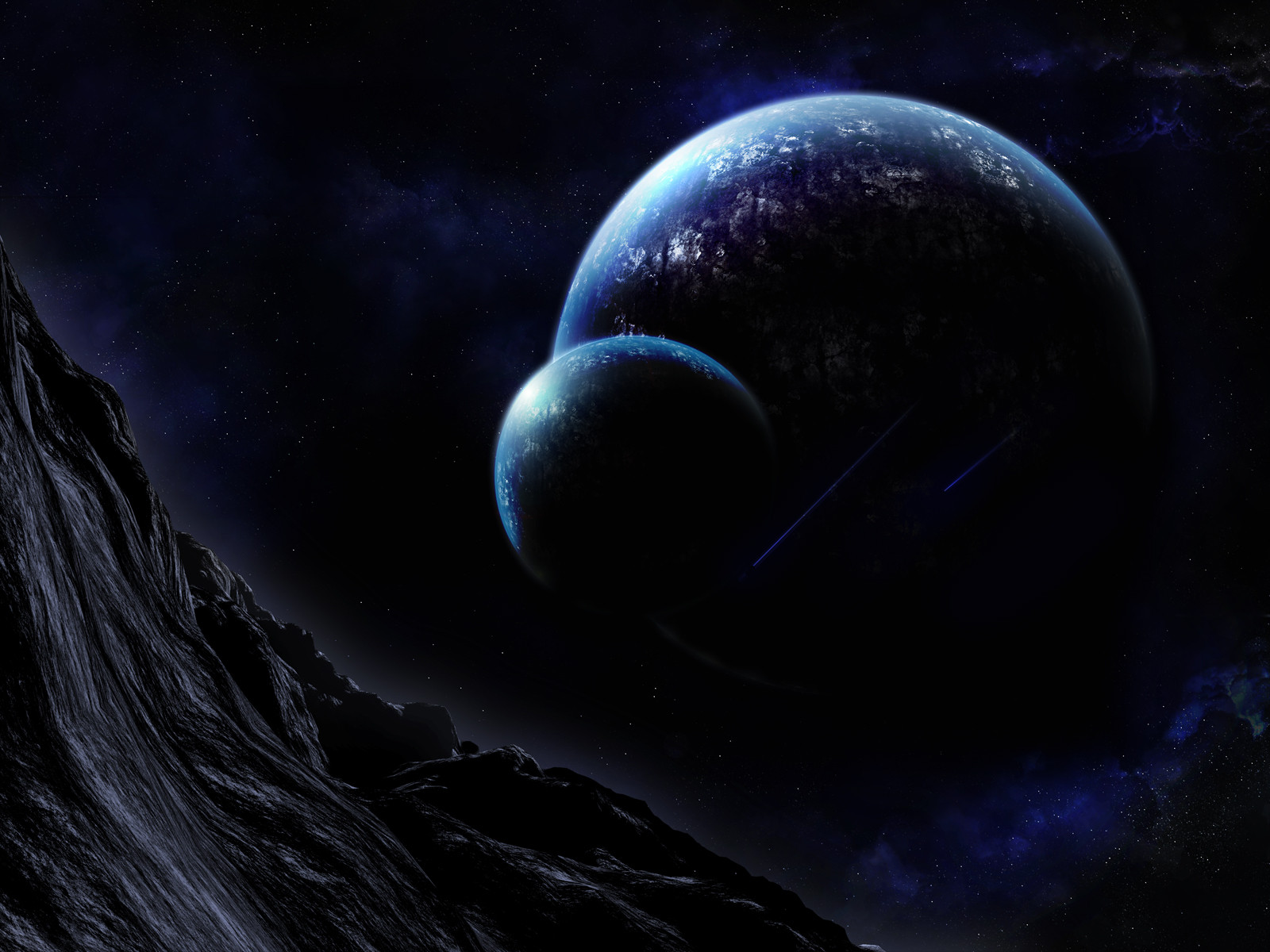
ja, oben dieses planeten bildchen ^^
sone art teilheader oder so..

egal, vergiss es.. sieht insgesamt sehr geil aus.

👍: 0 ⏩: 1

theinsidenoob In reply to Log89 [2008-09-21 15:37:35 +0000 UTC]

das ist das feature
könnt genau so irgend ein abstract work sein oder eine sig...

👍: 0 ⏩: 1


| Next =>