HOME | DD
 TikamiHasMoved — Diego Feral Reference Sheet

Published: 2009-11-27 08:32:38 +0000 UTC; Views: 1124; Favourites: 17; Downloads: 27
Redirect to original
Description
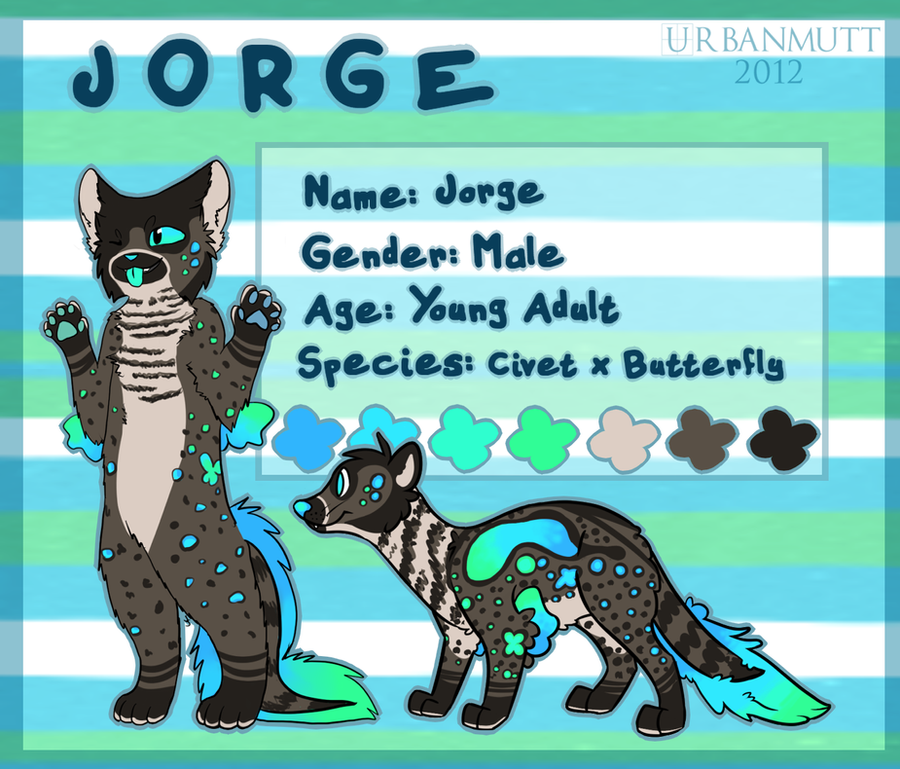
Finally, a proper reference sheet for Diego, Panthera's mate!I was working on this, and then got distracted by "In The Sky".
So I figured I may as well just get it done and posted.
So, to everyone that I've asked to draw him in the past... I'M SORRY. I didn't realize what a pain in the ass he was to draw.

Anyways, if anyone's up for a challenge... lol He's a good one.
Anyhouse, Diego's design and character belongs to me. He will not be used without permission! D:<
Related content


Comments: 15


Diego looks so kewl^^
I really love the idea of mixing animals especially if it combines with dragons!
👍: 0 ⏩: 1

")
👍: 0 ⏩: 1

I love the shinny pads he dosent look like that much of a challenge to draw at at first look hmm but who knows lol XD So this is the design that won the contest awsume! "D
👍: 0 ⏩: 1
^^ Nope, Diego is my own design.
👍: 0 ⏩: 1
")
👍: 0 ⏩: 0


I like how you managed to cross a dragon and a wolf without so much picking and choosing and making the look evenly varied. I really like his squat neck and fat tail, they really bring out a dragony feel without you having to say anything. There are a couple things you could do to make the reference sheet show more information, and be a better use of space, though.
Your character is pretty much symmetrical for the body, so there's no need to flip the image around for the other side. Instead of using tricks like that to fill up space, I suggest redrawing the head from an angle to show the varied face markings. You could then do a shot of him with the wings, which would be much more dynamic and interesting than just having the wings there on the page.
Also, I highly suggest you take a rest from gradients, especially rainbows- yes, they're easy to fill up and you don't have to do much work to make it nice and blended, but they're easily recognizeable and are an easy show of how much effort you put into your piece. The best uses of gradients are very subtle. Instead, just use the brush to color it in and blend it yourself. It may not look as uniform, but it def. makes it look more handmade and carefully rendered.
Overall, your char is overall pretty interesting, and you have a decent color pallette for him. I'm a little skeptical about the full saturation blues and greens, but that's your choice and it looks alright. because he's so unique you want a wide variety of drawings to capture him from all sides.
👍: 0 ⏩: 2
^^ I'm sorry, I kind of came off like a bitch. I was just trying to reply to all of my messages. I really appreciate you taking the time to critique my drawing, and I really will keep your suggestions in mind. I'm usually just too lazy to do some of those things.
But I'll work on it, and I really do appreciate you taking the time to leave such a comment. ^^ Thanks again.
👍: 0 ⏩: 0
Um, thanks. ^^ I'll keep that in mind.
👍: 0 ⏩: 0
 (Wink)")


👍: 0 ⏩: 0