HOME | DD
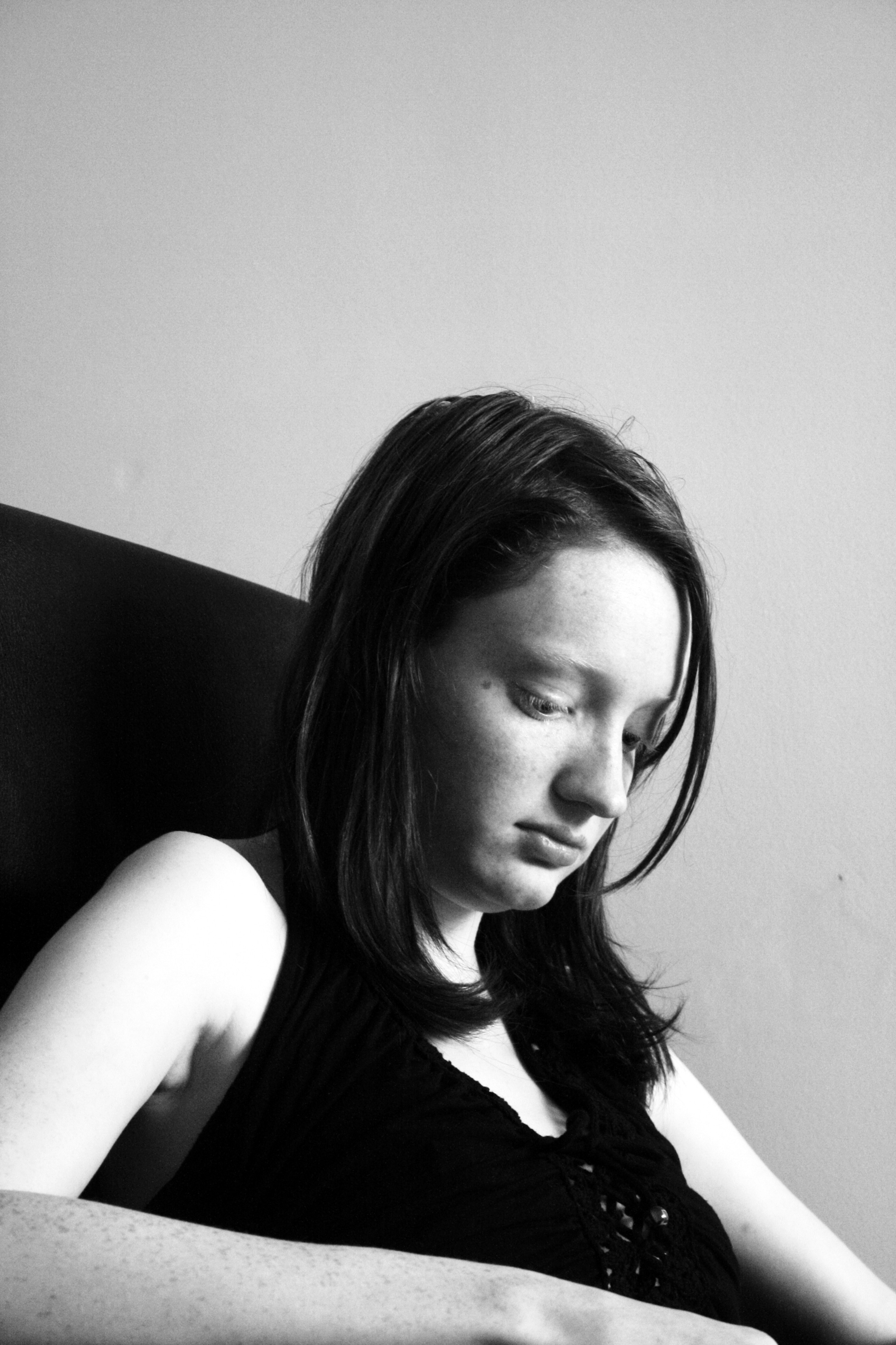
 timstar2000 — A Hint of Sadness
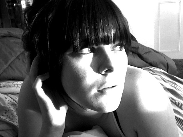
Published: 2007-07-18 21:42:06 +0000 UTC; Views: 371; Favourites: 1; Downloads: 3
Redirect to original
Description
Model - Katie [link]Not taken with my usual camera
Related content


Comments: 5

yes, I guess too B/W works best for a photo dealing with sadness, nice portrait!
 (Smile)")
👍: 0 ⏩: 0


I don't think Katie looks sad -maybe a tad bored. Were you boring her with one of your anecdotes?
Black and white works well in this case. did you take the pic in colour and then convert it in ps or did you take it in b&w via a setting on the camera?
The lighting is good -it isn't too harsh. Did you take any shots using flash?
I like the contrast between the light wall and the darker items in the picture.
The space above katie's head works well. I can't imagine landscape would have worked as well as portrait does. Ideally you would have kept her hands in shot.
This picture has a timeless feel to it -it could have been taken in the sixties or early to mid seventies (maybe technically that would mean it isn't timeless at all)
👍: 0 ⏩: 1

i tried many different shots, some with colour, some without, some with flash and some without, and this came out the best.
and i agree about the portrait shot
👍: 0 ⏩: 0