HOME | DD
 TJUArt — Beacon
Published: 2011-03-07 22:03:45 +0000 UTC; Views: 4903; Favourites: 112; Downloads: 167
Redirect to original
Description
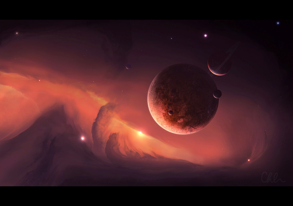
It started out as a flare test, then I overlayed some colour noise and I couldn't stop myself
The middle-sized planet is painted, and so is the starfield
~3hrs
I'd like some crit on this one please, I can always make changes
 (Wink)")
Related content


Comments: 22

Overall

Vision
Originality

Impact
I like the composition, but it's far too sharp. The texture on the planet just to the right and up from the sun looks fake. The galaxy/nebula on the far right is too distracting and unnecessary. However, for realism and plausibility, few of these ever are even near realistic for aesthetic reasons or wrong information, most noticeably if the planet with the weird texture is a moon, it's far too close (which always bugs me somewhat) and there are no green-appearing stars. There's lots of stellar dust.
As for positives, aesthetically it's very nice and one of the better space arts I've seen. The composition, as I mentioned, is nice and the asteroid(?) at the bottom adds a positive touch and point of view. The small planet/moon right to the left of the sun adds depth and feels right. The effects are well done, and the creator obviously has experience.
👍: 0 ⏩: 1

Nice points, well made, however, I wasn't aiming for realism in this piece (hence the overbright atmospheres, swirly clouds and lack of green stars
The focus for this one was the flare and experimenting with different stellar objects (galaxy)
I'm not sure what you mean about the moon being too close, when it's not a moon, it's a planet, though it appears close
")
👍: 0 ⏩: 1
I wasn't expecting you were going for realism, otherwise almost all space art would be ironic. Also, what I meant was, there are no green-appearing stars (which you can read more about here: [link] ). I really don't know what those few green lights are. I assumed by the red, blue, white, and yellow ones that they're supposed to be stars.
Well, I figured the planet was a moon. Either way.
Thanks for accepting the critique and your comments on it.
👍: 0 ⏩: 0

I love how peaceful this scene is, you did a great job, makes me want to go there.
👍: 0 ⏩: 0

the starfield looks really nice dude. Loving the colors
👍: 0 ⏩: 1
Cheers mate  (Smile)")
👍: 0 ⏩: 1
okay I have a few suggestions for you:
- I love the colors of the background, the stars might have too many different colors though. Especially the three big colorful stars on the left stand out pretty much (two purple and one green star).
- there's something on the far right of the nebula which is very sharp and distracting, imo it could be integrated into the background a little bit better, and since it's so isolated over there it seems kinda out of place
- the texture of the small planet looks a little weird, kinda whirly and unnatural. The big planet on the contrary looks very realistic but could use a bit variation (in texture or coloring)
- the upper edge of the closeup in the foreground is pitch-black on my screen. I think to integrate the close-up according to the lightsource, the edge should be brighter and highlighted
hope it helps!
👍: 0 ⏩: 0


Love the shadow clouds in space
Dont change it! We like it as it is
👍: 0 ⏩: 0


Thanks
👍: 0 ⏩: 0


")

Cool cloud patterns on the planets...they remind me of marbles

👍: 0 ⏩: 1
Haha yep, stormy marble planets
👍: 0 ⏩: 0
