HOME | DD
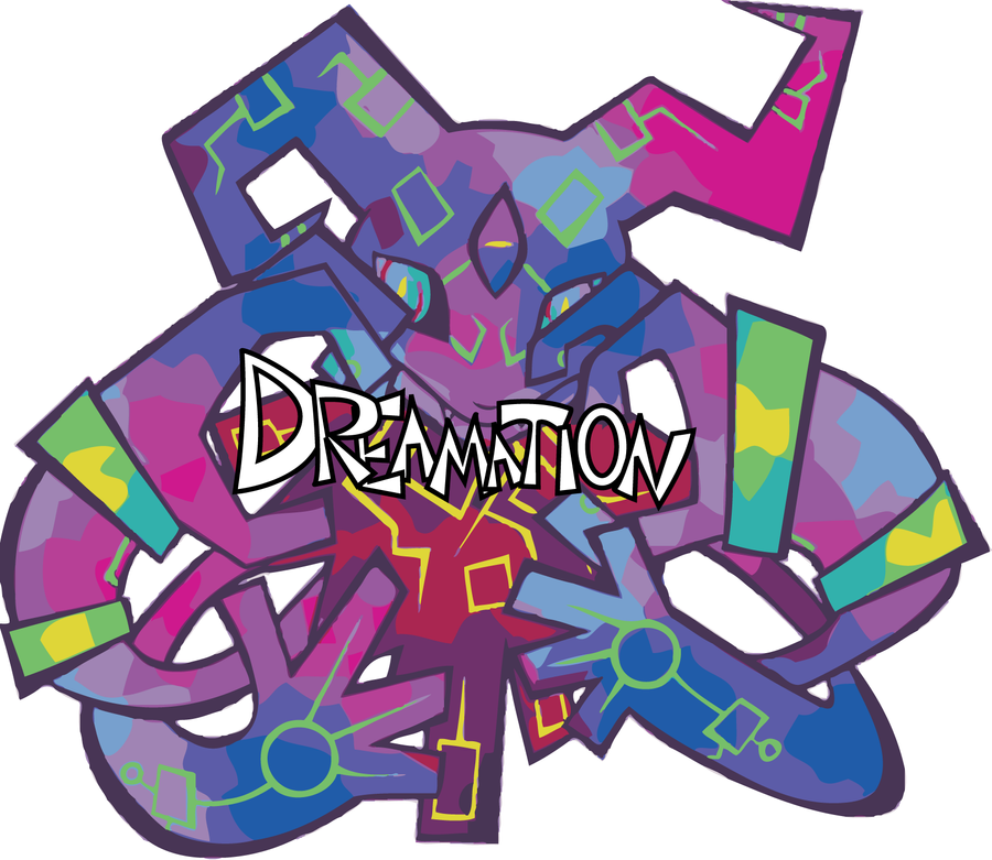
 torithefox — Logo design

Published: 2011-03-18 18:32:22 +0000 UTC; Views: 174; Favourites: 6; Downloads: 2
Redirect to original
Description
Class projectRelated content
Comments: 2

For a class project, I think it's great. As a piece of art, it is very cool. As a logo?? I think it would fail miserably.
My teachers are always asking me this question: "What does it look like in black and white?" I think that this image would lose a lot in Black and white. Also, I think if you shrunk it down, for a business card, you would lose a lot also. If you look around, most good logos stick to, no more, than 4 colors, including black and white. You have the whole rainbow in there. Maybe I'm wrong, but I cannot see this working out.
👍: 0 ⏩: 1

The version I gave to the teacher had all of that. Didn't lose much in blk/wht but it does look bad small I admit. It was originally flat in color actually. I changed it for big viewing.
👍: 0 ⏩: 0


