HOME | DD
Published: 2005-06-02 04:16:21 +0000 UTC; Views: 1147; Favourites: 25; Downloads: 328
Redirect to original
Description
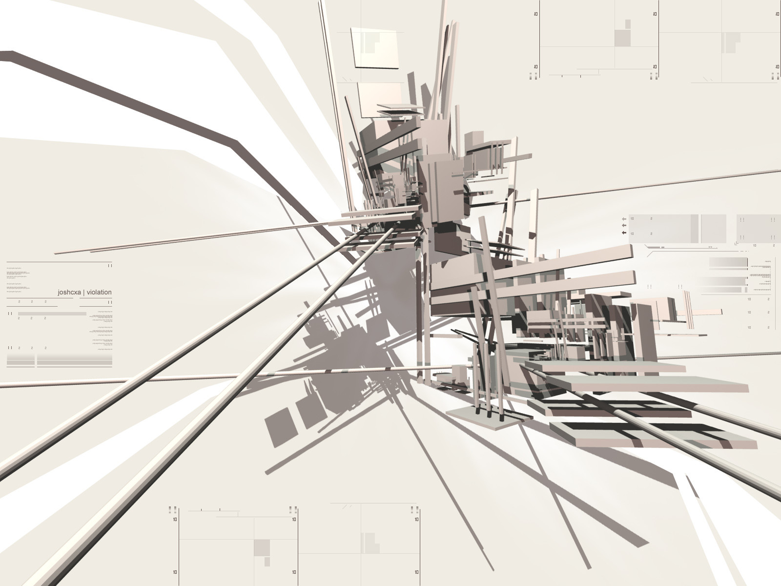
I dont expect you to like or favorite this, Im content with it as it can be viewed now. I often think to not think, to be truely abstract, I havent accomplished that yet, but Im in route.EXR
Related content


Comments: 38

took a look through your gallery, you have some very nice stuff, its unique, this ones one of my favorites
👍: 0 ⏩: 1
toThePixel In reply to to0t [2005-12-11 06:19:45 +0000 UTC]
I'm making another cell shaded piece now
👍: 0 ⏩: 0


I love this piece, nicely done love the style you used in this.
👍: 0 ⏩: 0

Brilliant, the cartoon feel you gave it really makes it stand out
👍: 0 ⏩: 0


That is insanely awesome... Reminds me of something but I can't quite put my finger on it... Nevertheless it's amazing... =O
👍: 0 ⏩: 0

toThePixel In reply to Centercore [2005-06-06 01:34:04 +0000 UTC]
eh, its a 3dsm thing, you can make cartoon fills.
👍: 0 ⏩: 1

omg i love this. its like a cel shaded abstract. This is really awesome! 
👍: 0 ⏩: 1
toThePixel In reply to UnyieldingHeirophant [2005-06-06 01:37:20 +0000 UTC]
Thanks, and thanks 2x for the fav! I also noticed you been submitting alot lately, very cool stuff.
👍: 0 ⏩: 1
heh, you deserve the fav! your artwork is teh w00t! And I know Im being modest in saying that its not that great cause...well...I got denied membership to EvokeONE because as vr-x says it "No, you need to work on your originality". But whatever, thanks for the compliment  (Wink)")
👍: 0 ⏩: 0


this is one of your best works ... but pls erase the exr text ... it doesn't fit on the rest
👍: 0 ⏩: 0

lovin the render mate  (Smile)")
👍: 0 ⏩: 0
lovin the render mate
👍: 0 ⏩: 0


it looks cartooney, cool, that render is kinda like something i would do LOL
👍: 0 ⏩: 0

exr this is one hell of a sexieh piece, except for the typo i don't like....
otherwise very good stuff, anime abstract >>> i love it.....

👍: 0 ⏩: 0

AHH THIS IS THE ONE I LOVE
It turned out amazing!
well you have my plus fave its like an excellent excellent excellent piece!
👍: 0 ⏩: 0


think it looks good, gives it more depth with the blurred renders in the bg. typo works great with the rest. keep it coming
👍: 0 ⏩: 0

I love how it looks almost like a cartoon. Cell shaded, maybe.
👍: 0 ⏩: 0


I like it. Kinda reminds me of graffiti and anime.
👍: 0 ⏩: 0

I think it's cool, has that japanese style. Did you render it like that, or illustrate it?
👍: 0 ⏩: 0

i really like it man, the only thing that is offsetting is the text because of the color, maybe try a red or gray/blue
👍: 0 ⏩: 1
toThePixel In reply to Ghost-001- [2005-06-02 04:40:10 +0000 UTC]
lol, it actually is a grey/blue
👍: 0 ⏩: 1

i like the color of the text actually.
👍: 0 ⏩: 0

toThePixel In reply to Korpus- [2005-06-02 04:22:42 +0000 UTC]
Why thankya sir I wasnt expecting anyone to like this.
👍: 0 ⏩: 0