HOME | DD
 treijim — Virtuous

Published: 2007-01-27 02:03:55 +0000 UTC; Views: 2862; Favourites: 55; Downloads: 73
Redirect to original
Description
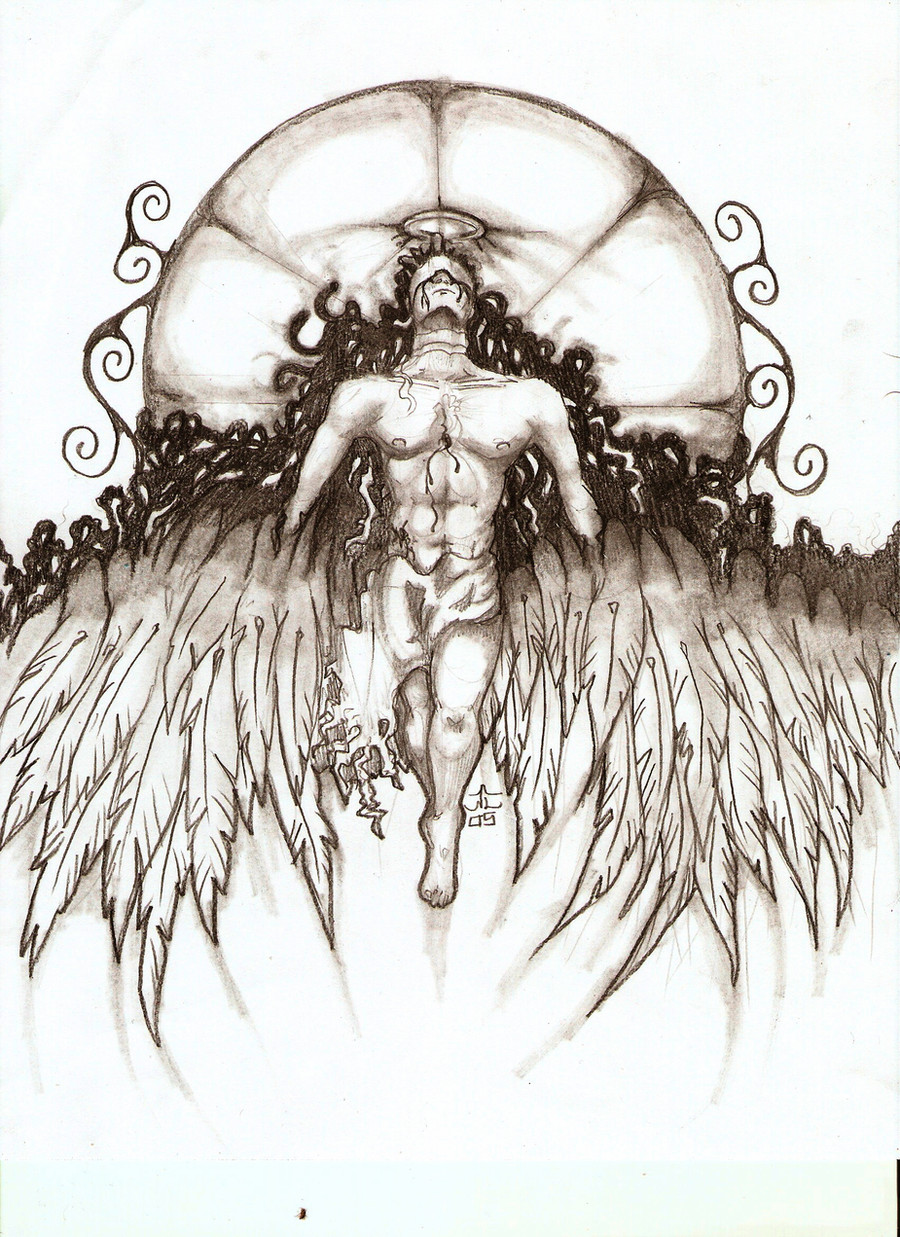
Done utterly with a 0.2 felt tip pen on A4 paper. I did this picture for almost all of yesterday, quite on and off, and for once I liked what I saw when I looked at the following morning") I feel good about finishing this.
I feel good about finishing this. This is my character Evan -- again with wings. I find him far more interesting to draw with his wings, but then who wouldn't?
")
I'm aware that he's left of centre. That's just how I drew it on the paper but I think the wings balance the composition. In case you're wondering, the techniques for shading were hatching and cross-hatching. In some places, up to five directions of lines crossed at the same point, resulting in the very shadowed and textured areas you see. Please FULL VIEW for detail!
Edit: Those are clouds, mountains, and pine trees
Related content


Comments: 149

I use Artline 0.2s or 0.4s from the newsagency. They're a few dollars each. Just don't press too hard with them and they'll last ages.
👍: 0 ⏩: 1

well iam from wales so i suposes u mean magazine cause thats wot newagency r so thanks 4 the help but i dont think i can get that newsagency
👍: 0 ⏩: 0

nice drawing man!
--------------
u get better and better
👍: 0 ⏩: 1
I don't see how I can get worse :3
👍: 0 ⏩: 0


Did you do a base sketch or just immediately go pen to paper?
👍: 0 ⏩: 1
There was a base sketch. I never dive in with a pen. Too risky D:
👍: 0 ⏩: 1

PEN?! Wow, that's amazing! I usually mess things up in my pics when I try and do things like that... -_-;
👍: 0 ⏩: 1
I messed a few bits up. I just hid it real quiet-like :3
👍: 0 ⏩: 1
Well, good job at hiding it... I guess I'll just have to see if I can spot it!

👍: 0 ⏩: 1

👍: 0 ⏩: 0

Haha...the Morning After test for artwork...how many times I've failed it...
The inkwork looks really cool, especially on the clouds....the clouds are awesome.
👍: 0 ⏩: 1
They're so simple, too. Thanks :3
👍: 0 ⏩: 0

JOSHIEEEEE YOUR INSANE O_O THATS SO CRAPPIN GOOD ITS NOT EVEN

👍: 0 ⏩: 1
Umm. Thanks? We all knew I am insane.
👍: 0 ⏩: 0


wow...Awesome mate 
Nice drawing as allways

👍: 0 ⏩: 1
It's surprising how balanced winged things are
👍: 0 ⏩: 1

wa ~ absolutely amazing. i really liked looking in full view because i could see, in great detail, your strokes. his wings are WOW!
👍: 0 ⏩: 1

Virtuous by *treijim
I was asked by ~InfinatelyWiseOne to give a critique, and so I shall. Any berating is to be directed towards them.
First, I'd like to say that the fact that you've decided to go left to the center rather than center was a very good move for this piece. It gives the entire picture a bit more interest than just being blandly in the middle. It is a recognized technique used by many artists everywhere.
Now, as this piece has a comic book sort of feel with a cross into early forms of anime (specifically with the rounded features of the face and the lighting), I was first impressed by the anatomy of your figure. Its practically correct, which isn't something you see every day in this sort of artwork. The wrinkles in the cloth are very fluid and lifelike, although I would have suggested adding in darker shading into the back to distinguish the shadows. This is most apparent in the cape/cowel. I like the variety of cross hatching you've given to show various values, however the darkest areas are just barely differentiated compared to the midtones.
The wings are spectacular and probably took quite a bit of time to draw. The only concern with them is the connecting point to the back, for it appears that they almost come out right above the shoulder blades. Usually you find wings a bit lower than this for stability issues, however this is just a technical issue for a non-existant physical principal.
I am enamoured with the clouds in the background, they have a wonderful form and shape to them. The mountains and the forest beneath being minimalistic almost in comparison really brings them out.
The only thing I'd change here besides the shadows is the lightsource to the sky. I know having the white gives you a great contrast to work with so your wings stand out, however the sky itself would have some sort of tone to it the further it was from the sun. As you're using pen though, leaving it like it is would probably be the most beneficial to leave it like it is. This is just a suggestion for any new work you may do in the future.
Overall you've done quite a good job with a cross hatching piece. I would suggest doing more work from life drawings in this media so you may further enhance your textural skills with crosshatching.
👍: 0 ⏩: 2
Thanking you awesomely for such a technically deep response
My style is anime, but then it isn't. I greatly despise most generic forms of anime and try to make my style more realistic. I am usually offended when people call my work flat-out anime, so thank you for being more specific. Correct anatomy isn't something I do every day. I'm grateful for being able to do it this time.
The wings were surprisingly easy. Because their edges needed less definition than the boy -- being soft and freely moving -- I was free to almost scribble them in, but it still looks all right as a result. The connecting point back was meant to be off. If you read my artist comments carefully, I hinted that he normally doesn't have them. It's a secret as to why  (Wink)")
The clouds I do like. I have a knack for drawing clouds, though. I draw them as often as I can, but this was my first time doing two-tone clouds. I despise the forest, but you get that
I know what you mean with the sky. However, I had taken so many risks in this image, I didn't want to start doing a sky and then find out it sucks afterwards. Maybe in the future though. Thanks again

👍: 0 ⏩: 1
Yeah, there is anime, and there is manga. Anime is a blanket term for japanese style animation, which runs the gambit, while manga is the type you see all over deviantART. I can see having a problem with being given the generic term, as it would make you seem less of an artist and more of a fan-artist.
Ah, that would explain the wings. And no worries about the sky, all art is a learning process in one form or another.
👍: 0 ⏩: 0
And yes, I repeated myself in there, but its 5:30am. Apologies.
👍: 0 ⏩: 0


Np... And yes, for me thay are purrrfect X)
👍: 0 ⏩: 0

Farout, the time spent on this proved worth it mate! 
I think its good that he's off centre. Rule of thirds, never have focal point in picture...my Dad just got through telling me that again, because I never listen
Keep up the fantastic, amazing work!

👍: 0 ⏩: 1
Thank you ^_^ I do want him to be off centre. Just not to the left >_> Oh well, thanks again
👍: 0 ⏩: 0

wow. I really love all the little details on the wings.
(having drawn wings recently... I know those took a great while)
👍: 0 ⏩: 1

| Next =>