HOME | DD
 tropicity — deep, deep, deeper...

Published: 2006-05-08 09:39:08 +0000 UTC; Views: 666; Favourites: 16; Downloads: 51
Redirect to original
Description
let's get lost again (Wink)")
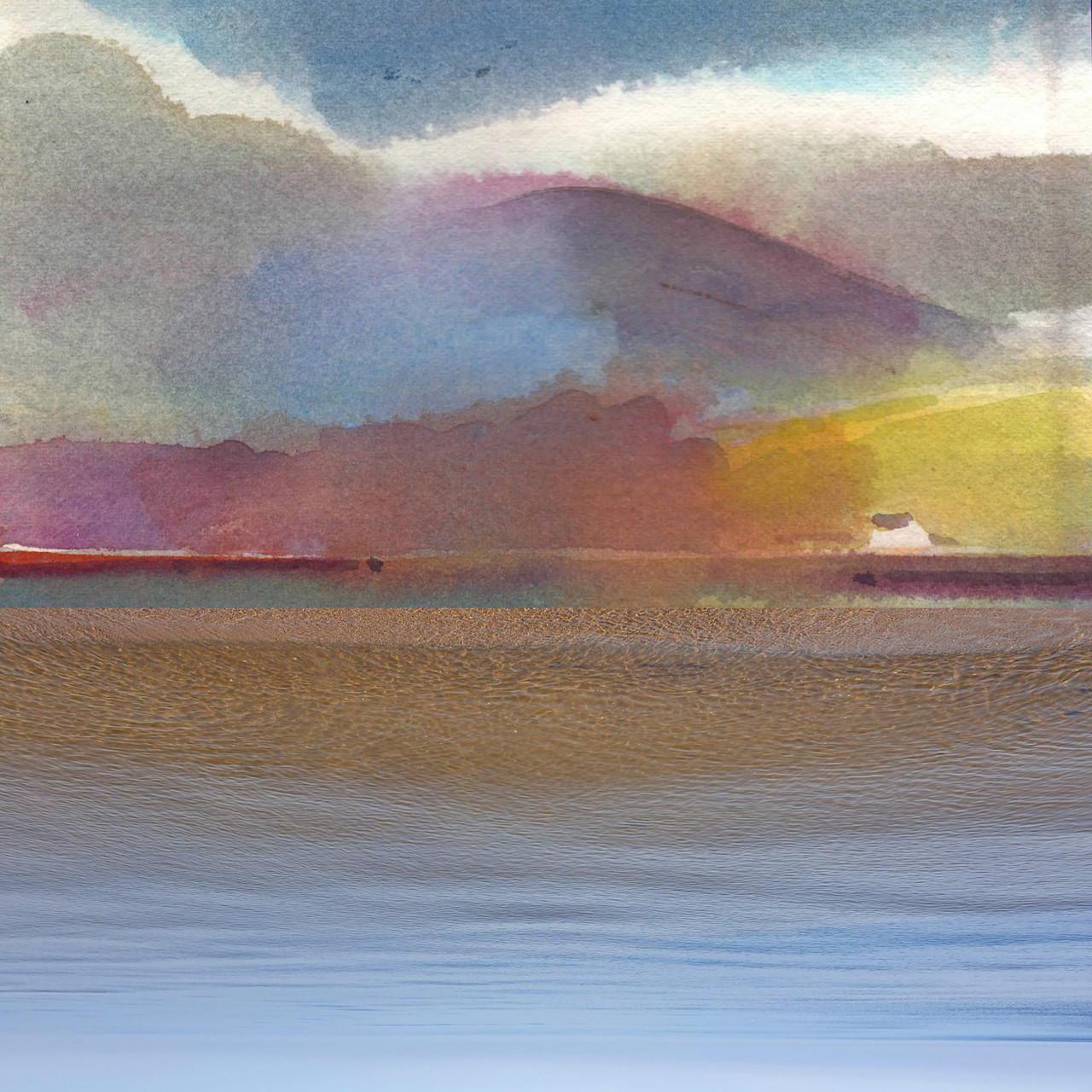
(acrylic)
Related content


Comments: 20


 (Smile)")

Ooohh.. it's.. ohh.
*incoherence continues*
👍: 0 ⏩: 0

Love the soft hues in this... they compliment each other well...
👍: 0 ⏩: 0

This image is so sexy. I love the strong contrasts, its like sinking within yourself, and when you think you have hit the bottom you realise you have found the light and beauty. Frequently in finding ourselves we find the freedom, we find out that there is nothing else but us, and honesty towards ourselves.
👍: 0 ⏩: 0

there is a beautiful depth in this piece nice job!
👍: 0 ⏩: 0

Hey! I love the depth! Open to so many interpretations. I feel I am getting lost either in a maze of arched pillars or bamboo trees! Cool!
👍: 0 ⏩: 0


Not the usual palette of colours that you use, so its quite interesting to see~
I can never get past the fact that skyscrapers keep flashing up in front of my eyes when I see you paint like this - some sort of memory I guess from places I've been to.
Thanks for sharing!
I've been waiting!
(not meant to rhyme 
👍: 0 ⏩: 0

I love that green color and how it stands out against the darker background
")
👍: 0 ⏩: 0


Really nice use of contrasting colors - the white blended with the green provides an eerie, ghostly mood on top of the murky darkness. The blue and the yellow ochre lend a life-like flicker to the green. The flesh-tone coral really sets the picture off, and draws the eyes in many different directions.
As I look at the painting, I am also wondering - what size is this? How did you capture the vibrant colors? Was this piece scanned? Photographed? Was there any manipulation to restore the colors to what you are actually seeing?
Great work!
Kirk
👍: 0 ⏩: 1

This one is a 9 x 12 in. piece on canvas board. I photographed it under natural sunlight (late afternoon), as it gives good results in terms of vibrancy. No manips... just resized it and added the border.
Thanks so much, Kirk. I truly appreciate your kind words.
👍: 0 ⏩: 2

That is such a cool idea.
(photographing your painting in the sunlight.)
I wish to paint, and when i do, if i display them on the net - I think i may try that out!
👍: 0 ⏩: 0

This is my fav of the bunch I think its the light on dark I like, and the way you smuged all the colors. I could look at it all day.

👍: 0 ⏩: 1
I've never tried this color combination before. Glad you like the result! Thanks so much, Nicole!

👍: 0 ⏩: 0

under the sea! under the sea! there are so many things to see under the sea!
:lovely:

👍: 0 ⏩: 1