HOME | DD

tul — dc interface me contest

Published: 2006-11-23 21:17:47 +0000 UTC; Views: 3841; Favourites: 17; Downloads: 108
Redirect to original
Description 
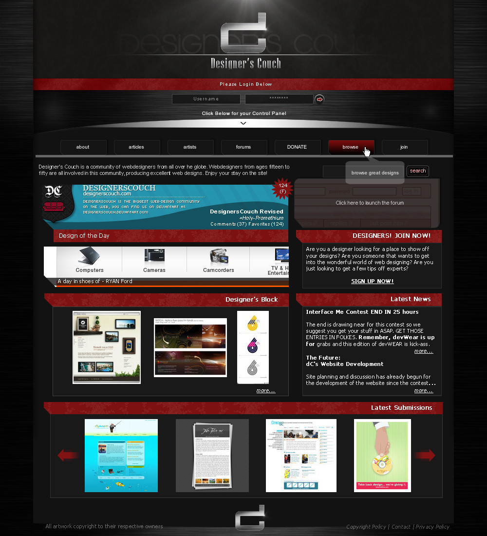
Okay, I don't expet to win with this, but here is the submission for *designerscouch 's interface me contest, ending today.
Started this two days ago, finished this today. Something new, hope you like it
Related content
Comments: 25

myemotiveemotion [2007-01-14 06:41:29 +0000 UTC]

would you be intrested for wroking for a media company? [link] ?

👍: 0 ⏩: 0

fREDp [2006-11-30 15:32:39 +0000 UTC]

I get a headake from looking at that couch.

👍: 0 ⏩: 1

tul In reply to fREDp [2006-11-30 20:13:23 +0000 UTC]

too bad there's no couch in it

👍: 0 ⏩: 0

NDroid [2006-11-26 15:18:37 +0000 UTC]

looks great man.

👍: 0 ⏩: 1

tul In reply to NDroid [2006-11-26 16:04:00 +0000 UTC]

sweet thanks

👍: 0 ⏩: 1

NDroid In reply to tul [2006-11-26 16:16:27 +0000 UTC]

np

👍: 0 ⏩: 0

AsKiller [2006-11-26 01:12:03 +0000 UTC]

nice wood style =], and the couch logo hehe pretty cool but i had to read your comment to figure it out =]

👍: 0 ⏩: 1

tul In reply to AsKiller [2006-11-26 01:51:14 +0000 UTC]

I was actually thinking of adding two near the bottom (cross legged, sort of). I was also thinking of actually adding a silhouette of someone sitting in it. Whatdya think?

👍: 0 ⏩: 1

AsKiller In reply to tul [2006-11-26 12:33:49 +0000 UTC]

yeah it might make it more as a couch =]

👍: 0 ⏩: 0

csjwcr [2006-11-25 14:25:43 +0000 UTC]

best submission so far imo. great job!

👍: 0 ⏩: 1

tul In reply to csjwcr [2006-11-25 15:53:21 +0000 UTC]

Wow thanks

👍: 0 ⏩: 0

Dagorath [2006-11-25 14:09:40 +0000 UTC]

Very nice....like the top area and the deviation areas especially.

👍: 0 ⏩: 1

tul In reply to Dagorath [2006-11-25 15:53:22 +0000 UTC]

thanks

👍: 0 ⏩: 0

chanaka [2006-11-24 10:04:56 +0000 UTC]

nice work

👍: 0 ⏩: 1

tul In reply to chanaka [2006-11-24 13:59:05 +0000 UTC]

thanks

👍: 0 ⏩: 0

perfectionality [2006-11-24 07:37:45 +0000 UTC]

Well...I like it in the sense that it's simple and effective. The colours are extremely well placed, as always...although I'd go for a little more complexity.

👍: 0 ⏩: 1

tul In reply to perfectionality [2006-11-24 13:58:52 +0000 UTC]

Yeah, its a little straight forward, thanks for the comment

👍: 0 ⏩: 1

perfectionality In reply to tul [2006-11-24 21:39:39 +0000 UTC]

Anytime.

👍: 0 ⏩: 0

depthskins [2006-11-24 02:56:22 +0000 UTC]

liking the logotype alot. That's really cool. It's a nice design. I think that you should focus some more on alignment of the type. Nice work tho

👍: 0 ⏩: 2

tul In reply to depthskins [2006-11-24 20:57:31 +0000 UTC]

Hope you noticed how the logo also looks like a couch

👍: 0 ⏩: 0

tul In reply to depthskins [2006-11-24 13:53:24 +0000 UTC]

WHat do you mean alignment of the type
Thanks

👍: 0 ⏩: 0

deanhydeist [2006-11-24 02:22:22 +0000 UTC]

nice design...hope u win that contest..

👍: 0 ⏩: 1

tul In reply to deanhydeist [2006-11-24 13:55:02 +0000 UTC]

probably not, but thanks anyway

👍: 0 ⏩: 0

Skyrail [2006-11-23 21:22:52 +0000 UTC]

I r teh awesome...oh wait, IT r teh awesome

👍: 0 ⏩: 1

tul In reply to Skyrail [2006-11-23 21:26:48 +0000 UTC]

XD thanks

👍: 0 ⏩: 0