HOME | DD

TurquoiseHexagonSun — Trouble in the Message Centre

Published: 2006-02-17 18:33:43 +0000 UTC; Views: 2516; Favourites: 86; Downloads: 173
Redirect to original
Description 
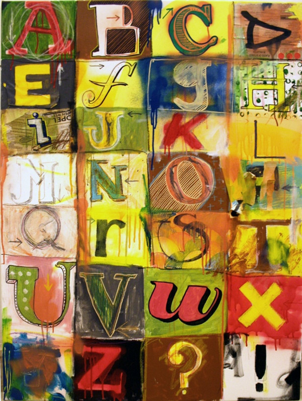
the most explicitly typo based stuff i've done to date.. on canvas 90x70cm
Related content
Comments: 81

TurquoiseHexagonSun In reply to ??? [2006-11-11 18:29:15 +0000 UTC]

thankx for the faves missus!

👍: 0 ⏩: 0

Jazzmuzak1212 [2006-08-30 16:54:46 +0000 UTC]

i love it... its awesome

👍: 0 ⏩: 0

SiddyGirl [2006-08-25 11:45:33 +0000 UTC]

So great it makes me droooL

👍: 0 ⏩: 0

Egostar [2006-08-22 20:07:17 +0000 UTC]

fuck thats brilliant
excuse me
deserved profanity

really really awesome

👍: 0 ⏩: 1

TurquoiseHexagonSun In reply to Egostar [2006-08-22 20:46:19 +0000 UTC]

bahaha.. you cracked me up man.. i was reading your comments like 'very nice' then another 'very nice' then 'FUCK THAT"S BRILLIANT!'

well thankx! profanity is the best way to express yourself

👍: 0 ⏩: 1

Egostar In reply to TurquoiseHexagonSun [2006-08-23 09:09:13 +0000 UTC]

and that is totally what it was like, i was flabagasted like pulled to the edge of my seat
brilliant
i love it


btw animal collective are great

👍: 0 ⏩: 1

TurquoiseHexagonSun In reply to Egostar [2006-08-23 09:11:26 +0000 UTC]

animal collective are so wow

👍: 0 ⏩: 1

Egostar In reply to TurquoiseHexagonSun [2006-08-23 09:20:46 +0000 UTC]

i hope to see them at reading festival

but they may be on at the same time as pearl jam... in which case i shall explode

👍: 0 ⏩: 1

TurquoiseHexagonSun In reply to Egostar [2006-08-23 09:47:37 +0000 UTC]

in which case i'd obviously go see the animal collective.
pearl jam are way past their prime.
you lucky bastard! sorry!

👍: 0 ⏩: 1

Egostar In reply to TurquoiseHexagonSun [2006-08-23 11:15:12 +0000 UTC]

well you may be right, but if you've waited since childhood to see them then theres a different kind of value to it all. so i must go, but i shall hunt them down prior i hope
oh i hope they aren't on at the same time...
for all our sakes

👍: 0 ⏩: 1

TurquoiseHexagonSun In reply to Egostar [2006-08-23 11:32:17 +0000 UTC]

we can only hope so !

👍: 0 ⏩: 0

Duffzilla [2006-08-07 15:10:03 +0000 UTC]

Delicious. I love this. Such a brilliant mess.

👍: 0 ⏩: 0

castitas [2006-07-13 03:28:27 +0000 UTC]

oh how I love type
this is great!

👍: 0 ⏩: 1

TurquoiseHexagonSun In reply to castitas [2006-07-13 10:29:05 +0000 UTC]

👍: 0 ⏩: 0

FLCLaddict [2006-07-06 01:07:41 +0000 UTC]

i love the excessive use of yellow. very lemony lol jk

👍: 0 ⏩: 0

gen-eva [2006-07-05 18:54:12 +0000 UTC]

mm the H looks familiar or maybe not

geneva

👍: 0 ⏩: 1

TurquoiseHexagonSun In reply to gen-eva [2006-07-05 21:22:17 +0000 UTC]


shhhh tghid lil hadd..!

👍: 0 ⏩: 1

gen-eva In reply to TurquoiseHexagonSun [2006-07-06 22:54:24 +0000 UTC]

xma nghidx?

👍: 0 ⏩: 0

Couk [2006-06-30 14:22:21 +0000 UTC]

sweet variety... the only ones that let it down to me are P and Y, the other letters are so bold and those two aint. doesnt spoil the piece at all though.

👍: 0 ⏩: 1

TurquoiseHexagonSun In reply to Couk [2006-06-30 15:42:05 +0000 UTC]

thankx yeh they do suck abit don;'t they?: altough i think my least fave letter would be the 'h'. it looks like boxer short textures or something.

👍: 0 ⏩: 0

chiarallit [2006-05-22 06:30:03 +0000 UTC]

beautiful, this is stunning, you know how to put colours nect to eachother, PERFECTLY.....

👍: 0 ⏩: 1

TurquoiseHexagonSun In reply to chiarallit [2006-05-22 09:53:05 +0000 UTC]

thankies

👍: 0 ⏩: 0

AlexWarble [2006-04-26 16:05:12 +0000 UTC]

this is amazing!!!!
that U is the best

👍: 0 ⏩: 1

TurquoiseHexagonSun In reply to AlexWarble [2006-04-26 16:52:22 +0000 UTC]

wow thankx man!

👍: 0 ⏩: 0

truemarmalade [2006-04-21 15:57:01 +0000 UTC]

I see a lot of typography type work since I like with 2 graphic designers, and as random and messy as this piece is; I love it and they thought it was pretty rad as well.

👍: 0 ⏩: 1

TurquoiseHexagonSun In reply to truemarmalade [2006-04-21 16:40:37 +0000 UTC]

ah thankx man (and your colleagues) for the fave and comment

👍: 0 ⏩: 0

popartmonkey [2006-04-06 03:40:53 +0000 UTC]

Great work!

👍: 0 ⏩: 1

TurquoiseHexagonSun In reply to popartmonkey [2006-04-06 07:26:24 +0000 UTC]

👍: 0 ⏩: 0

aer704 [2006-03-21 13:59:23 +0000 UTC]

b is for blur
and p is for parklife!

👍: 0 ⏩: 1

TurquoiseHexagonSun In reply to aer704 [2006-03-28 13:29:12 +0000 UTC]

and t is for....?!?

👍: 0 ⏩: 1

aer704 In reply to TurquoiseHexagonSun [2006-03-30 10:20:07 +0000 UTC]

t is for turquoisehexagon!

👍: 0 ⏩: 1

TurquoiseHexagonSun In reply to aer704 [2006-03-30 10:20:47 +0000 UTC]

👍: 0 ⏩: 0

verunicastar [2006-03-09 15:26:41 +0000 UTC]

i love your style.

👍: 0 ⏩: 1

TurquoiseHexagonSun In reply to verunicastar [2006-03-28 13:35:40 +0000 UTC]

👍: 0 ⏩: 0

the-Px-corporation [2006-02-24 02:36:18 +0000 UTC]

nice one again. i really like the x. there is a similar one on the silkscreen emulsion (probably meaning don't drink this it's bad for you)

👍: 0 ⏩: 1

TurquoiseHexagonSun In reply to the-Px-corporation [2006-02-24 08:05:15 +0000 UTC]

yup yup.. it means dangerous/poisonous etc etc

👍: 0 ⏩: 0

schlockhausen [2006-02-24 02:19:10 +0000 UTC]

cool one steve! each letter is like one little painting within the painting. and all the little paintings are good!
as is the big painting too, baby!

👍: 0 ⏩: 1

TurquoiseHexagonSun In reply to schlockhausen [2006-02-24 08:07:51 +0000 UTC]

yesir!! thank you schlocksman.. !!!!

👍: 0 ⏩: 0

maladie [2006-02-22 20:58:31 +0000 UTC]

great job!

👍: 0 ⏩: 0

punkrockDAN [2006-02-21 07:37:20 +0000 UTC]

I didn't get a chance to comment on this before I ran off to work,
But the typefaces and colors in this are SO nice. This is for sure my favorite work in your gallery.
Its got like the perfect amout of "grundginess" without going overboard.
If I were a man with money I would want this hanging in my office real bad.

Take care buddy

-Dan

👍: 0 ⏩: 1

TurquoiseHexagonSun In reply to punkrockDAN [2006-02-21 11:14:12 +0000 UTC]

wow i'm flattered man heh.. coz i really like your work too.. it's pretty fresh vector stuff without falling into the vector cliche. keep it up..! thankx

👍: 0 ⏩: 0

ikhon [2006-02-20 14:14:08 +0000 UTC]

thats the bestlooking 'b' in all of creation.

👍: 0 ⏩: 1

TurquoiseHexagonSun In reply to ikhon [2006-02-20 16:25:09 +0000 UTC]

👍: 0 ⏩: 0

dontdeletemyfrog [2006-02-20 11:21:51 +0000 UTC]

ohhh wow thats so fly!

👍: 0 ⏩: 1

TurquoiseHexagonSun In reply to dontdeletemyfrog [2006-02-20 11:24:22 +0000 UTC]

bzzzzzz.. thankx!

👍: 0 ⏩: 0

disintegration86 [2006-02-19 13:02:41 +0000 UTC]

tal- Host kemm kuluri imma qaxxartli ghajnejja!

👍: 0 ⏩: 0

juffycake [2006-02-19 12:07:34 +0000 UTC]

woow!! I love it nimmagina mdendla fil-kamra tieghi

👍: 0 ⏩: 0

mr-boonshine [2006-02-19 00:14:35 +0000 UTC]

now i know my abc next time won't you sing with me.

👍: 0 ⏩: 0

chocolatechopstick [2006-02-18 17:43:43 +0000 UTC]

i thought you are so cool typoman
especially like -I-...thanx man for an idea

👍: 0 ⏩: 1

TurquoiseHexagonSun In reply to chocolatechopstick [2006-02-18 21:02:43 +0000 UTC]

hihi.. typoman makes me laugh..

👍: 0 ⏩: 1


| Next =>