HOME | DD
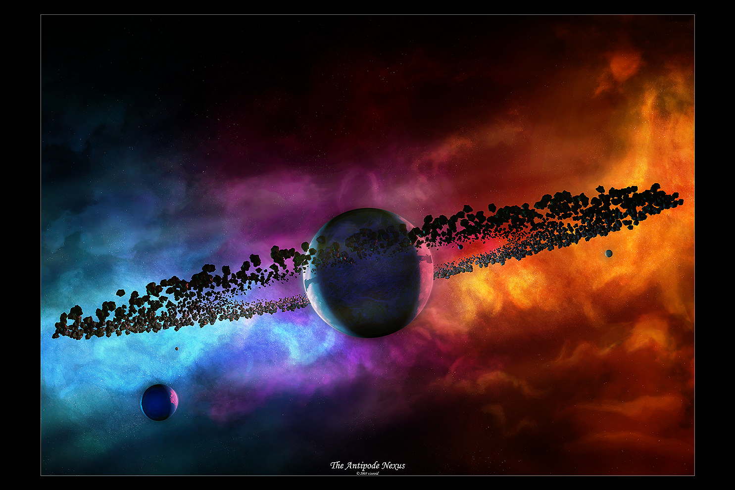
 vissroid — The Antipode Nexus
Published: 2005-04-12 11:39:33 +0000 UTC; Views: 4941; Favourites: 72; Downloads: 1010
Redirect to original
Description
Name says it all...hehe...I love comin up with names that fit the image(even if they might not make much sence to anyone)But anyway this is my hard work at 3DS max and PSCS
The moons, planet and Asteroid rings were made in Max while the rest was in PSCS
I tried really hard not to make bold lines on the starscape in the background and yet i was not in the mood to make a Neb' so I was inspired by Greg martins idea of a great spacescape with colors gases and such that doesnt show in a simple small Neb' in the background...I might add also not to whine about the stars in some areas...i was tryin for clusters on where stars are made from(which are very dense)
But I hope you likes because of the extreme time I put into this piece had made me lose count of the hours and layers(the .PSD was over 200MBs)
NOTE(!): Alot of this was tests but I loved how it came out
Enjoy
Related content


Comments: 77

o.O Hmmmm yeps yeps I likes it hehe ^_^ 
👍: 0 ⏩: 1

Amazing.. looks so real.
And I love the sharpness of whole pic !
👍: 0 ⏩: 1

ThanX
I was hopin it was good enough
👍: 0 ⏩: 0

omg I know noting of 3D comp art but I finally have a critique for you:
I think the shadow the ring is casting on the planet is too sharp. It should be fuzzier because it is on atmosphere/clouds.
👍: 0 ⏩: 1
yeah Im still learning on how the hell to fix that...lmao
But I decided I was happy with it
👍: 0 ⏩: 0

You really don't get the feel for it unless you full view it. It's absolutely beautiful

👍: 0 ⏩: 1

looks great man!
but something bugs me.
why dont u use a better font? the one u used kinda looks pixel-ish.
👍: 0 ⏩: 1
I just wanted to use something dif' from what I was always usin...
but hey no matter what font I use someone doesnt like it...
no matter...lol
👍: 0 ⏩: 1

WooW ")
Look very Good , I love the colours ")
👍: 0 ⏩: 0


Hey! Very nice man! Love the coloured nebula cloud thing!
👍: 0 ⏩: 0

It's a lovely image. I'm curious though, is it difficult / possible to make the planets / satelites look less smooth? Maybe via bump mapping or something. I dunno, they just look a bit surreal at the moment 
Of course I'm just looking for things to pick on when I really like this myself
👍: 0 ⏩: 1
lol...tis k...thats why I have the critique welcomed
actually some how(which I have yet to figure out) is when your quite far away from textures in Max I cant seem to keep the bump mappin visible very well and thus ends up smooth...plus the image here gives no justice to the planets actually
In the 4500 x 3000 the bumpmappin shows up quite well but still too light if you ask me
and for the background...well...its not a sunset at all thats for sure...this is a simple thing to answer:
In the name Antipode: "the parts of the earth diametrically opposite -- usually used in plural; often used of Australia and New Zealand" or in a thesaurus of the word just comes out as opposite and the major meaning(which is where the red vs blue comes in and the colors bein on opposit sides of the planet)
and Nexus: Center, OR link
which is where the colors link to eachother..I just simply went with a purple which would show the colors in-between themselfs of the opposites
Hope that help and yet may have made no sence at all...lmao
👍: 0 ⏩: 2

with the bump mapping, ( I take it you're using 3Dsmax, with atleast some knowledge of how things work  (Wink)")
 (Smile)")
Also what you can do, is using the same image you did for the bumpmap, add it to 'displace' in the 'maps' section of your material, this will further add to your bump, by slightly editing the mesh itself.
There are also a few plugins you can get which make bump-maps more defined, uhh... try looking for FinalRender somewhere, Im' pretty sure there's some free copies lying around.
I'm writing this from school, so don't come after me if I messed up some of my writing
👍: 0 ⏩: 1
lmao...you did fine
I'll have to try that next time...and look for the plugin if I can find it
👍: 0 ⏩: 1

What I was talking about wasn't the sunset itself but the way the blue and red blent into purple midway through the picture really
I was mostly just curious why you picked purple that's all, which would only occur from some weird phenomonon... that's my science noodle being picking ")
Godo work anyway
👍: 0 ⏩: 1
lol...well I dont go by the colors of the sunset mainly because thats settin it in the atmosphere of earth...other planets would be dif' because of there colors in the At'
So I simply went by red and bluse mixed makes purple...thus why I used the color
like if I was using blue and yellow...the center would be green...lol
👍: 0 ⏩: 1
As I was trying to explain - mixing lights together doesn't have the same effect as mixing different paint. E.g. shine a blue spot light on the table, and shine a red on the same spot, you don't get purple. It doesn't occur naturally. The only way you can get purple light, is if you use a blue filter and a red filter on top of one another, and shine a light through it.
That's what I was getting at. Sunrise and sunset were just examples of how light mix together in nature. Blue and yellow light mixed together won't give green; blue and yellow paint on the other hand can get green.
Doesn't matter anyway, but this was GCSE physic material I remembered, and being a photographer I learnt a bit about the effects of lights as well
👍: 0 ⏩: 1
cool...well I was just more after the whole thing of oposites and I wanted them to meld than show another color...lol
👍: 0 ⏩: 0


<= Prev |