HOME | DD
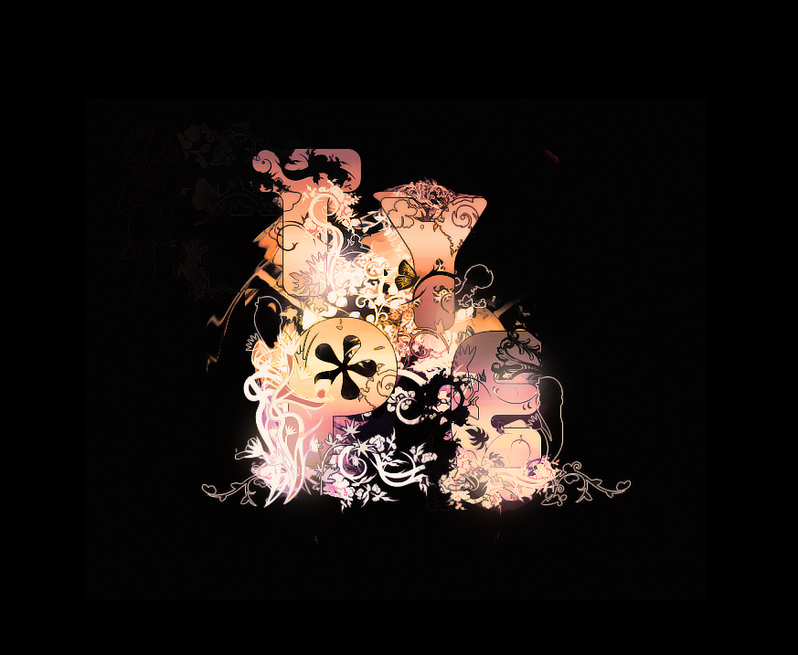
 Volture — Typography
Published: 2007-05-05 01:50:40 +0000 UTC; Views: 11812; Favourites: 166; Downloads: 554
Redirect to original
Description
I practiced some Typography today. (Wink)")
Edit: I made the Type font and effects around it a bit bigger, and cropped the outside.
 (Smile)")
Related content


Comments: 105

")


i love this., i just think u should have stroked it in a diff color so the font itself stands out more.. its blending in too much. idk i like it tho. its nice
👍: 0 ⏩: 0

This is definitely good,lots of detail..but there's somthing...doesn't feel right(maybe its just me),the base is broad with the P and E but the hollow between them is disturbing,kinda distracts you...otherwise,very well rounded up piece!

👍: 0 ⏩: 0

congradulations you have been featured here -> [link]
👍: 0 ⏩: 0


Really a wonderful typo/graphism, i love it and enjoy watching it !!
But were did you learn illustrator ?
Bye
👍: 0 ⏩: 0


It looks way better now that you've cropped it.
👍: 0 ⏩: 0

wow this is amazing, great colors and style.
awesome work.
👍: 0 ⏩: 0


As I said I just used it as inspiration, can you not read bro?
👍: 0 ⏩: 0
How did I rip it? I just used it as inspiration.
👍: 0 ⏩: 0


This is cotton candy-like goodness. This could definitely be screen-printed on a tote bag.
👍: 0 ⏩: 0


Wow, the coloring is fantastic! It's a very beautiful concept.
👍: 0 ⏩: 0


this is my fav in ur gallery its so neat
")
neat is such a neat word
anyway i like this 1 best
im such a knob
omg its starting again run away
👍: 0 ⏩: 0


How cool!
how do i get you to do something like that for me?!
👍: 0 ⏩: 0


Wow. I really like a lot of things about this image... The placement of the design, the dark background, the gradients, the "glowing" effect, the ghosted design in the background... Neat!
👍: 0 ⏩: 0

Very beautiful! i love the deatils of it. and the simple colors!
👍: 0 ⏩: 0

Well I'd say you did a very good job
and I surely wouldn't mind you possibly
sending on some tips on how to do this.
I think you should have written "love"
instead of type because that's boring.
Great job on the surrounding details
and the correlating colors though.
x Kia Lola x
👍: 0 ⏩: 0


great typography! I love the natural and magical feel to it ^^ excellent work <3
👍: 0 ⏩: 0


| Next =>