HOME | DD
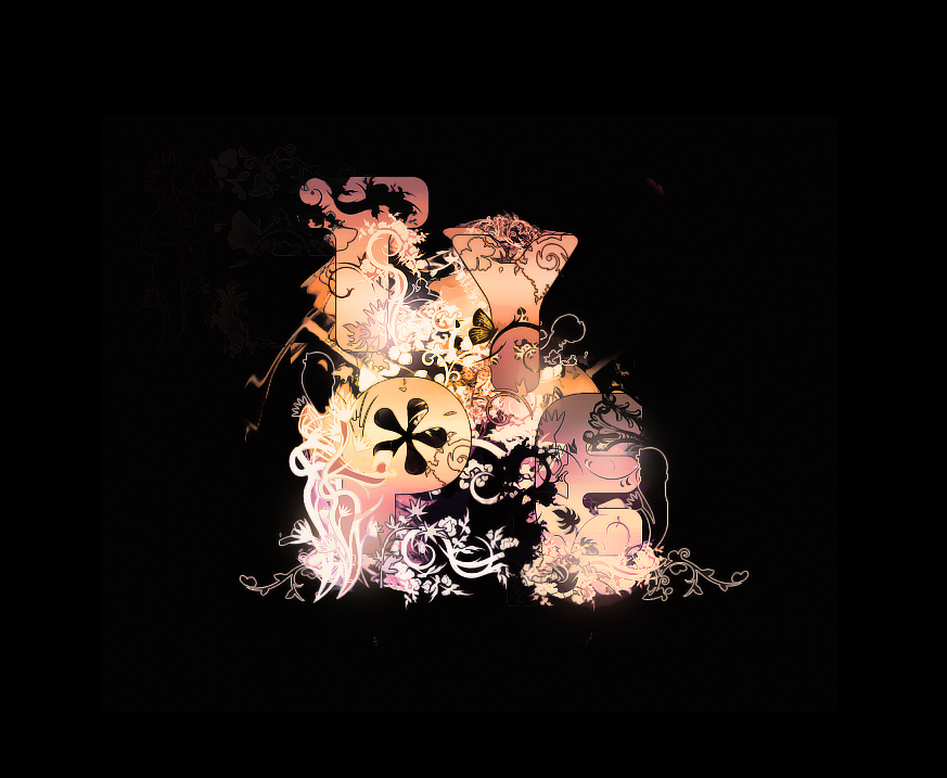
 Volture — Typography
Published: 2007-05-05 01:50:40 +0000 UTC; Views: 11814; Favourites: 166; Downloads: 554
Redirect to original
Description
I practiced some Typography today. (Wink)")
Edit: I made the Type font and effects around it a bit bigger, and cropped the outside.
 (Smile)")
Related content


Comments: 105


wow, the way it blend with each other looks very interesting
👍: 0 ⏩: 0

Looks nice. 👍: 0 ⏩: 0
I'd just lessen the black negative space


Really great job, even though I had to look twice before I saw the letters. Incredible colours and great style!
👍: 0 ⏩: 1

Lol, ya sorry about that! Thanks for the comment though!
👍: 0 ⏩: 0

I like where you've placed this in the image
👍: 0 ⏩: 1

Great funky 70's abstract piece. But not abstract enough for me!
Forget about the letters and go for the full frame!

👍: 0 ⏩: 1


I can see the lines where you made this on a square canvas and then just moved it to a bigger one. Might wanna clean that up
Nice work.
👍: 0 ⏩: 1
Oh crap, dang you bright monitors! lol My monitor is so much darker then everyone elses.
👍: 0 ⏩: 1
Lol, mines a Mac monitor so its brighter by default....
👍: 0 ⏩: 0


That looks amazing! It is the first time I really see something like this on dA. You've got a great style, and original work.
👍: 0 ⏩: 1
")

very nice. the darkness makes it much more appealing. I love the colors.
👍: 0 ⏩: 0


i like the negative space
and that is some fancy fancy lettering.
👍: 0 ⏩: 0

Nice use of light, it's a little over the top... to the point where it's slightly unrecgonizable... so it doesn't function well. But's it's tres dandy design wise.
👍: 0 ⏩: 1
Thanks! I agree with ya here man!
Well off to bed.
")
👍: 0 ⏩: 1


Awesome stuff bro, lovely illustrative effects
👍: 0 ⏩: 0


Great piece, very different and a nice blend of colors
👍: 0 ⏩: 0


Looks fantastic, it looks like it could use a little less black space.
👍: 0 ⏩: 0

such lovely llines, it'll make a very beautiful desktop! i ecspecially like all of the autumn colors you use!
👍: 0 ⏩: 1
Thanks! Very much appreciate the comment!
👍: 0 ⏩: 0

Really really nice
👍: 0 ⏩: 0

Not bad man i like what you did although I only wonder if you made all those details or if they are brushes. For background black isn't what I would of done, just a tad too much contrast And lastly, you over sharpened it a tiny little bit and didnt erase some areas, so you have random dots
sorry for the big crit :S
👍: 0 ⏩: 1
Thanks! It's aight I appreciate it. I didn't brush the flowers and such on.
👍: 0 ⏩: 1

b/g is too black but the text could be more readable but still n/j overall
👍: 0 ⏩: 0


Very nicely done. Love the color and shapes.
👍: 0 ⏩: 0

really pretty... incredibly original, it's awesome.
👍: 0 ⏩: 0

that's really quite interesting...i love the colors!!
👍: 0 ⏩: 0

Beautiful work. I love how the text just seems to glow. Nice details in it, too.
👍: 0 ⏩: 0
| Next =>