HOME | DD
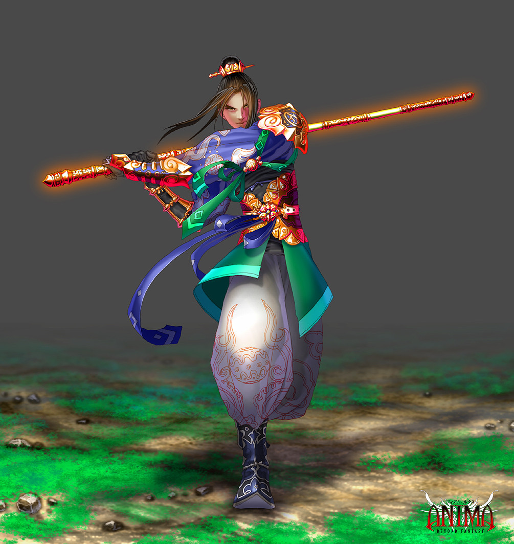
 Wen-M — Anima: Jiang
Published: 2007-10-11 21:24:02 +0000 UTC; Views: 131925; Favourites: 3951; Downloads: 3493
Redirect to original
Description
was done a while ago.=]
I liked the gold on this, but now i think it could have been done better, sigh...always, always...
Related content


Comments: 497

mm, many things, the stance is a bit off, for starters
👍: 0 ⏩: 1

I think it looks cool, but I can see where u might think it's off.
U'd have to have perfect balance to stay in that pose.
Wat else don't u like?

👍: 0 ⏩: 1
well, the lineart became shit after i downsized Y__Y
👍: 0 ⏩: 1
LOL!
The lines look a little blurry compared to ur usual pieces i noticed, but not unless you really know ur art i guess.
Why did u downsize?
👍: 0 ⏩: 1
to fit viewing online, i dont like my files too big
👍: 0 ⏩: 1
I understand. I do the same thing and It does such when u have to make the document smaller.

👍: 0 ⏩: 0

He really looks like he's goin to swing that at me.... *runs*
Awesome job, as always!
👍: 0 ⏩: 0


I like this! The pose is dynamic and the clothes look great! what software was used for this?
👍: 0 ⏩: 1

yes, always always. It still looks pretty cool though. You always make the prettiest patterns on fabrics. ah!
👍: 0 ⏩: 1

Very beautifully, but with such technics, it would be desirable for the character to make hardly more accurately. The color scale is pleasant

👍: 0 ⏩: 0

Let me just say that if I was making Anima into like a game or anime, I would so pay you a lot for your designs. (Note: Digital Media Major here!)
I like your use of color and design. Both the design on the metals and his clothing flow easily with each other accenting and whatnot. I also like how there is not too much of one color. No one color is dominating the whole scene. It’s all evenly put out to attract the whole eye to the actually figure and not just the color’s brightness/contrast. Love your designs and work. Keep it up. >D
👍: 0 ⏩: 1

I should be the one bowing to you
👍: 0 ⏩: 0


You never cease to amaze me with da details. ^^
I especially like the pose..one more step and someones noggin will be hurting quite badly.
Great expression too.
")
👍: 0 ⏩: 1
hehee, heard from Julica that you are always staying up late for school work? dont work too hard!
👍: 0 ⏩: 1
Sleep..wassat again??..uhh..
Not school, more like experience work..heh..i'll try to take it easy..thanks. ^^
So you and my sis are working together, huh? thats awesome. Good luck!
👍: 0 ⏩: 0

As a fashion design, this is very well done. The reflection of the metal that permeates the dark purple in the cloth adds to a higher degree of realism. Your colour schemes are slightly surrealistic but are brought back down to earth with the slightly duller tones of black and cool grey. The design itself on the other hand appears to take inspiration from Chinese architecture and statues.(Sorry if I'm being presumptuous, but after spending some time in China taking photos of their buildings, I can draw parallels to the designs here)
As a whole, the picture itself seems to be lacking in the background as though you intentionally left it as a grey space to accentuate on the design itself. This said, there is also a possibility that you intended for it to be a thick fog which is somewhat unlikely as there would be different gradients of the smoke and some of it would cover the figure itself.
One mar on the image itself though, would be the lineart. Although the colouring makes it next to unnoticeable, there are shaky lines in the image and while the thinness of the line makes the line next to invisible, it could possibly look better if there was some variation to the thickness of the line. Did you use a tablet to draw the lineart? That would explain the shaky lines though I don't usually expect to see that problem. Most people just use the pentool or for slackers like myself, ink it traditionally...though the lines are alot fatter than your own.
👍: 0 ⏩: 1
woa, thanks for the thorough comment.
I have used a few inspiration from the architecture decorations, yes!
the background is a multi used stock-style image. so yes, just for convenience.
the lineart is the most commented part of my art, and lately i have been trying to work around it. but all your points are true, thanks
👍: 0 ⏩: 0

Breathtaking. I love everything about this pic--the pose, the colors, the warmth of the gold...Just beautiful.
👍: 0 ⏩: 0

Mehhh! It is awesome but I don't like the combination of cool and warm color schemes.
Meh..
👍: 0 ⏩: 0


great coloring job. this is an awesome peice.
👍: 0 ⏩: 0


ooh the glow effect looks nice, and the grass looks like grass! its so hard to get it to look right even when pixeling it x3 love it!
👍: 0 ⏩: 0

my god you always amaze me! really beautiful!

👍: 0 ⏩: 0


Gah, trying to look at the full size always kills my comp! >_<
Love it Wen! Keep up the good work. I don't know what it is about it but it just seems so familiar!
👍: 0 ⏩: 1
lmao yeah, matches your cheesy grin.
But no. It actually looks very nice. I can't explain it but it has a feel of 'freindly familiarity' almost like a sight you've seen and really enjoyed. It calls attention but not in a way of *LOOK AT ME* it's more quiet about it
Hope I explained that well enough...
👍: 0 ⏩: 0

looks awesome! i love the detail you put in to your work
👍: 0 ⏩: 0

Once again, your attention to detail is amazing in your work. XD
👍: 0 ⏩: 0


<= Prev | | Next =>