HOME | DD
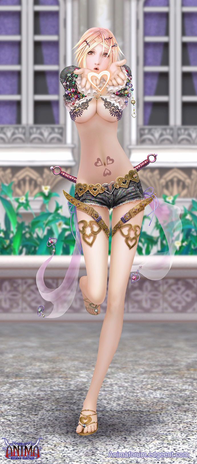
 Wen-M — Veronica revised
Published: 2008-12-05 19:22:19 +0000 UTC; Views: 15206; Favourites: 778; Downloads: 501
Redirect to original
Description
updated again, thanks for all your pointers =]on Jan-26-2009
A small gift to all who love Veronica.
revised with a BG too.
if you check this against the old one, you will see the differences =]
happy holidays.
Related content


Comments: 79

hmmm, i think its because back in the day i didnt want to re-post something already uploaded?
👍: 0 ⏩: 0


Incredible work as always. D: I kinda wish the background was a little less out of focus though, in the full view the blurriness gets really distracting. x_x
👍: 0 ⏩: 0

It reminds me of one of those stereotypical videogame designs made specifically to show lots of cleavage but with no real use in any other situation.
She has nice boobs. The rest seems a bit over done, or under cut. The background doesn't mesh very well with the drawing itself.
👍: 0 ⏩: 1
The torso is a bit over extended, her belly button is too high in comparison to her crotch, her fingers seem too fat when compared to her palm and her legs are really long and stringy.
The whole thing seems a bit over rendered.
I like your monsters much more to be frank.
👍: 0 ⏩: 0

Ok, this is going to deep, so take it or leave it. Your skills and attention to detail is wonderful! Your placement of that detail is confusing to me. The following are masterfully done: the knee, the dagger belts, the short-jeans, the boobage, the shirt, the hearts and fabric, the hair, and much more. But the stomach and midriff looks like it could be on South Park, because it blends in with her hip shape and is entirely 2D-in high contrast with the masterful work on the rest of her! I salute your craftsmanship, and I hope you will find this as an encouragement and an opportunity to further sharpen of your masterwork skills. I apologize if this is to rash (I really love this piece) and I hope you can benefit from my remarks.
👍: 0 ⏩: 0

very nice. You always do such a wonderful job with these.
👍: 0 ⏩: 0

Would I win a prize for spotting all of the differences?? Perhaps a prize involving candy??? 8D
👍: 0 ⏩: 0

Bloody hell I wish I looked like that.
I love the colours in this.
👍: 0 ⏩: 0


nice one...
any plans of working again with the sage girl and the fencer girl?
👍: 0 ⏩: 0

For a moment I thougth it was a photo, because of her skin.. it looks so smooth x3
👍: 0 ⏩: 0

i wish i could wear shorts like that!! happy holidays wen : )
👍: 0 ⏩: 0

Wen-M, I ADORE your stuff, it's gorgeous and the details are amazing. That said, I really, really don't like the way you draw girls.
The torso and legs are far too long, the boobs are a bit strange looking, and there aren't any nipples. And please people, don't tell me I haven't seen 'models' or whatever, I have seen more naked women than you care to know about, models and otherwise. This picture is still beautiful but I find myself unable to enjoy the anatomy of her figure. Perhaps make it a tad more realistic?
No flames at me, please, this is what is known as "constructive critism", children.
👍: 0 ⏩: 0

beautifully done, (or should i say redone?) i always love the detail you've put into your work.
👍: 0 ⏩: 0


As usual, love the details and the perspective is great, but she looks like she has no bones in her torso O.o
👍: 0 ⏩: 0

Wow, big difference!
[link]
Click middle mouse button in firefox to open the tab all cool-like for viewing.
👍: 0 ⏩: 0

Wow it is nice, I never saw the first one, but this looks really good :] lol
👍: 0 ⏩: 0

Oh my gosh!! A new Veronica picture!!! ^_^ Thank you so much!! I know this is totally for me. XD I absolutely adore it! ::marries Veronica again!!!:: I love her so much!
👍: 0 ⏩: 1
And you must put in her bio that she's married to Kaze! ^_^
👍: 0 ⏩: 1
Yeah omg ^_^ Definitely! supa kawaii -=-
👍: 0 ⏩: 0


spritelessperson [2008-12-06 19:11:30 +0000 UTC]
What is the purpose of that shirt? Can't be modesty, in real life her nipples would show once she moved her arms to her side. To show off more lace and beads?
👍: 0 ⏩: 0

Yes i see the difference, is the background, is beautiful
 (Smile)")
👍: 0 ⏩: 0

she is gorgeous! I love her shoes and how you've done all the denim on her shorts, I especially love all the beading on her arms with the little charms, I love the ribbons on her shorts too, I would so wear them!
beautiful! I love her hair clips as well! <3
👍: 0 ⏩: 0

Why do you always stretch the torso so much? It's the only thing I don't like about your art...
👍: 0 ⏩: 0

Artistis Question:
Just curious, but how come you don't add any light or father high light to the belly?
I mean, the breasts, hands, face and legs all have the apropriate lighter and highlighted areas that add visual shape to them so they don't look like a flat image, but not on the belly.
The bellys not any further back or under anything much more than any of the other areas on the body to cause it to not catch as much light, so it looks out of place and flat or forgotten.
👍: 0 ⏩: 1


me too, the stomach came off as a little odd.
👍: 0 ⏩: 0


Happy holidays to you as well.
This is so lovely. I love the way you drew her outfit.
")
👍: 0 ⏩: 0

...I would so wear that if I had the boobs and legs for it....
👍: 0 ⏩: 0


I'm sorry, your work is always 1st class, but her abdomen still looks under-shaded to me, so much flatter compare to all her other skin. Everything you changes, I LOVE. I just with that had gotten more of a touch too. Of course, since you did go back and retouch her, but left that the same, I can asume this is merely a doffrence of preferance.
She really does look great overall, but since everywhere eslse int he picture has so much texture and shading (Looks amazing) it makes her stomach stick out to me.
👍: 0 ⏩: 0


OMG! I love it! I'm a big fan of her. now where's the BG one?
👍: 0 ⏩: 1

👍: 0 ⏩: 1
She's part of a series that Wen-M does. Check it out They do some amazing work.
👍: 0 ⏩: 0

I'm trying to decide which version is better...
nothing's coming to me.
👍: 0 ⏩: 0


I think it's a shame to put so much care and detail into her clothing and hair, and then forget that even girls have rib cages and hip bones.
It would be much better if Wen would put as much anatomical detail into her torso and right leg as he did her breasts.
👍: 0 ⏩: 0

I agree, I think if you did a little more with her torso, it would really add a ton to the piece. Try giving her a dropoff from her ribs to her abs and also add the indents for the tops of her pelvis. It should only take a few more minutes to do and it would just make the whole thing far more awesome!
👍: 0 ⏩: 0

I like it! The background adds a lot. Like others have said tho, the torso area looks flat. Comparing to the original image, looks like there's a light missing.
I also am blind, because I compared the two images of her side to side (slow work day) and couldn't see any difference, other than this one appears brighter. ?
👍: 0 ⏩: 1
Edit - oh, and the two.. er.. things behind her arse are at a different angle.
👍: 0 ⏩: 0
| Next =>