HOME | DD
 Xadrea — Color Tutorial Series: Basic Terminology
Published: 2013-12-21 04:52:37 +0000 UTC; Views: 5988; Favourites: 206; Downloads: 111
Redirect to original
Description
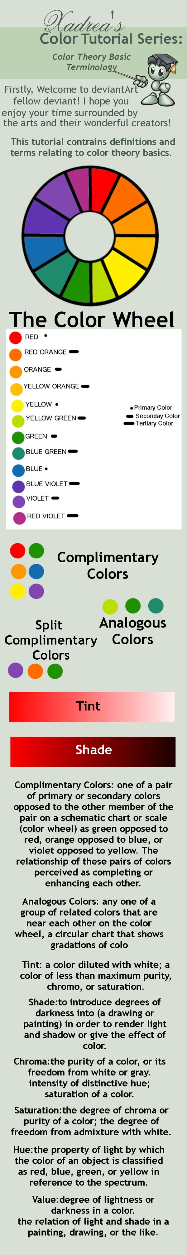
Based upon a lot of recent confusion I've noticed surrounding color theory (and understanding how to apply it) I'm making a series of tutorials about color theory, color mixing, color families, and color schemes. Familiarizing yourself with color theory will benefit how you handle color in your work and help sophisticate your palette. This particular tutorial contains textbook definitions of terms you should become familiar with, as well as a visual of the color wheel and examples of compliment combinations. The next tutorial will be on color families.
Related content


Comments: 14


Nice! One qualification though. I once tried mixing red and blue to get purple, and got instead a very nice shade of brown. Later, when I started working in the printing industry, I learned about cyan, magenta and yellow, and found that they really work. Nowadays unfortunately I don't do much painting any more, but when I do, I use those three. (Along with black and white, of course.)
👍: 0 ⏩: 1

The saturation of the original red and blue you were mixing counts as well. Scarlet or vermillion mixed with any variant of blue will almost always produce a cool toned neutral. The CMYK color palette is very useful, but for beginners it can be hard to grasp ")
👍: 0 ⏩: 1
True - my first try was with vermilion and prussian blue. My second try, with alizarin and ultramarine, was closer - it was a distinctly purplish brown.
I teach multimedia, which is all done on the computer and where RGB (and hence CMY for printing) are unavoidable. Furthermore, color printers always use CMYK, so anyone who buys printer cartridges is going to run into the issue. So I like to tell my students "Your art teacher lied to you."
Irrelevant note: in my printing job, I learned why the "K" in CMYK. It stands for "Key" - because in doing four-color printing, the black plate is the key plate that the cyan, magenta and yellow plates are supposed to line up with. If they don't line up, it looks awful - you've probably seen examples of that happening.
👍: 0 ⏩: 1
You'll get the best violet with ultramarine and cadmium red, but cerulean also produces a nice violet (just not as strong because there's white in cerulean)And yep! I do a lot of printmaking and some cmyk printing and I agree, registration has to be spot on, but ESPECIALLY with the key (whatever color the key image).
👍: 0 ⏩: 1

I have also found colour mixing to be far easier using a CMY colour wheel... it is the only way to mix a true blue and the purples are so much nicer...in fact you get a much better range of colours that are far easier to mix in my experience.
Magenta is one one of those beautiful, unexplained phenomena...it doesn't exist on the colour spectrum...but it does in the human brain (we 'see' it at each end of the colour spectrum as a hint of a colour).
Prussian blue and alizarin crimson make a beautiful purple...but you have to add white to be able to see it as it is so dark to be almost black to the eye...
👍: 0 ⏩: 0

A good intro to the basics of color theory. Well done.
👍: 0 ⏩: 1
Thank you for your kind words! 
👍: 0 ⏩: 1

very good! I'll be adding more very soon!
👍: 0 ⏩: 0

I have Color & Design next semester...think this might come in handy ^^ lol
👍: 0 ⏩: 1
excellent! glad to help you out!
👍: 0 ⏩: 0