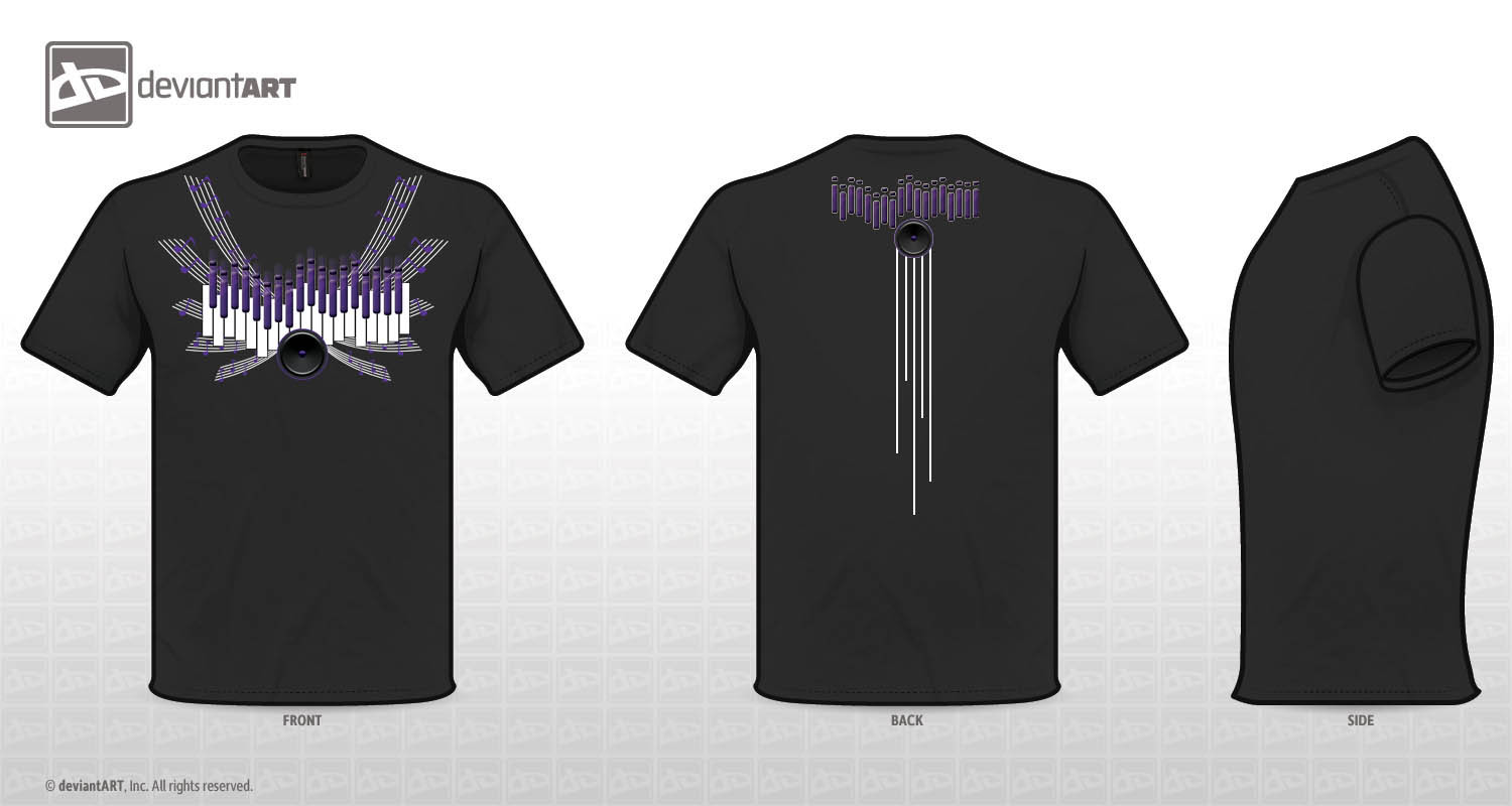
HOME | DD

YCL101 β€” Elements of Music

Published: 2012-07-05 03:04:47 +0000 UTC; Views: 2697; Favourites: 21; Downloads: 0
Redirect to original
Description Music inspired T-shirt design for the Deviant Art Contest, hope everyone likes it. I'm always up for suggestions on how my designs can be bettered

I wanted to incorporate different elements of music into my design: Piano keys, equalizers, speakers and staff lines with notes on them as wings
Related content
Comments: 301

YCL101 In reply to ??? [2012-08-04 14:10:24 +0000 UTC]

...wait, I am?

πŸ‘: 0 ⏩: 0

YCL101 In reply to ??? [2012-08-04 14:07:44 +0000 UTC]

Thank you so much!

πŸ‘: 0 ⏩: 1

ArVaWe In reply to YCL101 [2012-08-08 04:42:44 +0000 UTC]

You're most welcome .

πŸ‘: 0 ⏩: 0

RedeyeTrickmaster [2012-07-16 03:36:41 +0000 UTC]

You definitely got the right idea. Don't be afraid of non conforming. Go wild and to the extreme in expressing your ideas. You have great form and technique now you are ready to experiment. Push the limits.

πŸ‘: 0 ⏩: 1

YCL101 In reply to RedeyeTrickmaster [2012-07-16 23:37:00 +0000 UTC]

Thank you so much! Great advice!

πŸ‘: 0 ⏩: 0

PavitraSTandon [2012-07-15 10:24:43 +0000 UTC]

verrrry cool!

πŸ‘: 0 ⏩: 1

YCL101 In reply to PavitraSTandon [2012-07-16 23:35:44 +0000 UTC]

Thanks!

πŸ‘: 0 ⏩: 0

Dunnie26 [2012-07-14 02:16:13 +0000 UTC]

Very nice! A wonderful design indeed! ^^

πŸ‘: 0 ⏩: 1

YCL101 In reply to Dunnie26 [2012-07-14 02:21:44 +0000 UTC]

Thank you!!

πŸ‘: 0 ⏩: 0

PrincessEmber1111 [2012-07-13 01:56:12 +0000 UTC]

This is pretty cool! Only two things that I would suggest:
Not having gradations in your image. I'm not sure if that breaks the 5-color rule or not, but I would try to keep it simple and have flat colors.
I think you carry enough of the design to the back with simply the speaker and the vertical staff lines. The black keys on the back just feel kind of busy. I understand your wanting to keep the unity of your design together, but the speaker and staff lines on the back really accomplish that by themselves.
Hope this helps. Keep up the good work!

πŸ‘: 0 ⏩: 1

YCL101 In reply to PrincessEmber1111 [2012-07-13 02:33:09 +0000 UTC]

Yea, i think the gradients might have broken the rule... "/
Thank you so much for the idea! Thanks for the compliment as well!

πŸ‘: 0 ⏩: 0

GrfxImage [2012-07-13 01:16:02 +0000 UTC]

I like this design, it flows really well. I love its simplicity, even though it represents more then one element in music. I do think it would have looked even better if the wings looked more like actually wings with the not line and notes in it. You got my vote !!!!

πŸ‘: 0 ⏩: 1

YCL101 In reply to GrfxImage [2012-07-13 02:28:45 +0000 UTC]

I think you are right, I will try real wings with it on my own, thanks! Thanks for the vote!

πŸ‘: 0 ⏩: 0

katelunae [2012-07-13 01:05:35 +0000 UTC]

I like it, it's very very nice, maybe you should play more with the equalizers levels

πŸ‘: 0 ⏩: 1

YCL101 In reply to katelunae [2012-07-13 01:07:28 +0000 UTC]

Thank you! Thats a great idea!

πŸ‘: 0 ⏩: 0

mlnminass62 [2012-07-12 23:13:52 +0000 UTC]

Lovely and beautiful design YCL101 YOU GOT MY VOTE

πŸ‘: 0 ⏩: 1

YCL101 In reply to mlnminass62 [2012-07-13 00:37:56 +0000 UTC]

Thank you so much!

πŸ‘: 0 ⏩: 0

Nomzzzz [2012-07-12 12:30:09 +0000 UTC]

nice creativity...........specially on the back...........

πŸ‘: 0 ⏩: 1

YCL101 In reply to Nomzzzz [2012-07-12 18:03:09 +0000 UTC]

Thank you so much!

πŸ‘: 0 ⏩: 0

Meigas [2012-07-12 10:00:32 +0000 UTC]

I'm sure you're already told that but a piano doesn't have so many black keys... Actually an interesting idea, of course.

πŸ‘: 0 ⏩: 1

YCL101 In reply to Meigas [2012-07-12 18:06:43 +0000 UTC]

Yea I know, I played piano as a kid, I tried taking out a few lines but it just didn't look right to me... Thanks alot!

πŸ‘: 0 ⏩: 0

ShellSys10101 [2012-07-12 05:00:51 +0000 UTC]

That is awesome! The only thing that I would add is more color.

If you put the speaker behind the musical notes and lines and drop the keys below that - I am in no way an expert but it may be something you can just try and see what it looks like - Just a thought ...

I think the design is superb and the clean look are very expert.

Please know that if I had to choose = yours may well be in the finalists list!

GREAT WORK! Thank you for review of mine. I greatly appreciate constructive criticism

πŸ‘: 0 ⏩: 1

YCL101 In reply to ShellSys10101 [2012-07-12 18:24:23 +0000 UTC]

Those are great advice! I will try them out, thanks! Thank you for the compliment as well!

πŸ‘: 0 ⏩: 1

ShellSys10101 In reply to YCL101 [2012-07-12 21:28:15 +0000 UTC]

You are welcome - best of luck to you

πŸ‘: 0 ⏩: 1

YCL101 In reply to ShellSys10101 [2012-07-13 00:43:35 +0000 UTC]

Thank you, you too!

πŸ‘: 0 ⏩: 1

ShellSys10101 In reply to YCL101 [2012-07-13 07:02:57 +0000 UTC]

πŸ‘: 0 ⏩: 0

kk75 [2012-07-12 04:38:08 +0000 UTC]

Nice Design.

πŸ‘: 0 ⏩: 1

YCL101 In reply to kk75 [2012-07-12 18:24:35 +0000 UTC]

Thanks!

πŸ‘: 0 ⏩: 0

jesseppowell [2012-07-12 02:35:37 +0000 UTC]

Looks good. The back design is a nice touch too.

πŸ‘: 0 ⏩: 1

YCL101 In reply to jesseppowell [2012-07-12 18:24:55 +0000 UTC]

Thanks so much!

πŸ‘: 0 ⏩: 0

Attic-Fauxtos [2012-07-12 02:22:22 +0000 UTC]

I would give advice, but i don't think you need it. i love how the music staff is flowing, and i also love how the keys also look like a graphic equalizer.

πŸ‘: 0 ⏩: 1

YCL101 In reply to Attic-Fauxtos [2012-07-12 18:25:31 +0000 UTC]

Wow, thank you!!

πŸ‘: 0 ⏩: 0

AngelsSilverWings [2012-07-12 02:16:24 +0000 UTC]

Voted.Great job.

πŸ‘: 0 ⏩: 1

YCL101 In reply to AngelsSilverWings [2012-07-12 18:43:56 +0000 UTC]

Thank u so much!

πŸ‘: 0 ⏩: 0

hateless-kuroyuki [2012-07-12 01:50:32 +0000 UTC]

wooow I like it so much that i want it!

πŸ‘: 0 ⏩: 1

YCL101 In reply to hateless-kuroyuki [2012-07-12 18:44:40 +0000 UTC]

Aww, that's the ultimate compliment! Thank you!

πŸ‘: 0 ⏩: 1

hateless-kuroyuki In reply to YCL101 [2012-07-13 19:22:58 +0000 UTC]

youre very welcome n__n

πŸ‘: 0 ⏩: 0

shiiki [2012-07-12 00:43:14 +0000 UTC]

I like ur design, its like looking at a purple flower blooming And I like how you put the keyboards

πŸ‘: 0 ⏩: 1

YCL101 In reply to shiiki [2012-07-12 01:05:34 +0000 UTC]

Thank you so much!

πŸ‘: 0 ⏩: 0

Altyasix [2012-07-11 17:51:32 +0000 UTC]

The first time I saw it, I thought it was an organ. But no, it looks like a piano. Interesting concept

πŸ‘: 0 ⏩: 1

YCL101 In reply to Altyasix [2012-07-12 01:05:02 +0000 UTC]

thank you!

πŸ‘: 0 ⏩: 0

I-like-socks2 [2012-07-11 15:52:50 +0000 UTC]

no affence b ut i cant really tell what im looking at.....0.0

πŸ‘: 0 ⏩: 1

YCL101 In reply to I-like-socks2 [2012-07-11 16:13:38 +0000 UTC]

Lol, the white rectangular boxes are supposed to be keys on a piano, the purple things are supposed to look like both equalizer and the black piano keys, the wings are staff lines which has music notes on them, and then the speaker.

πŸ‘: 0 ⏩: 0

cat-2 [2012-07-11 15:15:01 +0000 UTC]

Really nice design. Voted!

πŸ‘: 0 ⏩: 1

YCL101 In reply to cat-2 [2012-07-11 16:10:11 +0000 UTC]

Thank you so much!

πŸ‘: 0 ⏩: 1

cat-2 In reply to YCL101 [2012-07-13 02:08:45 +0000 UTC]

your welcome

πŸ‘: 0 ⏩: 0

hyouto [2012-07-11 10:40:13 +0000 UTC]

Cool idea with the wings. : )
But the purple music notes are a little bit irritating on the grey shirt. A brighter color would be better maybe.

But what are this dot-things above the keyboard part? Can't imagine. ΓΆ.ΓΆ
Or is it only for decoration?

πŸ‘: 0 ⏩: 1

YCL101 In reply to hyouto [2012-07-11 14:00:09 +0000 UTC]

Thanks! That's a great idea! The purple does make it hard to see.

The purple dot and the line are supposed to be equalizer, and the black keys on a piano at the same time

πŸ‘: 0 ⏩: 1

hyouto In reply to YCL101 [2012-07-11 16:34:57 +0000 UTC]

: )

Aaah ok. : D

πŸ‘: 0 ⏩: 1

YCL101 In reply to hyouto [2012-07-12 01:00:27 +0000 UTC]

πŸ‘: 0 ⏩: 0


| Next =>