HOME | DD
 zdan — Project Goa - Splash

Published: 2001-10-24 14:18:41 +0000 UTC; Views: 1077; Favourites: 2; Downloads: 251
Redirect to original
Description
this is the future splash screen for my websitebased on Renoiro's Yuki Uchida wallpaper [link] and with his permission
done some job on the original photo, mostly contrast
comments and tips are welcome since i will be uploading this to the site in about a week, so if u think something should be added or removed feel free do say so
Related content


Comments: 19


The best part of this work wasn't made by you (the girl). Take her off and you get an ugly splash screen.
Need I say more?
I have my eye on you!
👍: 0 ⏩: 0


spifforific!
(nothin constructive to say so I'll fall back to the basics heh)
👍: 0 ⏩: 0

wooooo cool babe.....this is gd..
this will do fine for yur splash page!
👍: 0 ⏩: 0

Perfect as it is, don't touch a thing!
What have I become? I am not mute, yet I speak with my fingers, I am not deaf, yet I hear with my eyes, I am not paralyzed, yet I am bound to this chair...
👍: 0 ⏩: 0

Very nice! I like the simplicity of it, yet it still has a technical feel to it. The text is sharp and clean, and the colors are vibrant. Nice work!
sasso is also known as Sal Loria sometimes
👍: 0 ⏩: 0

Very nice ... colors are eye catching!!
I do agree with the enter button being a tad bit bigger. Although, I have been to sites where finding the enter button was impossible. So, this is a nice compromise. Sweet!
👍: 0 ⏩: 0

very nice
clean and simple
white bg's rule
-{ rival }-
👍: 0 ⏩: 0

Amazin' work... Minimalist & impressive, i like it a lot.
::zk::
👍: 0 ⏩: 0

I am in love. That girl is sexy. Is that you? Damn, that's sexy. Zdan, you the man! Err, girl, boy, whateverdafreak?!? I love it, chica. Dude. Bleh -.-
👍: 0 ⏩: 0

looks good to me. very nice, clean and sophis.
...........................
:::KwanStudios:::
· Defining creativity ·
- www.kwanstudios.com -
- malaysia@kwanstudios.com -
👍: 0 ⏩: 0

i agree with the first comment: you need to make the enter button bigger.
good all the same though.
👍: 0 ⏩: 0

Very nice, oughta look good on the page. Would be hard to make her look bad though, huh?
==========
Save the planet
.... an
....
==========
👍: 0 ⏩: 0

white background and the image will be centered on the page
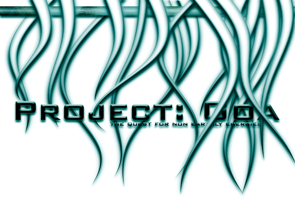
-{Project: Goa}- http://www.projectgoa.f2s.com
The quest for non earthly energies
👍: 0 ⏩: 0

i think it is really cool....i wouldn't change anything about it...just be careful what color background you use to go along with it....it could make or break it as a splash unless you give it a border for seperation....this is really good work
-olo- (a.k.a.) -unlogikal-
WARNING: do not click here --> http://www.computerologist.org
👍: 0 ⏩: 0

Maybe 1 pixel lines would look better?
.netium
[ technetium | kwanstudios ]
👍: 0 ⏩: 0

I think it looks pretty good as it is. Maybe the enter button a little bigger?(just me)
|Dinosaurs Are NOT Extinct|
👍: 0 ⏩: 0