HOME | DD
 zeruch — The Banality of Evil
Published: 2006-01-28 10:50:19 +0000 UTC; Views: 2008; Favourites: 50; Downloads: 431
Redirect to original
Description
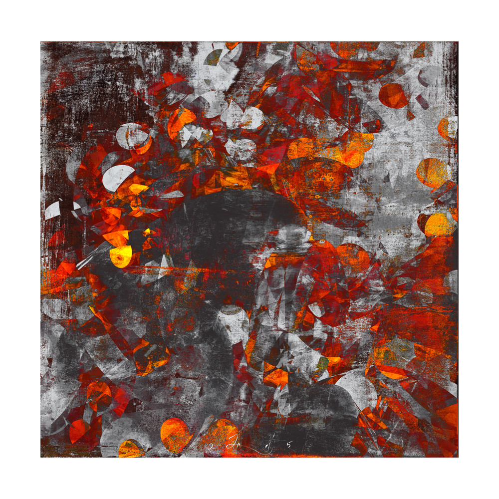
I still consider this somewhat overworked, but aspects of it I liked fundamentally, so it stopped here (instead of perpetual tweaking which would have inevitably brough total ruination).This originally was borne to the public with the Exemplify Release fo the Breed Art Group. There are several DA members aboard, including `nuvem and `Senecal so check it out.
various paints and inks on several sheets of bristol, and various digital forms of chicanery.
Named after a track from the latest Davis Sylvian/Steve Jansen project, Nine Horses .
Related content


Comments: 36

oh my god i seriously love all of your paintings like this. i can't even describe with words how much i love them! just amazingly beautiful.
👍: 0 ⏩: 0


Is the grey on this actually grey? Or a silver?
Its pretty damn amazing as it is, but I think it would look mind blowing in silver + red ...
👍: 0 ⏩: 1

Is the grey on this actually grey? Or a silver?
Neither. It is a combination of neutral greys, antique silver paint, and a couple of tints that I digitally desaturated.
👍: 0 ⏩: 0

A very cool piece, much like reading highly metaphored or yuxtaposed poetry, where there are so many open ends to be interpreted and decoded by the reader or observer...as in this case this paint to me looks like the death of a sun...maybe it's because i just read a poem called the sun is dead..by some fellow deviant...and oddly enough this painting looks like very much what the poem describes in a way...a broken sunrise, the last flames of a star as it shatters...no matter what, but the colors mixed strike amazingly...there is a different between abstract pieces that look like mere splats of paint and works well attained as this one..and im certainly adding this one to favorites!!! Awesome!!! 

👍: 0 ⏩: 0


wow.. i really love this piece... it something totally different from your other pieces and up close it looks even more amazing ..
really love this piece 
keep up the crazy Kotic but calculated works.. really amazing stuff here.. !

👍: 0 ⏩: 0

There is something about it. I can't tell what it is but it looks really good!
Well done!
👍: 0 ⏩: 0

textures and colors, first of all! fire and rust, scratches and beautiful overlapping elements! the depth of layering and blending is stunning! great art!
👍: 0 ⏩: 0

i can see either an angry volcano from the top or leaves falling in a bluster during fall. Love the colors and the chaos.
👍: 0 ⏩: 0

I swear I never understand what appeals to people. I was sure this image would be a big flop but folks seem to like this thing.
I would be lousy at picking horses or playing craps. I am sure of it.
")
👍: 0 ⏩: 1


This is very nice. I love the blending on there. The colours are mixing so well together.
And when you stare it at for a while - you get lost in its beauty.
Making you daydream.
Really nice.
Awesome work.
👍: 0 ⏩: 0


I enjoy it. It has a lot of movement, which is always excellent in my opinion.
👍: 0 ⏩: 0

never let mother smother the child...
I love the red against grey, the rough texture. It's both violent and calm, which is unusual... wonderful.
👍: 0 ⏩: 1
Why does it not surprise me that you of all people would know the song/artist.
You seem to be in better spirits since last we were in contact. I find this a Good Thing.
👍: 0 ⏩: 1
I am, and it is, thank you!
I love your taste in music, as well as your work which I always look forward to seeing in my watch, despite the fact I'm really horrible at commenting and keeping in touch.
👍: 0 ⏩: 1
I am, and it is, thank you!
Quite good.
I love your taste in music,
I do not know if you would say that when I have some of the most brie-like 80s pop fluff cranked at about 200db.
as well as your work which I always look forward to seeing in my watch, despite the fact I'm really horrible at commenting and keeping in touch.
That is quite alright. In that regard you and I are quite similar. It is simply too hard to keep up with it all. But I do always enjoy stopping by, looking at quite nice images, and occasionally leaving a missive in your journal.
/me tips hat
BTW, Dean from Curve last did some work with Jeff Beck, but I cannot find squat as to what Ms. Halliday is up to. You would not by any chance have any secrets with regards to that would you?
👍: 0 ⏩: 0

lmfao @ chicanery!!
crumbs this is good
rustic vs grey works so well everytime
👍: 0 ⏩: 0

Looks very like worked metal, to me. Kind of primitive, in a way, but really full of emotion, which a lot of abstract artists don't seem to be able to achieve. This radiates fury. I think it's pretty awesome.
👍: 0 ⏩: 0

that is absolutely gorgeous. in a way it reminds me of a stained glass window.
👍: 0 ⏩: 0

")
I sent the print file for approval, so hopefully soonish...
👍: 0 ⏩: 0

Hmmm... perhaps you say over worked for that left middle bit? It reminds me of fire, and ash... So to me it's not really overworked, since fire has a tendancy to overdo things. I keeps seeing little faces in it, for some reason.
👍: 0 ⏩: 0

there's somethign about this that i am really attracted to. i think it's the chaotic nature of the piece, the dazzling harsh reds and the almost charcoal-like main brunt of it. it's like staring into the eye of an apocalyptic storm and only seeing more chaos
👍: 0 ⏩: 0


As always, I love the way your pieces are so completely open to the interpretation of the viewer.
For me: the taste of copper pennies.
👍: 0 ⏩: 1
the taste of copper pennies.the taste of copper pennies.
That is almost worth subtitling this work with. Or maybe I'll make something else to fit, just because I like the phrase.
👍: 0 ⏩: 0

I love the abstraction of this... reminds me of the way that Sandy Skoglund did her work, putting her neon cats on a black-and-white background. I'm kind of torn between seeing this as autumn leaves on concrete or the fires burning in the crematoriums.
Either way, it's really well-done.
I love it.
👍: 0 ⏩: 0


boa yea i like the colors
how much time you spent for this picture?
 (Wink)")
👍: 0 ⏩: 0


I tend to think the same thing about cereal with a heavy bran component. But that is a different type of movement I would imagine.
How are you dear, it has been a while. I notice that a family reunion of sorts is in the works. This sounds quite nice.
👍: 0 ⏩: 0

Wauw, that's just awesome! (Smile)")
👍: 0 ⏩: 0