HOME | DD
 zeruch — collide0scope II v4
Published: 2003-10-25 08:09:55 +0000 UTC; Views: 1855; Favourites: 60; Downloads: 348
Redirect to original
Description
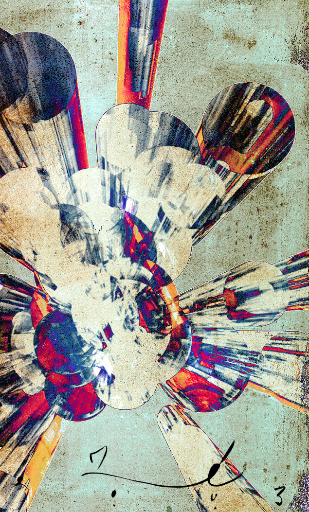
an accidnet that led to an incident that led to another happy accident. the hardest thing about this was titling it once I figurd out how I wanted it to look (and this is a small success for me in terms of technique). I was listening to the Brand New heavies Shelter but it didnt suit the mood. I almost used a title I had scrapped for another work, The Frank Zappa Memorial Bris , but opted instead that it was closest related to Coliide0scope I (a piece I submitted earlier thsi month based on the music of Living Colour, of which it shares their new albums name).acrylic paint, + digital (2d & 3d elements)
Related content


Comments: 35


whoops i wanted to fave this, and then i had to read that it was removed from my favorites  (Smile)")
👍: 0 ⏩: 0


If only it could be. It was a small piece to start with.
👍: 0 ⏩: 1
the base paintings are 8.5x11, but scanned at 200dpi, so the resolution is very so-so., and I can't recreate a larger res version for the life of me.
👍: 0 ⏩: 1
The original is made from more than one base painting, and even if I got the layer order correct again, the final digital assembly, including the adjustments, would be too hard to replicate.
Most of my abstracts are created starting with 2-6 different base paintings that I assemble into a unified whole (hence the requirement for digital), so replication is at best...iffy.
👍: 0 ⏩: 0

woohoo it's loading!!!!! ")
nice work definately has a collaidescope feel even if that is just from an album name it suits....
i like it alot especially the light background.. it works very well x
👍: 0 ⏩: 0
won't load... thinking of a print... trying to pick which of your works to pick.. any recommendations... anyway i'll be back to comment on this when it decide to load, it looks real promising and beautiful from the previews... grrr anyway i'll be back x
👍: 0 ⏩: 0


Beautifully dirty. I like the Frank Zappa title better.
👍: 0 ⏩: 0

shit.. this is too rad for me to say anything else.
👍: 0 ⏩: 0

What I love about this is that even though it's computer-manipulated it still looks traditional. Lots of people use programs just because it makes them look good. This istruly amazing work.
Pickles and mayo!
👍: 0 ⏩: 0

the composition is wild and incredibly successful.
I can picture you, like a hunter, lying in wait to trap
and taxidermize the unsuspecting compositions.
👍: 0 ⏩: 1
you make the kind of observations that make a boy happy to be arbitrarily creative...
👍: 0 ⏩: 0

oooh, that looks great!
im not too sure about the brown wash over everything, but apart from that this is fantastic
nice composition too

👍: 0 ⏩: 0

Fuck me this is impressive.
+favs...
I don't know what else to say... I'm just totally floored by it!!!
👍: 0 ⏩: 0


you are teh awesome!!!!
 (Wink)")
great impressions of colours and places in my mind. i think it worked as far as effect is concerned - and more so while in contrast with your previous work.
👍: 0 ⏩: 0

wow; this goes so far beyond anything I've seen you do. It has so much, depth. Awesome, awesome.
👍: 0 ⏩: 0

holy shit this is the greatest thing ive seen in a long time. it reminds me of a superman cartoon because they look like those things they put when superman flys away and its like swoooosh, or like poowww when he smaks someone. I forgot what those are called but u know what im talkin about.
👍: 0 ⏩: 0
uh...wow folks. i did not expect such a positive reaction to this...
👍: 0 ⏩: 0

FAB!!!!!
definatly a FAV!
just great visual art!
a wonderful example of how digital can be wonderful
👍: 0 ⏩: 0


great piece. i really dig the texture, and i think the composition is really interesting. killer colors too. this just sparked a few ideas for me now...
very nice work...
👍: 0 ⏩: 0

The Frank Zappa Memorial Bris would have been such an awesome title. Haha.
Fantastic hot and cool runnings vertically. It's like a vertigo of temperature.
👍: 0 ⏩: 0

there are many diffrent elements in this that i havent seen you use before... its very exciting i love the colours.
👍: 0 ⏩: 0

amazingly beautiful colors and textures. wish I had better words for you.
👍: 0 ⏩: 0

Awesome.. Looks a little metallic... Such wonderful colors.
👍: 0 ⏩: 0

+hahah...i think the way you combine dig. and trad elements is pretty incredible. this looks great, combining a kind of constructivist composition with great force and expression. you're it, man.+
👍: 0 ⏩: 0

Awesome is all I can say. That is one of the coolest things ever.
👍: 0 ⏩: 0


Incredible presence this has, movement/energy/scale, it's exciting for the eyes to look at.
Like an explosion or rods being smashed together, it fits the title rather well.
")
👍: 0 ⏩: 0