HOME | DD
 zhama — My Sai Process- Mini Tutorial
Published: 2012-09-22 21:01:54 +0000 UTC; Views: 3508; Favourites: 72; Downloads: 45
Redirect to original
Description
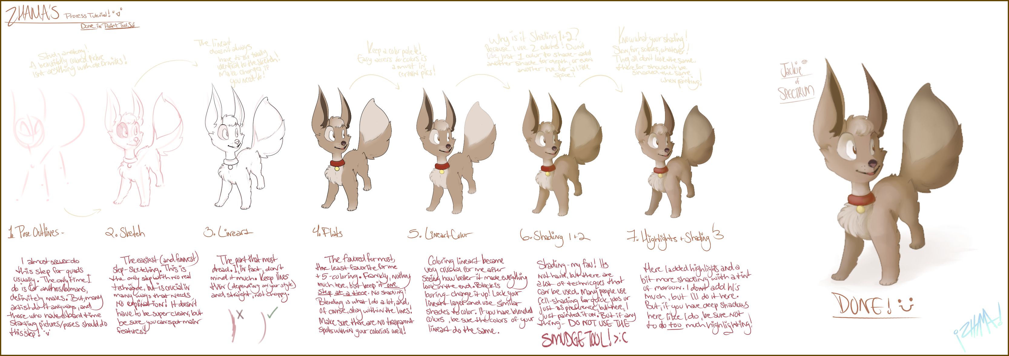
SUPER SHORT AND STUMPY AND ALSO NOT VERY WELL DONE TUTORIAL. :'DMy first one- I just wanted to give some of you guys a glimpse of how I've been doing my at over my uber long period away from DA.
This doesn't show HOW to do things specifically, but how, as said, I do it.
Nothing much- I'll go in depth later this year if I feel like it. c:
--
 1. OUTLINES- I nearly never do this step. As said, I only ever do it for human/anthros, especially males since they aren't my forte. But since I'm much more advanced in quad anatomy rather than the others, I just start with the head and maybe the eyes, then go right on to lineart. But, for those who'd rather be sure of their drawing, or just have a tough time starting them, I'd recommend this step. Not much technique, just be sure to know your ANATOMY. A horrid word for beginners, but hell, it's true. All pictures that have a living creature in it has to have some form of good anatomy. No picture will look right with deformities, even if you paint like Da Vinci. 2. SKETCHING- My favorite, no doubt. You have total FREEDOM here. Nothing much, your style depends on your sketch. Make it clean, make it dirty and rough, it's your call. I usually make mine semi-clean in red with light lines ( Marker tool of Sai), but if one thing's certain- be sure you can spot main features. You can even make features different colors if you need to. 3. LINEART- A LOT of people hate this step. I, actually, don't. It is in fact one of my favorites. But, if anything goes here, it's knowing what program you're working with. GIMP, Photoshop, Sai, whatever. They are all different, therefor have different pens and pen pressures- the way they react with your tablet. I favor Sai for lineart, since it's way smoother for me, and has that nifty Stabilizer for those with too much quiver in their hands.
 Either way, KEEP LINES STRAIGHT. Choppy lines look like you don't know what you're doing (and I see a LOT of that in DA- that's a no-no, people.) Frankly, I like thin lines, but that depends on your style and what you're tying to aim for (painting does better with thin lines, certain comic book styles work better with thick lines- it's an either or kind of thing.)
4. FLAT COLORS- Be surprised- MY LEAST FAVORITE STEP. Why- it's time consuming for me. I hate it. Likely because I have horrid color picking skills. I DESPISE IT. A lot of you like it, I have no idea how you guys can like it. >:UAnyways, not much- stay in the lines, keep the flats in a layer UNDERNEATH THE LINEART'S, and blend colors if it is needed. Some find it better to make the base color (main color) and lock it/make clipping masks to place the rest on. Either way, make sure you can spot all of the main colors and have them in the right place. It's a bit difficult to change colors when you get further in the picture's process.
5. LINEART COLOR- I started coloring lineart after how better it made art look in the end. As said in the tutorial, lock the lineart layer and color it corresponding to the color it covers/is next to. It's not hard, a little time consuming, but you'll appreciate it later. Some do this after shading, but I just do it whenever I feel like it to see shading better. Remember- BLACK IS BORING. 6. SHADING 1+2- My fav. <3 Everyone knows how to shade, right? Light source, something behind the other, blahblahblah. I WON'T GO OVER THAT. That is too boring for me to type, and it's all over DA how to do basic shading. But, there are different types. Cell, painting, gradient. Here, I do painting, because it's funner for me. But... know your layer knowledge. Layers help a lot in shading, and if you think "layers are overrated", well, you'll never get far in the digital art world. :I
Anyways, do NOT use black and lower the transparency. Make it a darker color of the colored area and do it then. Also, you may use different tints to add a bit of spice and depth. Also, shade as MUCH AS YOU WANT. Whoever told you to not do too much shading obviously doesn't know how to shade. Personally, I love adding a lot of shade- it compliments my style. But, Shading can reflect the mood and tone of the picture. Manipulate your light source and darkness to get the most out of the picture and your concept.
7. HIGHLIGHTS + SHADING- Here, this would be the "touch-up" portion of the picture besides making it match the entire picture. Now, here is the trick- the more shadows, the less highlights. The less of shadows, the more highlights. Simple right? Needs no explanation, really. Also, if you feel like you must, add a bit more shading (here, I placed a low brick red.)--
Yeah, short and to the point.
I may do another soon about other things, like brushes, tints... or whatever. XD
Actually- if I MADE another one, what would you guys want it on? It could be anything, from basics, my style and how I do things, to how to draw a certain character (that one's a bit famous for Hotch and Zhamamba.)
Anyways, enjoy!

--
(C) ~zhama
Related content


Comments: 3

What settings for the brush do you use for line art?
")
👍: 0 ⏩: 0

this is really useful! im really new to sai and have no idea how to lock the colors to change the lineart from black to color.... so my question is how do i do that?
👍: 0 ⏩: 0
