HOME | DD
 zilla774 — Magic:Marker:3
Published: 2004-11-11 10:23:55 +0000 UTC; Views: 1182; Favourites: 17; Downloads: 256
Redirect to original
Description
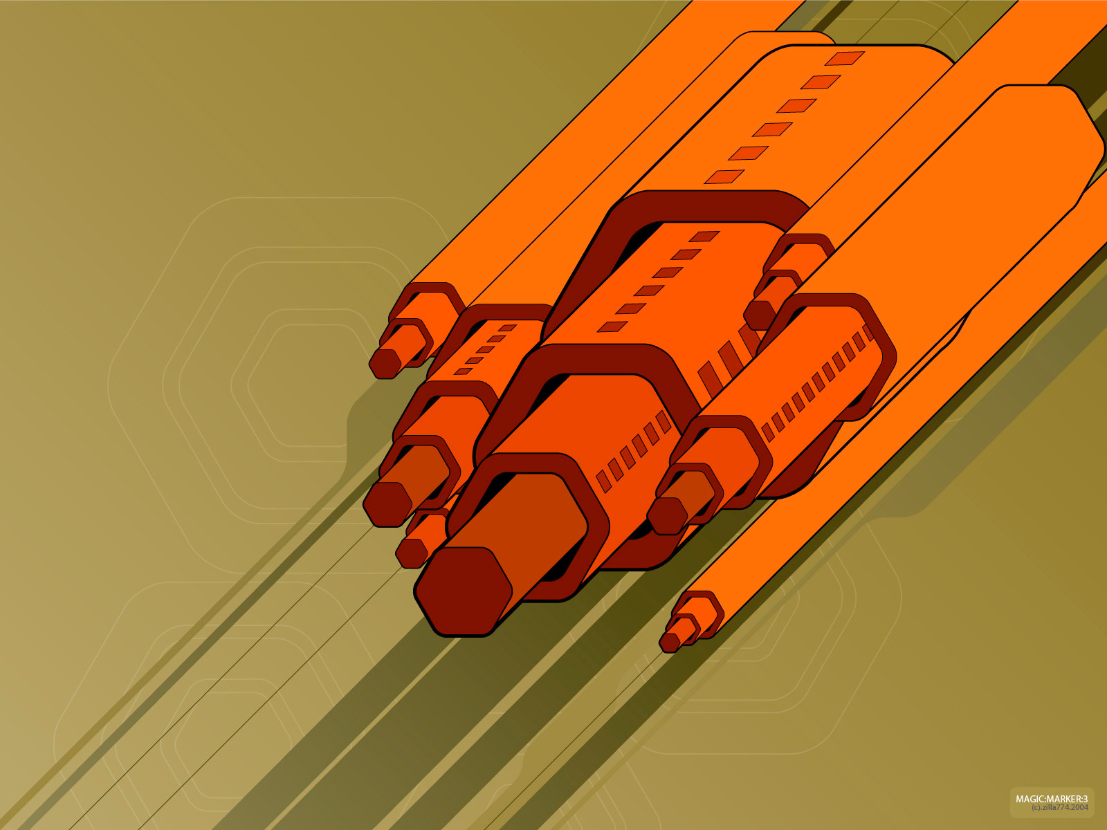
version 3 : This was about as far as I was willing to take this. Still love the colours and the shapes. So simple, makes for such a great freaky deskie.--- --- ---
those of u who read my journal will be waiting for this. This is the image I couldn't take further than this. Not for the want of trying, but I kept coming back to it and looking at it like this; crazy colours and simple shape, and it worked goddamn it! Well, it works for me anyways. This is gonna look so schweeet as a mousepad....
Created in Adobe Illustrator.
Related content


Comments: 21

I found all of these interesting, but I like the third one best!
👍: 0 ⏩: 0
I found all of the interesting, but I like the third one best!
👍: 0 ⏩: 0


this one out of all three you submitted i like the best. the whole compostion is simple and elegant all at once. i love the colors you choose also.
👍: 0 ⏩: 0

Of the three, this one and #2 are my favorites. I think I prefer #2 because of the texture of the background, but there's more "happening" in this one, in regards to the markers themselves (the spots on the markers are an excellent touch).
👍: 0 ⏩: 0

Instant 
")
👍: 0 ⏩: 0

I'd have to say this is my favourite of the three Zilla!
Lovely work, in my opinion!
- ][ocus
👍: 0 ⏩: 0

Good job. The colors mesh very well and the concept being "wierd" or "strange" works.
It's a nice change of pace and I look forward to more pieces with this new enlightenment
of yours. Again, nice job man and keep it up. Even if it is different from the other stuff.
👍: 0 ⏩: 0

i thought that you said these were gonna be shit?  (Smile)")
👍: 0 ⏩: 0

They all look good. I can't tell which one I like best.
👍: 0 ⏩: 0


the best of all three, this has the most interesting background, and would probably do best as mousepad
👍: 0 ⏩: 0

Number three is my favourite out of all three of them. Great design concept!
👍: 0 ⏩: 0


Of the 3 images, I like this one te best. It has the strongest design qualities. The colours are superb, the combination reminds me of something I would have liked if I was alive in 1972.  (Wink)")
👍: 0 ⏩: 1
Maybe next time I'll read the name of the image before I say what I think it looks like... Doh!
👍: 0 ⏩: 0


hahah god ur fast zilla
👍: 0 ⏩: 0

very interesting as well
👍: 0 ⏩: 0

I would say this is the best one. I like the olive from the 1st one, but the second was too busy. This is a good babance I think.
👍: 0 ⏩: 0

this might be the best one ^__^or i dunno.. coolness
👍: 0 ⏩: 0