HOME | DD
 andymorum — PxlPlusM
Published: 2005-04-05 20:45:12 +0000 UTC; Views: 63492; Favourites: 31; Downloads: 32002
Redirect to original
Description
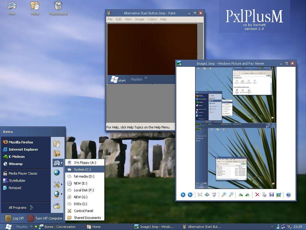
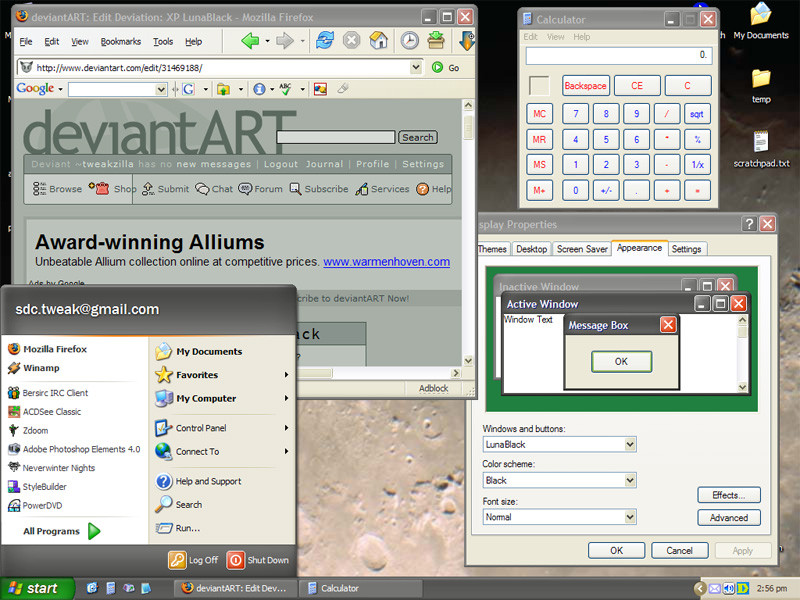
A 'modern' version of PxlPlus incorporating - get this - gradients! WOW!And no shellstyle
 (Smile)")
Please read the readme file included in the zip file
UPDATE
1.1 Release 06/04/05
- due to overwhelming requests at Neowin, I've
added a more 'traditional' (read boring) start
button
 (Wink)")
- thinned out scrollbars to 15 pixels
1.2 Release 06/04/05
- fixed scrollbar glyph not being centered
(thanks Timerever for reporting that)
- Shaved 2 pixels off titlebar height.
- Shrunk 'arrow' glpyhs
1.3 Release 07/04/05
- added thin taskbar version (nag, nag, nag)
- fixed logoff/shutdown icon widths (thanks again
Timerever!!)
1.4 Release 08/04/05
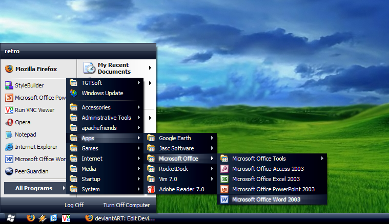
- added thin taskbar/compact start menu mode
- fixed minor bug with toolbox window borders
- fixed titlebar button margins (improves
Adobe Photoshop support)
- hopefully fixed problems with non-English
versions of Windows XP (please let me know
if not!!)
- added glow to flash items to make them 'bolder'
Related content


Comments: 42

One of the best themes so far!!
,Please send me a quick tip on how to remove the text on the start menu, like My Computer and My Documents? That would be greatly appreciated! I, to am making a theme of my own.
,Bmw2go11
-love the clean look of just icons to the right of the menu!

👍: 0 ⏩: 0


A very nice theme, though the little blob-mouseovers on the taskbar buttons are hard to quickly see.
👍: 0 ⏩: 0

when will you update the this VS . Waiting..foro......
👍: 0 ⏩: 0
when will you update the this VS . Waiting..foro......
👍: 0 ⏩: 0

I absolutely LOVE (*<3*) the start button and the thin taskbar.
The minimize, maximize and close button, though, needs some improvement. The images on the buttons are too small, try to make them a tiny little bit bigger. Or you could try to match those three buttons with the amazing (thin) start button, say, that the white symbols are bigger than the button itself...
Great work, still
👍: 0 ⏩: 0


Excellent work dude. Thin taskbar, compact start menu are an absolute must. Glad you added them. The mini lights on the active program, and flashing programs is an excellent touch. No more flashing programs! W00t!
Just one beef:
Can you make the start menu even more compact by making the header thiner and the Logoff/Shutdown buttons smaller?
👍: 0 ⏩: 1

Thanks mate! And I will make the start menu a bit more compact for the next version
👍: 0 ⏩: 0

man... i was so close to downloading it. If you come out with a version that has thinner titlebars, let me know. It'll be my favourite. Excellent look otherwise.
👍: 0 ⏩: 0

So any new version soon? Can't wait!! Well infact I can wait but it would be better if I didn't had to :-D
👍: 0 ⏩: 1
I'm trying to fix that annoying start button bug... once that's fixed it's good to go!
")
👍: 0 ⏩: 0

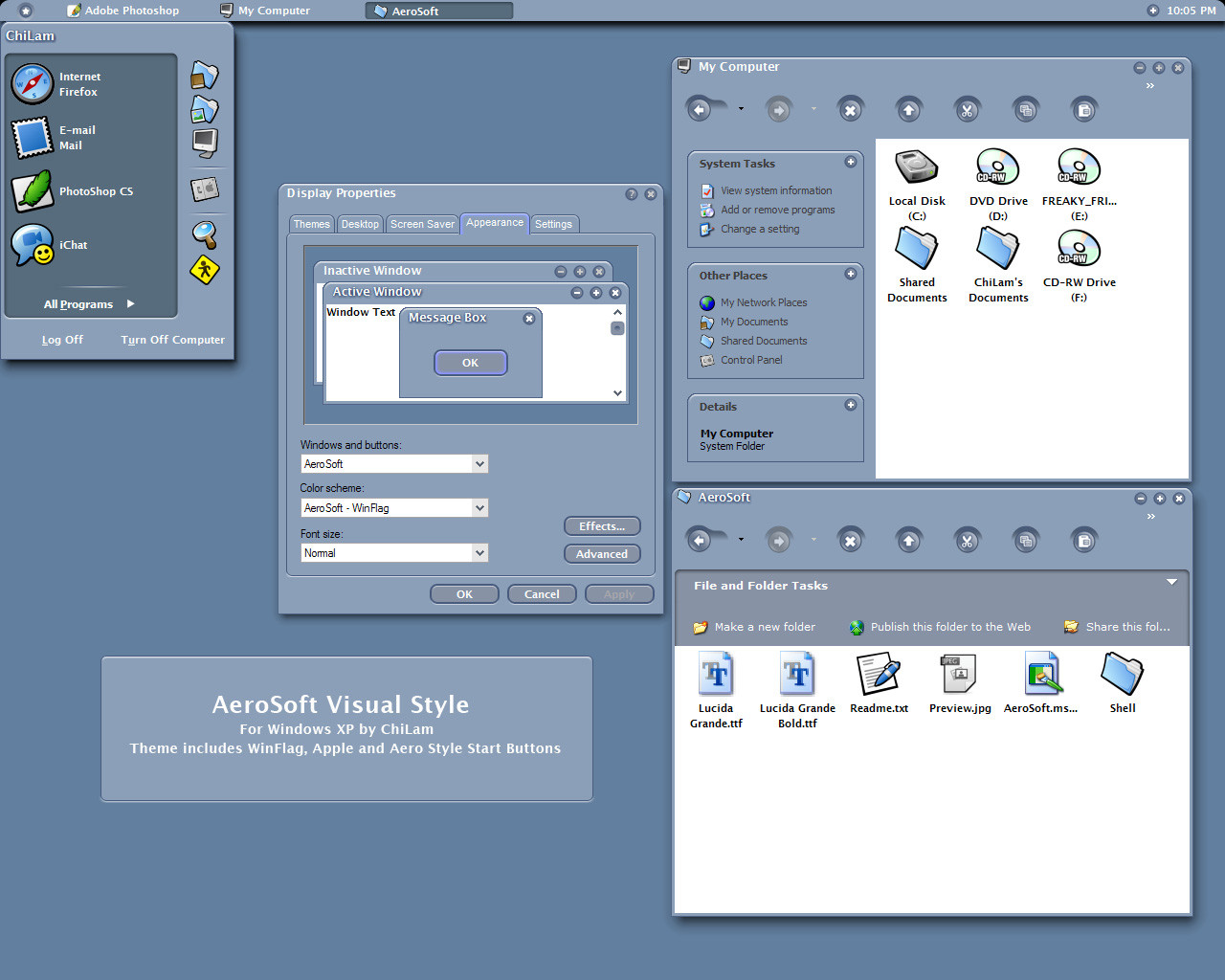
Can you tell me, what icons you are using on the screenshot? Thanks
👍: 0 ⏩: 1
They are BlueCurve icons from RedHat Linux, they used to be available for download from bluecurve.tk, but it seems the site has gone down
")
👍: 0 ⏩: 1
Thanks for the quick answer.
I found them on wincustomize.com.
👍: 0 ⏩: 0

this one is growing on me, been using it the last 3 days without switching back to system
👍: 0 ⏩: 0

Like it...! If you could make a shellstyle I would def. download it. But new and very nice.
👍: 0 ⏩: 0


i downloaded it,and i like it very much,it looks like "Longhorng",thanks
👍: 0 ⏩: 0


The gradients are just the best thing about this! I've always wanted a gradient over the systray, most cool!
How about adding a similar gradient under the min/max/close buttons
👍: 0 ⏩: 1
"How about adding a similar gradient under the min/max/close buttons"
Sounds good! I'll look into it for the next version!
👍: 0 ⏩: 0
That titlebar fix sure improves support for Illustrator (don't know about Photoshop, don't have it thank god) but still not perfect [link]
See? there a extra bit of border on the titlebar.
As for the green start menu... nope, it's still bugged
👍: 0 ⏩: 0

This vs keeps getting better and better!
Thank you!
👍: 0 ⏩: 0
quite a fan of the thin taskbar version, like the start menu and taskbar and overall window colours. like the scrollbar colour but not a fan of the mouseover change of colour... prefer it if it stayed the same
but... "Oh no... centered titlebar text?!" why??!!
the active window representation in taskbar is kinda cool, but I find it a bit harder to see which window I am in compared to the standard entire panel colour change... I'll give it a shot at getting used to though...
nice work, I'm sticking with system 3.1 still though, your best work so far
sorry if the personal opinions are a bit blunt.
👍: 0 ⏩: 0
Found some more things:
- Since I don't know the exact name of this thing (and called it trackbar) I'm gonna post the image, and if you want, please change it so it doesn't look like luna too much [link]
- Is this start button intended to be like this? It seem like it got something at the end (the blue rectangle) [link]
- The logoff button isn't square (23x24 pixels) but the shutdown button is (24x24 pixels). [link]
Hope you don't get mad at me for being such a nagger
P.S.: And now for the shamefull self-promotion: My cursor set DeepSky goes nicely with your theme so if you have CursorXP give it a look at [link]

👍: 0 ⏩: 1
Ahh I see! Those trackbar things are horrid, I'll be changing them hope fully soon!
No the startbutton is not intended to be like that, are you running a English version of XP?
I'll take a look at the logoff shut down buttons...
👍: 0 ⏩: 1
Nope, I'm running Windows XP Portuguese version 'cause, yes, I'm portuguese and I live in portugal
And thanks for giving those trackbars a look
👍: 0 ⏩: 1
Hopefully, the start button problem shoiuld be fixed for you now
👍: 0 ⏩: 0
WOW, that was the fastest report/update ever!
Thanks a lot!!
👍: 0 ⏩: 0
Nice but there are somethings that I don't like:
- Make the taskbar thinner.
- Center the plus thing on the horizontal scroll bar.
- Diferent trackbar, it's too much like the original luna.
Keep it up anyway, it's one of my favorite Visual Styles!
👍: 0 ⏩: 0


its a bit.. fat.. for my tastes, but ill download it and see if its just the resoultion of your picture or something making it look bad
👍: 0 ⏩: 0

Yay! Welcome back mate - and with some style too
👍: 0 ⏩: 0

oooo, very nice my man, gonna be a thin/compact version?
👍: 0 ⏩: 0
Great! I especially like the colors.
Only if the taskbar wasn't so 'bulky'...
👍: 0 ⏩: 0
