HOME | DD
 bolsterstone — Tutorial - Grids and Artrage
Published: 2008-08-06 07:48:12 +0000 UTC; Views: 20001; Favourites: 56; Downloads: 606
Redirect to original
Description
I've had a number of requests to explain how I do my portraits So here goes -- please be kind. (This is my first time doing this type of tutorial.) Now, to make matters easier, I chose a digitally done portrait because that was what I was working on at the moment. My traditional realist-styled work -- from the ink sketches to the pastels usually involve a similar technique.(This'll be a straight render -- with not too much on the interpretation side of things. There'll be some but not too much.)
The nice thing is that I'm so used to working this way that I work pretty rapidly on a piece using this sort of technique.
 (Smile)")
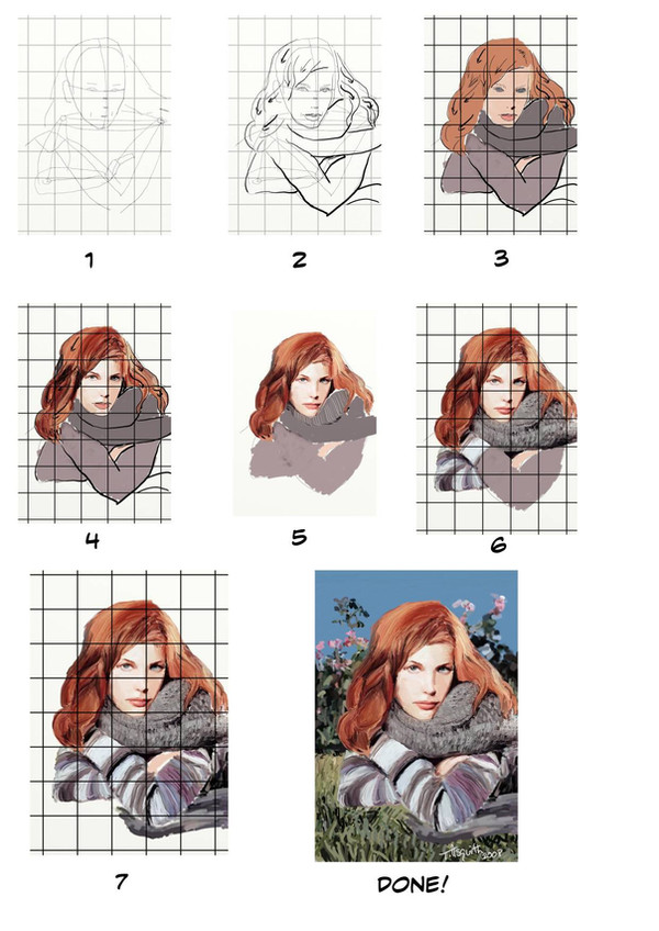
PREPARATION
Now, before I start, I gather together what I need -- my drawing/painting materials, a reference ( [link] ) and one of my graticolas/Durer grids. You can buy them commercially but being the cheapskate that I am, I just copied them onto some acetate transparencies that I picked up at the nearest Staples. The squares can range in size from 1cm x 1cm to 4cm x 4cm depending on the amount of detail and the size of the piece I'm trying to interpret.
After that is done, I overlay the grid on my original and create another one on either my drawing page or my screen. Here, I uploaded the grid as a layer on Artrage. I then leave this grid alone -- only turning it on and off to help me with the perspective and measures of the piece.
Step 1: On a layer above the grid, I work out the placement of the skull, torso and arms. Once that is done, I measure out the placement of the eyes, nose and mouth using the grid as a guide. (Note: The grid I was working from had smaller squares allowing me to measure this out even easier. (REMEMBER: for greater detail, use a smaller grid.)
I also rough out the hair and eyebrows.
Step 2: On a new layer, I now work out Liv's features by roughly fleshing out the skeleton and reworking the parts of the face. I overlay the hair making note of the flow of the hair -- hence the reason for the arrows. Note that the ears are included in Steps 1 and 2 to help give me a sense of direction for the face (even though they don't appear in the final piece).
Step 3: On another new layer, I now put in the flats using Artrage's crayon tool -- approximating some of the colours I found in the original and start planning out the shaded areas. Taking a leaf from Greg Horn, I too like to darken the eyes and then apply lighten colours. (I find it helpful when I start to round out the eyes.)
Step 4: Keeping with the head, shading and hues are added in a chunky manner. The hair itself is conceived in portions to assist me in adding the appropriate colours. Eyes are worked out as is the nose.
Step 5: Hair is refined further - lips are roughly shaped. (I turn off the grid at this point to give me a sense of how the work is going. Grids are great at helping you focus on small parts -- but they make it much harder to see the grand scheme.)
I also do the outlines of the face in warm greys and flesh tones.
(You can also see that I was trying to work out how to do the scarf at this point. )

Step 6: Turning the grid back on, I now start moving away from the face and start to fill in the clothing. (A knit pattern at a lower resolution can be emulated quite nicely by carefully adding small lines in close proximity, following the flow along the fabric.)
I also went back and tinkered with the highlights a little. (At this point, I am still not entirely happy with the lower parts of the hair though.)
Step 7: Fill in more of the fabric - at this point, I decide that I no longer need my skeleton. I add the part of the scarf which is lying on the ground. I keep the sweater a bit on the rough side texture-wise.
As I move to the next step, I go back to the face for one last cleanup around the mouth, lips (and philtrum) and the forehead.
I also cleanup the hand and the gaps around the figure to make sure that the background I'm adding will not show through the figure.
Step 8: I now switch from the pen and the crayon which I've used up til now and move to the paintbrush (which is now set to autodry).
The original photo had a simple background -- some grass and a floral backdrop against a sky. This was done using three colours for the grass, three colours for the green of the flowers with a simple pink for the flowers. The sky itself was a uniform cyan.
After that, I give the piece one last check and then sign my name.
Done.

Tools: Artrage (pencil, crayon, paintbrush)
Related content


Comments: 12

Please, let it be ok for me to copy this imformation to a word doc, so I can do this off line. ??? What a great tutorial ! I hadn't thought to look here for ArtRage resourses until now. SO glad I did ! Thank You !!
👍: 0 ⏩: 1

Sure, it should be fine.
Be sure to check out or download the Artrage marker palettes that I have here. Plus you might want to check out 's account too. (He's known as Mister Paint on Ambient Design's Artrage forums.)
👍: 0 ⏩: 0

For those of us that are digitally challenged could you explain in more detail how you get the grid on the picture?
👍: 0 ⏩: 1
Okay -- I'll do my best, Bill. (BTW, nice gallery.)
Now, I'm assuming that you have got your original picture selected and you've got a grid put on top of that already -- either drawn by hand or by using a transparency. (I like to use transparencies because that way you can preserve your original. 
Now, normally, if I was working traditionally I'd basically get a ruler out and draw the grid by hand on my drawing paper. But this is awkward in any digital computer programme -- even in Artrage, which has a built-in ruler stencil.
Fortunately, there are a couple of other approaches available.
First Method - The Layer Approach
You can download a copy of some graph paper (in GIF/JPEG) and copy it into a layer. This seems to work okay but I'm always squeemish when I upload a file and put it in another file. (Being something of a digital painting wimp, I'm always afraid that I'll save on top of the file I'm copying that file over. And, before you ask, yes I've done it. And, I am not entirely sure how.)
If you were to work in Photoshop, then this seems to be the only way to do it. Maybe there's a brush for grids but I'm a bit of a digital newbie too.
Second Method - The Stencil Approach
So, here is the second route and it is my favourite choice because it closely approximates the traditional approach. And, it doesn't run into the resizing issue as much.
First, I choose to take a graphics file of a grid I've copied into my drawing stencils. Then I quickly scribble over it in a colour different from the colour I'll be using for the sketch. Usually I do this using the airbrush, crayon or pastel. This leaves a grid on one of the layer I was working on.
(There is one such grid stencil that has been uploaded on the Ambient Design website in the Supplies forum, but I like to use a scan I made of some old Hilroy 10 x 10 graph paper which I use when I teach my students graphing.) The beauty of this approach is that you can adjust the proportions fairly easily -- something which I've had a bit of difficulty doing with the first method. (Artrage doesn't allow for resizing of individual layers very easily and I find that I really need to adjust the size of the squares depending on the detail in the image.)
After that, it's just falling back on basic drafting skills. You can either immediately use the pencil tool to work your way around the grid -- just like you would if you were gridding with the ol' pencil and paper in real life. Or if you want, you can do it on a separate layer. And, when done with the pencilling , you can either ink over it on another layer or just paint over it.
Third Method - The 'Tracing Paper' Approach
There is a third method which another friend on the Ambient Design forum suggested to me after I first posted this tutorial. Instead of putting the image on a separate layer, you could upload the grid as a tracing paper. (I've since discovered that the same trick is also available in Corel Painter. But it also has an automatic grid maker as of version 10.)
The main catch is that Artrage will automatically switch to a colour cloning tool. You will have to click on the bottom right corner to turn off the colour matching and get control of your own colours again. Just make sure that you don't hit the "T" key before completing the preliminary sketch because that would turn off the grid. (Though turning the grid on and off might help you get a sense of how the sketch is turning out.)
I've experimented with this idea once and found that tracing paper is not a perfect solution because resizing issues pop up with this approach too.
And that's about it. (Whew!)
I hope I've answered your questions. If you want me to put some more information up on grid drawing (perhaps from a traditional perspective), I could create another tutorial for it, if you wish.
 (Wink)")
👍: 0 ⏩: 1
Thanks a lot for your help Bill
👍: 0 ⏩: 0

Thank-you kindly. Good to see that an Artrage club got started on dA.

👍: 0 ⏩: 1

Your welcome and I couldn't believe DA didn't have one up until now. I just had to fix that mistake
")
👍: 0 ⏩: 0

You're welcome! You're welcome! You're welcome!
👍: 0 ⏩: 0

Very cool, it's always nice to see how someone works.
👍: 0 ⏩: 1
Thanks
👍: 0 ⏩: 0