HOME | DD
 DanRabbit — User Accounts Plug
Published: 2011-02-24 00:23:53 +0000 UTC; Views: 16751; Favourites: 58; Downloads: 137
Redirect to original
Description
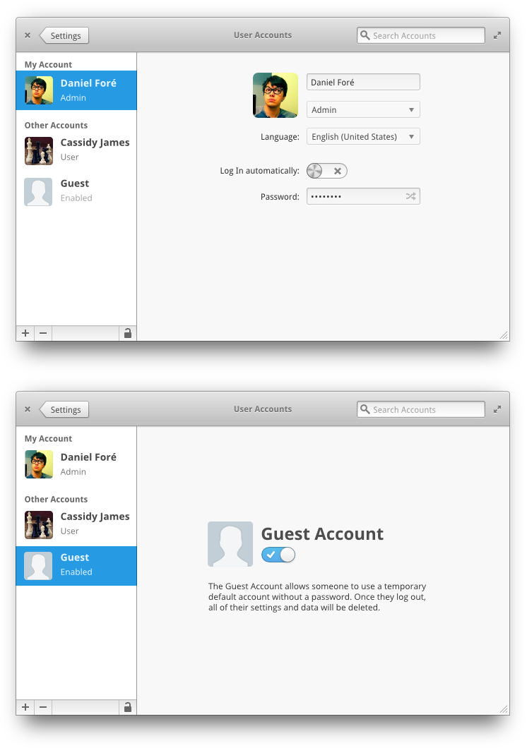
Just thinking about redesigning the User Acccounts settings stuff.Related content


Comments: 56

Will the Guest account limit access to the data already on the disk?
👍: 0 ⏩: 0


exactly, before even thinking about implementing it the groups stuff should be solved...
👍: 0 ⏩: 0

Why is there a remove account button in the content area itself and in the sidebar?
👍: 0 ⏩: 0

One question about plugs in Switchboard. Does clicking on a plug open up a new window that particular plug or does the plug open in the same switchboard window. I think it should open up in another window in case th euser wants to change several setting s aat once
👍: 0 ⏩: 1

No, it opens in the same window. Unless you have more than one pointer you, by definition, are not capable of changing more than one setting at a time, lol.
👍: 0 ⏩: 0
One question about plugs in Switchboard. Does clicking on a plug open up a new window that particular plug or does the plug open in the same switchboard window. I think it should open up in another window in case th euser wants to change several setting s aat once
👍: 0 ⏩: 0
The New Account thing should be at the top, and always be at the top, so for long lists the new account will still be easily accessible.
👍: 0 ⏩: 1
I need to redo this plug altogether, it's not very good.
👍: 0 ⏩: 0

I guess it needs a "lock" button somewhere to prevent changes/get root permissions, don't you agree?
👍: 0 ⏩: 2
 (Wink)")

that would be nice, maybe were it says remove there could be a "unlock" button...
👍: 0 ⏩: 0

looks really nice. really clean and straightforward
👍: 0 ⏩: 0

This looks great! Although, if someone has a lot of accounts on a computer the 'New Account' might be pushed down to where they can't see it anymore unless they scroll down, so maybe move that to the top or add a new account icon next to the arrows? I will say I do like where it is now though, but for practical reasons just wanted to point that out.
👍: 0 ⏩: 0

Wow, this looks fantastic! Congrats! (implement implement implement).
One little picky point: I may just be a *very* visually oriented person, but it bothers me that the back and forward buttons look too close to the margin on the left. This may be an illusion caused by the arrow coming to a point, but it bothers me just the same.
 (Smile)")
👍: 0 ⏩: 0
This is meant to be only a single pane in a complete settings application (much in the style of XFCE, Gnome Control Center, I believe KDE did this, and OS X)
👍: 0 ⏩: 2

So Back takes you to the Control Center (or whatever it's called), but what does Forward do?
👍: 0 ⏩: 1
it's meant to be a full history. So if you go from Home to Appearance then hit back, forward takes you back to appearance. This is because I think it's possible that one pane could lead to another.
For example, maybe on the "Displays" pane there is a link to change your power saving prefs (for things like backlight brightness or such).
👍: 0 ⏩: 0

I suppose that leaving only name, surname and photo is intended to 1. ease the creation of an account and 2. stop depending on Evolution to create an account, right?
👍: 0 ⏩: 1
Well we have Dexter for more extensive contact data (thus the button). So I only have what is essential to indentify that user.
👍: 0 ⏩: 1

So will there be a central 'People' bit that has options to interact with dexter and user accounts? or will they stay separate?
👍: 0 ⏩: 1
No no. This screen is meant to be part of a larger settings app. I added the link to open the contact card in Dexter because I figured that semantically the option makes sense to be here.
👍: 0 ⏩: 1
ah yh ok, that makes more sense. I thought it was probably part of a larger app. It sounds like the plan is all coming together!
👍: 0 ⏩: 0

You should add few more details to 'New Account' button so its more different from the rest of the buttons.
👍: 0 ⏩: 0


March
it's elementary OS, the code name for the release is Jupiter
👍: 0 ⏩: 1

@ ~Algalord-Gnome
Sorry but the reason I like this is because it doesn't apply to that (in my opinion) silly rule.
Its a pet peeve that they put those types of buttons so close and off centre into a corner.
I think this is perfect. I don't care about wasted space when it's filled with a calm grey and sacrificed for the "greater good", but stuffing completely opposing (in result) buttons so close is a mouse slip away from a pound in swear jar.
👍: 0 ⏩: 0

Why so much wasted space around the GTK controls? This might have something to do with arrows moving through windows of different size.
I agree that the remove button doesn't need to be so prominent, since removing accounts is a very rare occurrence. It would be nice to be able to manage groups from this window, possibly calling them "Permissions", since this is what groups are really used for in Linux.
Also, this should be accessible in a reduced form to non-administrator users, since they should be able to fill in their contact info - or perhaps this info should be provided somewhere else, for example in the contacts manager?
👍: 0 ⏩: 0
This is awesome. The User account stuff does need to be changed. I do agree about the Remove button.
Also perhaps replace the headshot in the New Account icon to a '+' I think this will make more sense to the user.
Maybe also put the dotted line around the "New Account" text too. This will draw the users eye to it more because it will be a bigger target.
Maybe instead of getting rid of the Remove button. Maybe move it to next to the Cancel Button.
Another option would be to go with the toolbar paradigm and at it there.
OOOoooo Another option would be to get rid of the button and have the user drag the Account name from the sidebar off the window to delete it in a mac stylee puff of smoke.
I think the problem is there are about a million different places you could put the remove account function.
I'm gonna put my thinking cap on for this one...
👍: 0 ⏩: 0

looks good, but i still don't understand where that side pane is going. you once had it in a darker grey, like in elementary-nautilus. with a thin handle (which doesn't really work because it's too thin, but it looked good).
now with a larger handle but without a status bar, it looks weird how the fat handle bar reaches the bottom of the window (which is just a thin line), I don't know, but it looks weird to me, maybe it's a matter of getting used to it.
the overall UA settings look good anyway.
👍: 0 ⏩: 1
Those are too different types of panes
The grey sidebar is meant to contain a relatively finite number of items. It's a store for shortcuts or locations.
This type of pane is meant to be scrolling and support lots of items.
👍: 0 ⏩: 1
I get it now. seems logical.
so, in this case, why not integrate the handle strip with the right pane?
leaving the dot, showing it can be stretched.
maybe not, I'm just trying to visualise how it would look, maybe more simple.
👍: 0 ⏩: 0


I really like the thick separator bar. So much better than all the ugly ones in GTK themes right now.
👍: 0 ⏩: 0

I think the remove account button is not necesary, it would be replaced with an icon over the avatar or something like that, but not in the way you did it.
👍: 0 ⏩: 2
Can you draw your idea for me?
👍: 0 ⏩: 2

I also agree that the Remove button looks out of place, and the duplication of 'Remove' is quite obvious.
I would do something like this:
[link]
Although this removes the 'New Account' entry in the TreeView on the left, I think this is a good thing.
First of all I didn't immediately realise that it was there, and wondered how I would create a new account. whilst I am not saying that this would happen for all people, what I am saying is that it is not immediately obvious (even if it does look pretty good!)
In your current mockup, the add and remove actions, two very similar things, are situated very far away from eachother. I feel this is confusing and they should be close.
Anyway just my thoughts, and nice work!
👍: 0 ⏩: 0
also, why the next and prev buttonn? are you thinking in an all in one configuration gui like mac? I think its a good idea.
👍: 0 ⏩: 0

Looks good!
The top left five buttons seem strange due to its inconsistent used space, I'd consider aligning them by center, it might get better.
👍: 0 ⏩: 1
I'm not sure what you are referring to. The window controls?
👍: 0 ⏩: 1
yes. the x - + probably would look better if aligned by center with the back and forward buttons or by arranging one of line of buttons so they can occupy the same space.
👍: 0 ⏩: 1
Ah, that's not really possible ")
👍: 0 ⏩: 0

Nice, nice. Really, no plans for a system-wide desktop search feauture? A la spotlight?
👍: 0 ⏩: 2
| Next =>