HOME | DD
 depthskins — design by dots
Published: 2006-10-19 18:49:35 +0000 UTC; Views: 9719; Favourites: 38; Downloads: 37
Redirect to original
Description
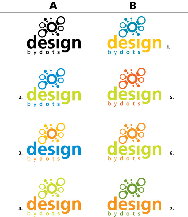
Hey...For those of you who've been following my polls the title would sound familiar to you. Well, yea, I had to go with "design by dots" for my corporate name because my lectuerer liked that. He made some interesting points so I was like...ok, he's the one giving the marks so no use going against him. Last time I did that, I lost marks.
So anyways, as usual I NEED your help. The peice is organized in 2 rows, A and B. There's 7 different logo colour schemes for the logo I designed, lecturer liked and will be my corporate identity (only for class project). My lecturer liked all the colour schemes and couldn't go with one because he's torn...so I told him I'll turn to my fellow deviants for opinions. What I'm asking is for you to choose your favourite colour scheme for the logo by stating it in your comment.
For example: A1 or A7.
Thanks for your help guys.
Related content


Comments: 46


B1 , but the blue must be lighter and the orange more orange.. if you know what i mean  (Wink)")

cheers m8!
=mangatobbey
👍: 0 ⏩: 0


A3 stand out the most cause it's the easiest to read.
👍: 0 ⏩: 0

B1 A3
Agreed with blissart, design should be the first thing that catches your eye and some of the other colour schemes hide it.
BTW, I hate how some lecturers basically make you do what they want because they're the ones marking it, where's the freedom!
👍: 0 ⏩: 1

A3 is what I went with
Yea, i hate that too but let's just say I'm the kid that never listens and do what I want.
")
👍: 0 ⏩: 0


A3 or B1. I'm leaning more towards B1 though. I like how the blue isn't as overpowering in that one in comparison with A1.
👍: 0 ⏩: 0

I like A3 first and B1 second. It's the two tones of orange that work for me in A3, maybe if B1 had two tones of blue it would look better. Great design concept in any case. Good luck.
👍: 0 ⏩: 1
thanks for choosing. My teach said the same thing.
👍: 0 ⏩: 1

hehe so that means my eyes getting better")
👍: 0 ⏩: 1


A3 for me, because, words "design" don't get lost in designs, you know what I mean!
Pls. let us know, which you finally select & reason too!
👍: 0 ⏩: 1
good point. That was the reason I made it blue. You'll know which one I choose from my journal or my next submission of the stationary.
👍: 0 ⏩: 1
Yes please, I will be awaiting eagerly!
Watching your work is quite like learning to me!
👍: 0 ⏩: 1
cool, since u watch my work so keenly, you'll notice which one i went with
👍: 0 ⏩: 1
Yeah, I noticed today, could not be missed hahaha!
Thanks!
👍: 0 ⏩: 0


dot objects color from 1 and "designs by dots" should have 80% black ...... i personally think soo . . .
but "by dots" color can be the same like dot objects . . .
👍: 0 ⏩: 0

2-6 are nice and black is nice aswell. They look nice, and clean. GJ.
👍: 0 ⏩: 0

B1
No question about it. The blue and orange are perfect for eachother (check the color wheel...lol) and those shades of colors are unique. Good job man!
👍: 0 ⏩: 0


B5- make center circle lighter orange, like text in A4
A3
👍: 0 ⏩: 0


I think A3 looks the most professional in my opinion . nice design tho
👍: 0 ⏩: 0

looking really nice!!!
im digging the colors of #2 and #5.. but all of them look ace.
Its just that 2 and 5 are dripping with web 2.0 goodness  (Smile)")
nice job!
👍: 0 ⏩: 0


for me,, I found B6 more eye-catching...
got confused between B6 and A4 as they are almost the same colors,,
however, I thought that B6 is more relaxing to the eye-watching it..
the colors in that one.. are live but yet stable and of the same level.. don't know if I make myself clear..
I speak so much
")
👍: 0 ⏩: 0


that's alot of choices. mind narrowing it down to ONE
👍: 0 ⏩: 0

I like 3 and 2, but 3 better.
I think you should try one with a blue text and green dots
👍: 0 ⏩: 1


B1 or A2, i think B1 it's stronger, but the A1 seems lighter.
👍: 0 ⏩: 0


man the colours are really nice.. i think i love the blue and yellow..
so either A3 or B1
👍: 0 ⏩: 0