HOME | DD
 DigitallyDestined — Ubuntu Unity 5.0 Mock-up
by-sa
DigitallyDestined — Ubuntu Unity 5.0 Mock-up
by-sa
Published: 2010-12-01 14:08:20 +0000 UTC; Views: 25220; Favourites: 53; Downloads: 2170
Redirect to original
Description
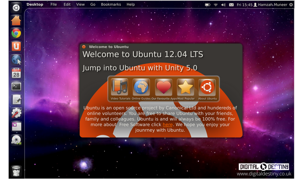
Unity is the desktop shell Ubuntu has created for its computer operating system. This is what I hope to see it become. Ubuntu may be late to the transparency game but that doesn't mean it can't be the best at it. Let me know what you think. Made on Ubuntu with Inkscape ~ W'salaam - PeaceRelated content


Comments: 46


This was done 4 years, I'm afraid I've not no idea where that wallpaper is from now
👍: 0 ⏩: 0

I wish the system panel could auto hide. Looks great by the way.
👍: 0 ⏩: 0

If Canonical ever makes Unity and its codebase more stable and looking like this, I'd switch back to Ubuntu from my rock-solid Debian Wheezy
👍: 0 ⏩: 0


I do like it, but it mimics gnome shell too much...
👍: 0 ⏩: 0


whoa looks amazing!!! probably similar to what it will actually be we'll have to find out when it comes out!
👍: 0 ⏩: 0

I would use the same edge angle of the apps for the separator
👍: 0 ⏩: 0

I love the clean look of this. Perhaps make the edges sharper (less round) especially for where the menubar meets the panel/dock.
👍: 0 ⏩: 0

Assalamu'alaikum. How to create this mockup, my dear brother? I need the tutorial. I think you can make it. Wassalam.
👍: 0 ⏩: 0

i like this one, please announce this to ubuntu team!
👍: 0 ⏩: 0

I like the original unity already ")
👍: 0 ⏩: 0
Looks like I got the Unity version number right then
 (Smile)")
👍: 0 ⏩: 0


Hopefully canonical will get there head out of there ass, and not screw up 12.04 like they did 11.10... blending the status bar into the launcher is a good move, espescilly since the Ubuntu button is in the launcher, that just seems like a smart, over to do this... well ubuntu's mystery concept will be released in a few days.
👍: 0 ⏩: 0

look like a fusion between unity and gnome 3.... i like it....
👍: 0 ⏩: 0


I like it very much but it begs the question what the panel would look like when the launcher is hidden behind a window? I would suggest a comprimise of the 11.04 and this...so when the panel hides it displays the logo like it did in 11.04...keeps the same design like above though only with the curve being hidden with the launcher.
Although if the line always displays like it does on 11.10 then the curve could stay and that might look cool.
Very very good mockup though.
👍: 0 ⏩: 0


Dude, this is AMAZING! You should send this to the Ubuntu team!
👍: 0 ⏩: 0


Hope you know, your mock-up has been featured on OMG! Ubuntu!
👍: 0 ⏩: 1
Yeah it surprised me this morning
👍: 0 ⏩: 0


Good idea, i like the transparent top bar and the small curve.
however i think the top bar is too wide.
on your past mockups it was thinner.
[link]
also there is the problem with maximized windows...
some have suggested either a new theme (with the window handle bar being transparent) or the top panel would switch back to opaque when there is any window maximized.
what do you think ?
👍: 0 ⏩: 0

Nice mockup Musl1m, but there is just one thing that is often annoying in a lot of Ubuntu designs : why do you have to copy what Apple is doing that much ? I mean, you are good enough to have your own way, right ? This wallpaper, no way one cannot think about OSX. The design of the Apple OS is great, sure, it's a source of inspiration, of course. But if I want to have the Apple design, I will buy Apple. I don't want a copycat. Your design is really nice, no need to make it look like a "wanna be like OSX". That's just my feeling, but as a long time Ubuntu user, I just don't want it to be too similar to OSX. I think the people implied in its developpment and the community around it are talented people, they can have their own way and be proud of it.
👍: 0 ⏩: 0

I like it, but I don't like the top left hand curve thingie. It doesn't fit with Unity because the way Unity handles maximized windows. Maximized windows take all the screen space and the panel itself becomes a part of the window. That curve makes it look as if maximized windows would maximize under the panel and have a curve on the left side making it look weird. Remember that the Launcher hides automatically, that curve makes it look as if the Launcher can't move because it's attached to the panel.
No hidden menus? That's a plus! I looks very nice, I don't mind hidden menus at all, but having them all the time up there looks cool.
I love how you themed the panel and Launcher. It makes it look more unified, something that's missing from the current Unity. The panel needs a major overhaul, your design makes perfect sense.
The icons are something that will change in the future, hopefully 12.04 will bring a new icon theme (Mark promised it a long time ago).
I really like the window theme you used on that welcome screen. I don't like how window borders look on the current version. I like that flat, unified look you're using. The shadows look amazing as well, darker than the current shadows (which are a step backwards from the 11.04 shadows) but still subtle.
You should create that GTK+ theme! I would gladly install it on my machine!
I would really like to see an option in the future. I would like transparent toolb ars and window decorations if the user chooses a transparent panel on CCSM. Making the panel transparent without the rest of the window being transparent makes no sense. Also the indicator menus should be transparent or have the same look as the Launcher quicklists.
 (Wink)")
👍: 0 ⏩: 0

Great job! But I think that welcome window is too crowded and that rounded border looks a bit childish..
👍: 0 ⏩: 1
I think there is definitely room for refinement but in the current version of Unity there is a massive disconnect between the launcher and the panel I am trying to address that in this mockup. The rounded border was the best way I could think of connecting the panel and launcher but it does need some work. Thanks for your feedback.
👍: 0 ⏩: 0

If this is what Unity looked like, Microsoft would be out of business. I really wish Unity could look like this. This and simplifying the dash would make the Unity interface epic.
👍: 0 ⏩: 0

This is beautiful. If this is Ubuntu 11.04, it should have a dash similar to the traditional Applications/Places/System, then it's almost perfect. Love the ideas you have.
👍: 0 ⏩: 0

Hopefully Unity will someday look as stunning as this!
👍: 0 ⏩: 0

this looks very nice, i like how it makes the wallpaper more visible...
one suggestion, for when/if this is implemented, if a window is maximized but the side bar is still visible, the gradient behind it should perhaps be made less gradual (sharpened, if you will) so that it is apparent that there is a panel there
👍: 0 ⏩: 1
I hadn't thought of that but yeah i totally agree
👍: 0 ⏩: 0

well considering Unity is new its bound to get features like this
👍: 0 ⏩: 0

your mockup is wonderful , i hope ubuntu team applies it
👍: 0 ⏩: 0

I know this is just a Mockup (Which is awsome by the way) but, do you know if there's a way to make a shorcut of the File Sytem in the desktop?
👍: 0 ⏩: 2

It is, just create a normal launcher: change the type to location and use "/" as the location
👍: 0 ⏩: 0
Im not actually to sure about that
👍: 0 ⏩: 0