HOME | DD
 dpcdpc11 — Simplify Visual Style for Windows7
by-nc-nd
dpcdpc11 — Simplify Visual Style for Windows7
by-nc-nd
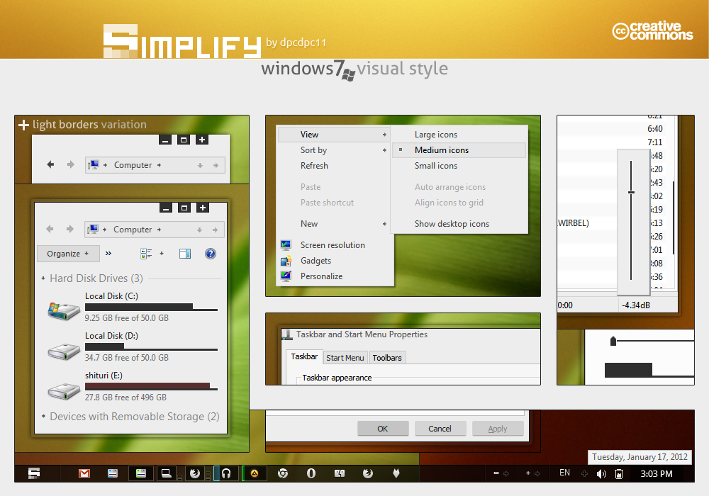
Published: 2012-01-17 15:30:35 +0000 UTC; Views: 123681; Favourites: 393; Downloads: 19167
Redirect to original
Description
Get my latest Simplify 10 themes: gumroad.com/dpcdpc11 for Windows 10!UPDATE 01 (2012.02.08)
- added a new variation: LIGHT BORDERS!!! Try it on!
- tab body and active tab are now a bit darker... it's now easier on the eyes!
Yes, you can believe it... you better believe it! Simplify is finally here! I know... I know... many months have passed since the first WIP screenshot and it's even 2012 now... but hey, better late than never, right? I hope I'm right!
Full view ScreenShot: dpcdpc11.deviantart.com/art/Si…
Feel free toSupport my artwork: Donate ... thanks!
This is part of the Simplify Design Concept by dpcdpc11 and outofashion
Simplify resources free to download:
Simplify Windows 7 Theme by dpcdpc11: dpcdpc11.deviantart.com/art/Si…
Simplify startOrb for Windows by dpcdpc11: dpcdpc11.deviantart.com/art/Si…
Simplify Cursors by dpcdpc11: dpcdpc11.deviantart.com/art/Si…
Simplify Icons by outofashion: outofashion.deviantart.com/art…
Package includes:
- the theme itself with the 4 variations: regular version, normal SegoeUI Font version, light borders and light border with SegoeUI Font.
- Fonts needed to make it work perfectly
- Explorer Navigation Buttons
- Windows Start Button: Simplify startOrb
- Matching windows cursor schemes: Simplify Cursors
What's not in the package:
Icons used in the preview: Token by brsev
Wallpaper used in the preview: djmattricks.deviantart.com/art…
gdipp - the tinny app that makes your fonts clear and smooth like those in Linux Distros. It's available in 32 and 64 bit flavors. Download here: code.google.com/p/gdipp/downlo…
How to:
1. Patch your system files and install the required fonts!
You must patch your system files before you can use 3rd party windows themes. Use this tool to do it: www.windows7download.com/win7-…
Install the fonts found in the folder "Resources/Fonts"
2. Install the theme?
Copy the content of Theme folder in "C:\Windows\Resources\Themes\" (Asuming that you're Windows 7 is installed on partition C)
3. Change the start orb?
Use Windows 7 Start Button Changer to change the start orb. You can find this tool here:
www.door2windows.com/windows-7…
Launch Windows 7 Start Button Changer and choose the BMP from the "Resources/Start Orb" folder and you're done!
4. Change the Windows Navigation buttons?
Use Windows 7 Navigation Buttons Customizer to change the Windows Navigation Buttons, resources available in the folder "Resources/Navigation Buttons"
Download the tool here: www.door2windows.com/windows-7…
5. Smooth Fonts like in OSX or Linux?
Use gdipp, the little app which changes your font rendering engine to make the fonts smooth just like, or almost like, in Linux or MacOS.
Download here: code.google.com/p/gdipp/downlo…
6. Say "Thank you!"
If you like the theme don't hesitate to say thanks!
Thanks for downloading!!!
Related content


Comments: 226

L-ai incercat? A iesit beta-ul deja?
👍: 0 ⏩: 1

Beta inca n-a iesit... doar Pre Builduri... n-am incercat nici o varianta insa urmaresc screenshot si videos postate de testeri si pentru desktop chiar nu ma incanta directia in care a luat-o UI-ul. Pentru tablete e ok insa pentru desktop eu zic ca ar fi nevoie de o adevarata varianta Professional care efectiv sa fie pentru power useri... ca la fiecare release pun in pachet mai multe versiuni (professional, basic, ultimate etc.) insa ele difera foarte putin intre ele iar varianta Professional niciodata n-a fost professional. Pe vremea XP-ului preferam sa rulez programele de muzica pe Windows Server 2003 pentru ca avea un Kernel mai nou si se misca totul mai bine... chiar si acuma am instalata o varianta de Win 2003 Server pe care mai butonez din cand in cand.
👍: 0 ⏩: 1
Intr-adevar, e ciudat sa umbli pe interfata metro cu mouse-ul. Sa speram ca rezultatul e altul decat ne imaginam noi.
👍: 0 ⏩: 1
ramane de vazut... fingers crossed!
👍: 0 ⏩: 0


a version with more transparency would be awesome! its too white for me
but still, great work
")

👍: 0 ⏩: 1

Looks really good!  (Smile)")
Other than that, this is a really great simple visual style. Great work
👍: 0 ⏩: 1
thanks for ur feedback bro!
regarding the caption buttons... there's nothing I can do about that and as for the text in placeslist... I have no idea how to move it up... if it can be done and you know how, then I'm listening.
👍: 0 ⏩: 1
Yeah, I know :/
As for the text in the placeslist, here's how to fix it:
Go to Start Menu > Panels > Aero > Bottom > UserPane > Defaultpanesize:Rect
Change the 4th number to a new value. I would suggest 10.
👍: 0 ⏩: 1
thanks for the tip bro... but I think I'll leave it the way it is because if I move the text then a huge amount of empty space will remain.
👍: 0 ⏩: 0


Sure thing, testing it out right now!
So far I suggest you to disable the colorizationopacity
(DWM Window> Frames> Normal> Top> Active/Inactive)
You only have to change the OPACITY:INT and the COLORIZATIONOPACITY:INT to 0
Everything else works perfect!
👍: 0 ⏩: 1
Thank my friend for the feedback... really helpful... it's one element that slipped!
Already uploaded the repaired version.
👍: 0 ⏩: 1
if you find anything else, please let me know!
the other day I talked to outofashion and told me about mini'em all which has blue as the default HotTrack color for the icons on the taskbar.
did he happened to tell you how to fix this? this specially looks weird using grey/white icons like Token Light. it's not usually a problem but if you like you can change it here: Taskbar & System Tray > TaskBand > Basic > TaskBand > TaskItemButton>HOTTRACKING:COLOR ... must be set to WHITE.
👍: 0 ⏩: 1
Thanks, i got this
He sent me a note about it, but i just forgot to write you...
Everything else works nice as it is,
great work, again!
")
👍: 0 ⏩: 1
Ur welcome! Glad to hear that my info was helpful. It's nice to see designers helping each other out. I take collaboration over competition any day!
👍: 0 ⏩: 1
That's my point!
We're all doing it just for fun
👍: 0 ⏩: 1
Exactly... glad we agree on this one bro!
👍: 0 ⏩: 0
<= Prev |