HOME | DD
 emmanemma — Classique
Published: 2008-10-08 11:45:17 +0000 UTC; Views: 53913; Favourites: 167; Downloads: 14253
Redirect to original
Description
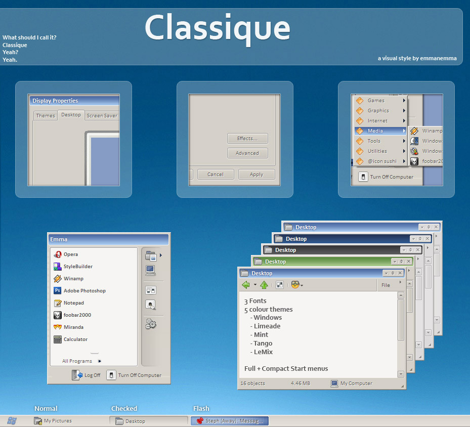
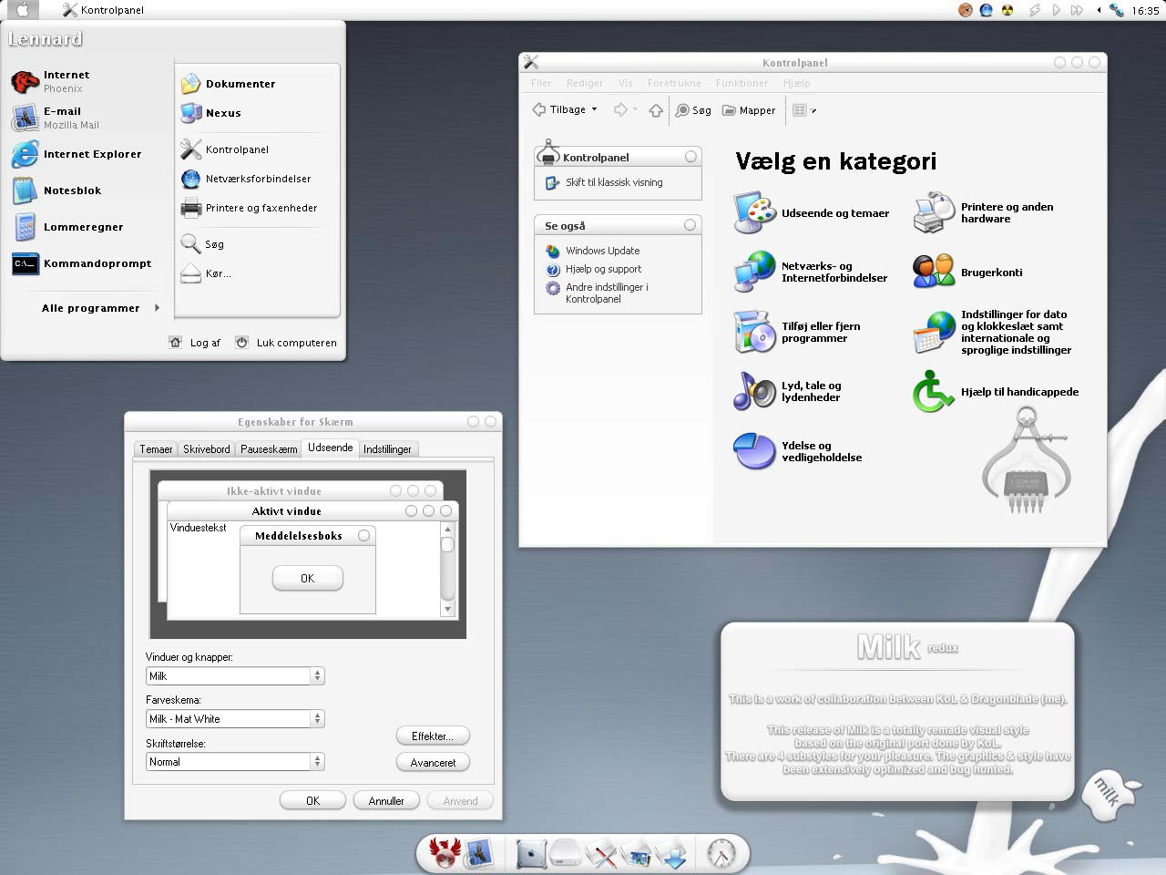
Windows Classic meets 2px rounded rectangles.This was just for kicks, I love the simplicity of windows classic, but I like a little eye candy too. I think I channeled a little ~b0se in the making, cos' some elements remind me of his work. A mention to him outta respect, but all images were made by me. Big thanks to ~reactART for his help.
3 fonts included - Calibri, Trebuchet, and Frutiger Linotype (sorry, I know they arnt too popular these days, but I think they look great)
Feel free to leave criticism and bug reports.
*Mint substyle based on 3dcc by ~saemke
*Tango substyle based on another 3dcc, but I cant remember where I got it.
Thanks for looking.
Related content


Comments: 76

The VS does not contain the fonts that come in the file zip. Example: frutiger.ttf
Thanks. Its a great VS.
👍: 0 ⏩: 0


Wow, excellent! Pretty colors, soft lines...
But... I HATE THE START BUTTON!!!
Sorry, but it's true) Such beautiful VS does not fit with this horrible "Windows" logo.
And... Fav, of course ^^
👍: 0 ⏩: 0


Wow, i really like this one! Your Visual Styles are fantastic!
I haven't seen any bugs so far, none whatsoever. There are no buttons with missing letters  (Wink)")
I don't know if i've had a play with everything yet, but from what i've seen, its all perfect. I'll be keeping this one for a while!
Please, feel free to mail me any more VS's you make, i'd be happy to betatest them for you!
*downloads the full set to get hold of the black one*
👍: 0 ⏩: 0


Nice style but has some mistakes. Space between icons on quick launch bar is too big and Large fonts don't have good shadow (looks like displaced shadow on large font). Other then that is great.
👍: 0 ⏩: 0


Truely awesome. May I suggest some changes?
- task bar items separation would be great
- please include Tahoma font
- in some cases, select is orange, if you belnd the color with the theme color, it would look better
Thanks. Looking forward to updates.
👍: 0 ⏩: 0

title fits perfect and its way past cool, wakes memories yet your design makes it feel like brandnew, great work
 (Smile)")
👍: 0 ⏩: 0

hmm.. i just would love it more if the quicklaunch button spacing was more compact. don't like the wide buttons.. other than that it's very nice
👍: 0 ⏩: 2

I second that. The button spacing is far too wide. Otherwise it's very good.
👍: 0 ⏩: 0


Wow.....you've done it again!
Wonderful skin. Simple yet subtle.
👍: 0 ⏩: 0


I thought I wouldn't switch "Omnios" for anything for quite a while - and now you come up with something equally fresh (even if it has a "classique" feel indeed) and make me change mind... and my XP skin. ")
👍: 0 ⏩: 0


I as the creditee order you to download this VS or this foot is going to go so far up your..
👍: 0 ⏩: 0
<= Prev |