HOME | DD
 etc-etc-etc — Keep on Walkin'
Published: 2005-05-10 11:08:20 +0000 UTC; Views: 1796; Favourites: 53; Downloads: 282
Redirect to original
Description
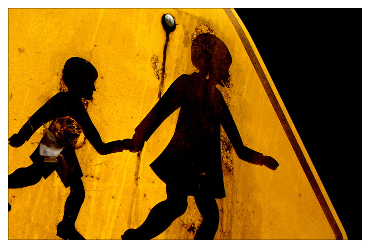
(even though you'd rather sleep)----
This photo is almost a year old now.... I had forgotten about it almost completely until I was going through all my older work a few days ago.
A slight crop, a bit of contrast and saturation, and black dumped in the plain white overcast sky.... and we have a new work.
Keep on walkin' kids.... and I hope you like it

Related content


Comments: 30

 (Smile)")


It's cute. I like the contrast, and the cropping.
👍: 0 ⏩: 0

it looks like they are running out of the yellow marks of the board..
leaving for the unknown, the adventure, the mystery,
the freedom
It's the conventional Alice suddenly jumping into the rabbit hole
👍: 0 ⏩: 0


Nice croppage going on there. And use of colour as well. I like how you've made a simple street sign look quite horrible and, for lack of a better word even though I wouldn't like to use it, dirty and also in a sense unfriendly, in comparison to what is displayed on it.
👍: 0 ⏩: 1

There's so much room for interpretation. I love this one, however simple your description proved it to be.
👍: 0 ⏩: 1

hehe, that description is actually a tribute to the past 16 months of my life.
I was hit down pretty badly with a viral illness and have been incredibly fatigued since - but I have to keep reminding myself to keep going, to keep on walking - even though I'd rather sleep (even though I'd rather give up)
Thanks for your comment
👍: 0 ⏩: 0

Gotta agree with everybody else on this one... It rocks! I think the reason I like it so much is cuz it has a human element, which is a little off your beaten path. And, of course, the rusty texture is wonderful. Good work!
👍: 0 ⏩: 0


i love how this image looks dirty and rusty, but then the yellow is so vibrant. the jaunty angle does it for me aswell! nicely done
👍: 0 ⏩: 0

this shot has a very sinister feel to it...
like they are walking to their death...
i loves it

👍: 0 ⏩: 0

love this shot
awesome colors
and angle
your photos really capture a different side of the world
how many kids walk by this sign, and pass it unnoticed, but you have captured it in a lovely pic
👍: 0 ⏩: 0


Wonderful picture and crop too! The textures and contrast in this one are just fantastic! I love it!
")
👍: 0 ⏩: 0

i like this, its really neat. i love the contrasts and the great textures in the sign, great sign and a great photograph
👍: 0 ⏩: 0

they look in flames. that is damn intimidating.
👍: 0 ⏩: 0


i like...
i like that you can achieve the whole "its crooked" part, cuz i'm so OCD that i can't...
maybe i'll try it though...
well done
:insert thumbs up emoticon here:
👍: 0 ⏩: 0


very nice colours in this. That yellow/orange of the sign is really nice and the textures look very cool and dirty  (Cool)")
👍: 0 ⏩: 0


mmmmmmmmmdirty.
but how did you know i'd rather sleep?
👍: 0 ⏩: 0

this is like, the most menacing street sign i've ever seen, haha.
👍: 0 ⏩: 0


i love it! i love the shadow and the contrast... i din realize it was a road sign until i read ur description. Good angle
👍: 0 ⏩: 0

