HOME | DD
 FabianMonk — 2016-04-24
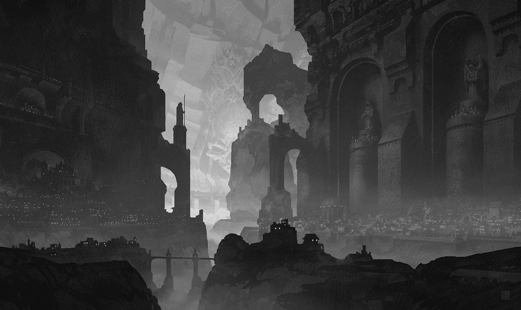
#digitalpainting #landscape #random
Published: 2016-04-24 23:37:29 +0000 UTC; Views: 6664; Favourites: 298; Downloads: 111
Redirect to original
Description
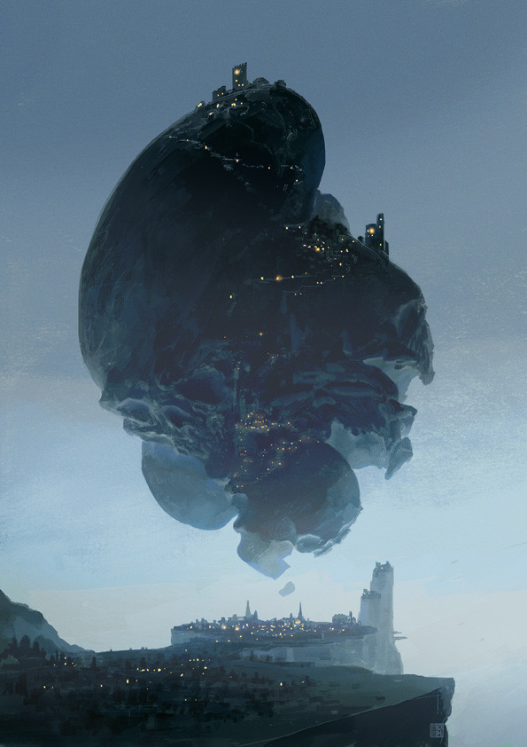
Started as a sketch and then I didn't want to stop. Always fun to work in grayscale.I know I rarely update these days. For a sliiiightly more frequent flow of updates, follow me on Tumblr or Instagram .
Related content


Comments: 17

👍: 0 ⏩: 0


 (Smile)")

It's hard finding pictures of hive-cities. Thank you for making one.
👍: 0 ⏩: 0

I love love love love this! That scale though, I love it <3
👍: 0 ⏩: 0


Sweet! Let me know if you need a 1920x1080 version.
👍: 0 ⏩: 0

haha I'd love to see the starting sketch too. This is amazing. I want to and need to be able to create things like this. It's very important. Can you give me any tips or direction? Teach me master.

👍: 0 ⏩: 1
Here's the original sketch: imgur.com/Rd9lPMi
A tip for something like this: I find that juxtaposing large, clean shapes with a bunch of smaller clutter makes for some good scale. Take the larger columns and arches for example. I had to remind myself to keep those lines long and straight, instead of filling up every available part of the walls with more towers and details. If I had done that, then despite having more buildings, the scene might have ended up feeling smaller (I say might, because there's no solid rule). By limiting the clutter of smaller buildings to a few sections on the bottom, we get a feeling that the walls are large and I don't have to do as much work.
You can actually try that out really simply for yourself. Draw a rectangle. On its' own it's just a rectangle. But if you pick one side of the rectangle and just add a bunch of dots in and around it, concentrated along that one side, you already get a feeling of scale. Fill the entire rectangle (or paper) with dots and the scale is gone, replaced by texture.
There's also the matter of atmospheric depth, which means that the further away an object is, the lighter it is / less contrast it has. In Photoshop there's a really easy way to knock out some good depth. Keep separate layers for foreground, middleground, background, etc., and then just create new layers, blending mode set to "lighten", inbetween each of those. That way you can easily buff out the shadow areas of objects that are further away.
As for direction, recently I've been looking at a bunch of paintings on this blog: master-painters.tumblr.com/ . Really good stuff there. I always find that I spend too much time detailing out areas that aren't really important and I feel like I need to let the texture of rougher brush strokes do more of the work for me.
Glad you like the piece! Thanks for the kind words!
👍: 0 ⏩: 1
Ahhhh, ok. I'll keep that in mind. Scale rule, really small clutters and everything else big. Hmmm and dept, yeah, that's a tricky one. I'll try some examples on PS with layers as you have suggested, designating the positions of depth of field to front, middle and back. Guess I'll use group layers for that. Thanks a lot for the input. I'm gonna check on that site you pointed me to, too.
")
👍: 0 ⏩: 0