HOME | DD
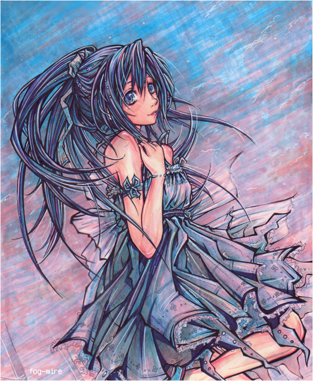
 fog-mire — Moonlit Rose cmsn

Published: 2010-03-09 20:18:23 +0000 UTC; Views: 9983; Favourites: 825; Downloads: 244
Redirect to original
Description
Commission forCharacter (c) cindilette
Drawing (c) fog-mire
Drawing done with marker and abused white gel pen.
Hope you enjoy
Commission info here: [link]
Related content


Comments: 149

I can agree with you.
The petals seem to be blowing the opposite way which makes it seem a bit off.
The dark green trees cannot clash with the whole blue theme.
To be honest, I didn't notice that until you brought it up.
Second, the proportion of the wings yes, are a bit off.
But it's still so so detailed and beautiful. The feeling is graceful too. Love It
👍: 0 ⏩: 0

Overall
Vision
Originality
Technique
Impact
What really struck me first was all the blue that you used. I think you made a great choice of blues. The picture did not end up looking too depressing to the point that it rids the picture of its intended meaning which is a common effect of blue shades. Also, nice usage of contrast.
After the colors, I noticed the very detailed flowers you've drawn. I really adore how you outlined and even slightly cross-hatched each flower petal with the white pen. It really brought out the details and emphasized the strength of the light from the moon.
As for the figure herself, I noticed that you varied the weight of the inks for her lineart. While this can be effective, I think that it would have been better if the inking for her hair wasn't so bold. For me, it does not really suit the soft-looking coloring that you used for the figure and the flowers and is a bit inconsistent with the rest of the figure. Maybe what you could have done was make the weight of the lines in the lower part of the figure a bit heavier just to make things more consistent. I've also noticed her eyes are a bit lopsided. Great coloring technique though, especially for the hair and dress.
The other elements of the picture are pretty okay too. I like how the moon look s so bright, though I think it would have been okay if you made it a bit smaller. Also, it would have been okay for the clouds to not have outlines since the clouds were already pretty obvious and are already in contrast with the sky anyways. The flowers underneath the tree cold have been made to look a bit less like they form one solid clump.
Still, even with all those flaws, great job for this piece. It's effective and the great usage of colors really backed up the flaws.
👍: 0 ⏩: 0


First off, it's very beautiful. Perspective is wonderful as well, and you have a lovely monochromatic color scheme. The roses look wonderful in the foreground, and your background is very calming. The light source being the moon, I might suggest possible darker shades on the girl where the moon doesn't hit her much. A little dramatic lighting never hurts. Some of the white outlines on the close up roses looks a bit off, possibly just tone it down slightly, maybe a very light blue wash. Just on the side that would be shadowed. Other than those small little things, this is beautiful as always! Your work always inspires me to do better with my art.
👍: 0 ⏩: 1

Thank you so much for my first critique! 
👍: 0 ⏩: 1
of course  (Smile) - :)")
👍: 0 ⏩: 0

wow!an amazing piece, the petals and everything in the drawing looks very graceful.
👍: 0 ⏩: 1

Hi!
I want to let you know you were featured in my
Thank you for your beautiful work, and keep it up!


👍: 0 ⏩: 1
Thank you! That is too kind! It is an honour to be featured, thanks for taking the time to do this
👍: 0 ⏩: 1
You're welcome. your art is wonderful c:
👍: 0 ⏩: 0


simply amazing *___*
marker and gel pen wow XD
congratulations ^ ^
👍: 0 ⏩: 1


The roses are my favorite part of this. They're absolutely stunning. Great job!
👍: 0 ⏩: 1
You're very welcome!
👍: 0 ⏩: 0

Abused white gel pen lol xD
I LOVE HOW YOU DID THISISSSS
You draw so well WHYYY
Yay black and blue colors I love it!
The roses were drawn so nicely *v*
I like the outfit of the girl, too!
Heehee I actually like everything
Awesome job, as always!
👍: 0 ⏩: 1
>D I love abusing my gel pens (I have to go out and buy more now T_T)
Thanks very much!
👍: 0 ⏩: 0


Wow, the atmosphere of this, the colours... it's so magical! I love how you do lightening, it's so awesome... and all the details, on the flowers. And mostly because it all works so well together in your composition! This is so beautiful~
👍: 0 ⏩: 1
Thank you! I wanted it to be very magical!
👍: 0 ⏩: 1

Nice work with all the blue. Very beautiful over all. Keep on rocking!
👍: 0 ⏩: 1

The roses are absolutely stunning, has kinda a ghostly feel to it. As per usual, such bold, crisp colours! Esp love the sea, it's so nostalgic and beautiful, and may I ask how you did the clouds? Did you smudge the gel pen? It's very cool given your choice of media.
You're such an amazing artist!!! <333
👍: 0 ⏩: 1
Thank you very much!
For the clouds I kept a little but of the lighter blue undertones open and tehn smudged with whit gel pen
Thank you!!!
👍: 0 ⏩: 0

The poor, abused white gel pen deserves a monument and a memorial plate for its selfless sacrifice in the betterment of the state of art in the world- may it's role in creation of this excellent piece, which could never come to pass without its heroic commitment, never fall out of human memory! 
With no joke, though, it was a single piece I was waiting for a long time- an unmistakable show of your abilities in a full, complete bloom 
As with any of your really detailed pieces, the integrity of all the elements places it apart from so many other drawings I get to see everyday 

With all these necessary fragments of the mood it's hard to find the most impressive part of the work  - :D")

Contrary to some voices in the previous comments, I'm in a very deep awe on one aspect of your work- the dynamic lightning 
That small trick left me breathless for a couple of seconds, and seeing how well her radiance works with the moonlight behind her on the roses surrounding it only lengthened it  - :o")
Having only been able to comment that late, I don't think I can see any field of improvement here that wasn't already covered- if anything, I've only found a very nice tutorial on the wing anatomy I think you might like 

P.S. On a bit different note, would it be okay with you if I used this work as a wallpaper for my PC? 


👍: 0 ⏩: 1
Haha my white gel pen certainly did take a beating in this one! But even more surprisingly it still lives! It was especially hard to keep the details alive in this one because I used a much larger piece of paper than I'm used too- I used 11x14 instead of 8x11 (haha, putting it like taht doesn't sounds like a big different but when I actually had to cover that much space with blue it felt like forever!) I had fun with the lighting. I have to agree with you (even though I should practice darkening skin in backlighting) but I did want he encapsulated in light as if she could suddenly dissapear like one of the stars! I was influenced by a scene in one of Shinkai's film where portrayed is a memory of a girl in a field at night - and to hint at the 'memor' part, its like she glowed semi transparent. Anyways, I was going for something like that ^^ And thank you! I used your tutorial on one of my latest works. THough I feel I still haven't mastered wings, I don't kow whats wrong with me
Thanks very much as always! And of course you can use it as a wallpaper!
")
👍: 0 ⏩: 1
Not only putting such a feat of heroism, but even surviving? Okay, what's in order is a medal, a veteran's benefit and a chance to tell its tale to the younger generations of markers during the Annual Marker Memory Day! May its replacements take inspiration from its valiant deeds!
The lighting worked perfectly, no matter what the reader would have in mind upon seeing the siltouette there can't be any doubt the scene is very far from the ordinary
11x14 instead of 8x11... (quickly checks the latest drawing in SAI) HOLY ****!!! You know, you've just given me some perfect idea of why it's always so tiring for me to draw, and why I always feel like my works are swamped both with the details and huge fields of free space (quickly hides a work in 41x28 resolution under the bed) 
After trying some wings in a drawing I'm doing right now I think there's nothing wrong with you, and everything's wrong with the wings 

Still, I think I might have an idea or two you might find useful
Another thing is the size of the wings
Thanks a lot, wallpaper installed

 (Wink)")
👍: 0 ⏩: 1
Hehe, thanks for more suggestions regarding the wings. Somehow thinking of the wings as 'hair' really helped me visualize what I should aim for XD That's craziness that you work that large! hehe, 11x14 almost killed me
👍: 0 ⏩: 0


wahh, the rose and the colors looks so beautifuull
and i can feel the night *O*b
👍: 0 ⏩: 1


i know uve commissioned it to someone else...but dam...its almost as though uve commissioned it to me haha...i love just about everything about this pic!...u sure have outdone yourself =O
👍: 0 ⏩: 1
haha most welcome ^_^...blue toned pics are my kryptonite
👍: 0 ⏩: 0

this is the most beautiful drawing I have ever seen from you
I'm not shocked you really can draw and color to this level after I saw all your amazing drawings
I'm really sure you will end up with something BIG someday
I wish you good luck dear fog
👍: 0 ⏩: 1
| Next =>