HOME | DD
 freespace — Sending gifts overseas?
Published: 2004-11-19 12:26:46 +0000 UTC; Views: 208; Favourites: 0; Downloads: 17
Redirect to original
Description
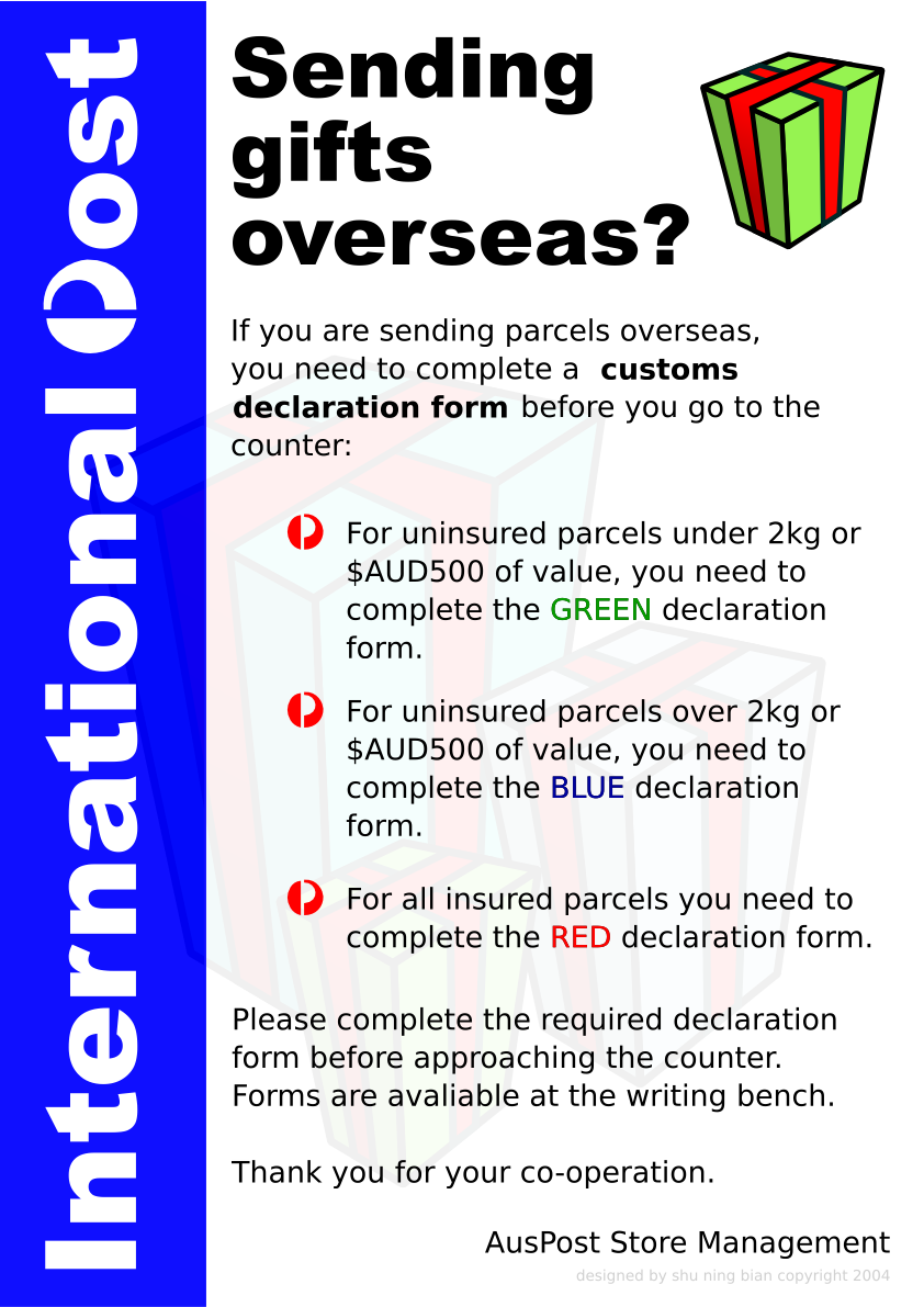
If you are, and you are in Australia, the poster here is for *YOU*.My first ever poster design, not sure how it went. The post office people are happy with you, but some feed back would be great.
Cheers,
Steve
Related content


Comments: 6

Looks good, although since its an Australia Post poster red would have been the more logical choice for the side bar (especially when u take branding and such into consideration.)
still it grabs attention and gets the info across nicely. well done.
👍: 0 ⏩: 0

Its good - the contrasting blue on the side and red points make it stand out like a babbons arse
The wording on the under and over 2kg confused me a little while reading - just how the wording looks the same
Im actually not to sure about the highlighter green - it hurts my eyes.
also your credit seems to flow with the main body of text - try placing it smaller up the right side
what are the print specs and dimensions of the poster?
also - is this freelance? - for a post shop or a national thing? - seems like a good client to do
👍: 0 ⏩: 1

Thanks mnp. The green is a little bright, but like the blue, it bled a little during printing, and is acceptable. This is more courtesy thing, I don't get paid to do it. I just wanted to flex my artistic (*cough* sif) muscles after long periods of inactivity.
Except a funky my-1st-time-doing-this vector on monday, when I can leech creativity off my friends as they jam
")
👍: 0 ⏩: 0

It is quite good.
DOnt know about the blue and white on the left tho. Kind of hurts the eyes.
👍: 0 ⏩: 1
I was worried at first too, but in print, its pretty good thankfully. But will definitly give colors more consideration in future...
👍: 0 ⏩: 1
Yeah. In print it woudlnt be so harsh. But yeah, a softer blue would have been better
👍: 0 ⏩: 0