HOME | DD
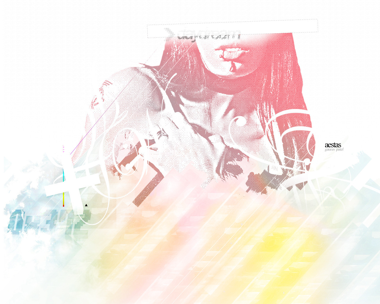
 gauravpatel — Aestas
Published: 2005-12-04 13:09:25 +0000 UTC; Views: 1100; Favourites: 10; Downloads: 260
Redirect to original
Description
I haven't made a wallpaper in quite a while (ever since I was banned actually which was 4 or so months ago) and since I won a Prints account (props to $spinegrinder ), I thought this would be the perfect opportunity.So hum, I spent a few hours last night on this, up until 2:30 AM.
Enjoy.
Related content


Comments: 16

OHMY ITS GREAT(:
im going to use this as a wallpaper(:
<3
you make great stuff dude/
👍: 0 ⏩: 0

pretty interesting man. way too many colors for my taste, esp. for a wallpaper. i still like it though, good work
👍: 0 ⏩: 0

very nice. i love the mix of colors. definately top notch work.

👍: 0 ⏩: 0

fantastic work... very neat effects and typo. I love this!
👍: 0 ⏩: 0

Oh dear lordie. I think I just ejaculated. Beautiful. Must fave. This'll be on my desktop for ages, I assure you. <3
👍: 0 ⏩: 0

Very nicely done, man. I love how you always have the most interesting shades of colors and textures. I like this...The true meaning of the world "abstract". Keep up the good work, amigo.
👍: 0 ⏩: 0


Pretty sweet piece. I like the interesting style. The colours are pretty light, so it takes a lot of inspection to truly see everything.
👍: 0 ⏩: 0

I like it as its a different style from the usual 'trend' wallpaper affair.
The white colour for a start is unusual and extremely attention drawing. You have to look close to see all the small detail contained within the piece. The lus sign, the outline of the body, all the boxes all look much better offset by the brightness of the background. the same goes for the parts in colour. They are magnified in our eyes by the contrasting white background. We are drawn to them and appreciate them more as ther white gives them more defining outlines and clarity.
I really like how it is almost a pixel piece. The non anti-aliased outlines and colours give it a grungy, retro styled look. That it is not perfect and has these flaws makes it far more appealing.
Something I must say, the bottom colours remind me of an ocean that I am looking at through a rainbow. Its a highly soothing effect and comes off very impressively.
Excellent work my friend.
👍: 0 ⏩: 0

omfg insta favourite.. plus if you do make a print i'll buy it
JUST DON'T KICK ME plz

👍: 0 ⏩: 0

I agree with Moggy. You should do something like this, but dark. And don't use mathematical symbols. kthx.
👍: 0 ⏩: 1

I know it's too hard for your little brain to comprehend, but try and stick with it ok. It's for your benefit.

👍: 0 ⏩: 0

Oh man, thats fucking hot! Seriously. Very good work man, Props too you. Hope to see a print soon

👍: 0 ⏩: 1

its nice, you should make a similar darker wallpaper
 (Smile)")
👍: 0 ⏩: 0