HOME | DD
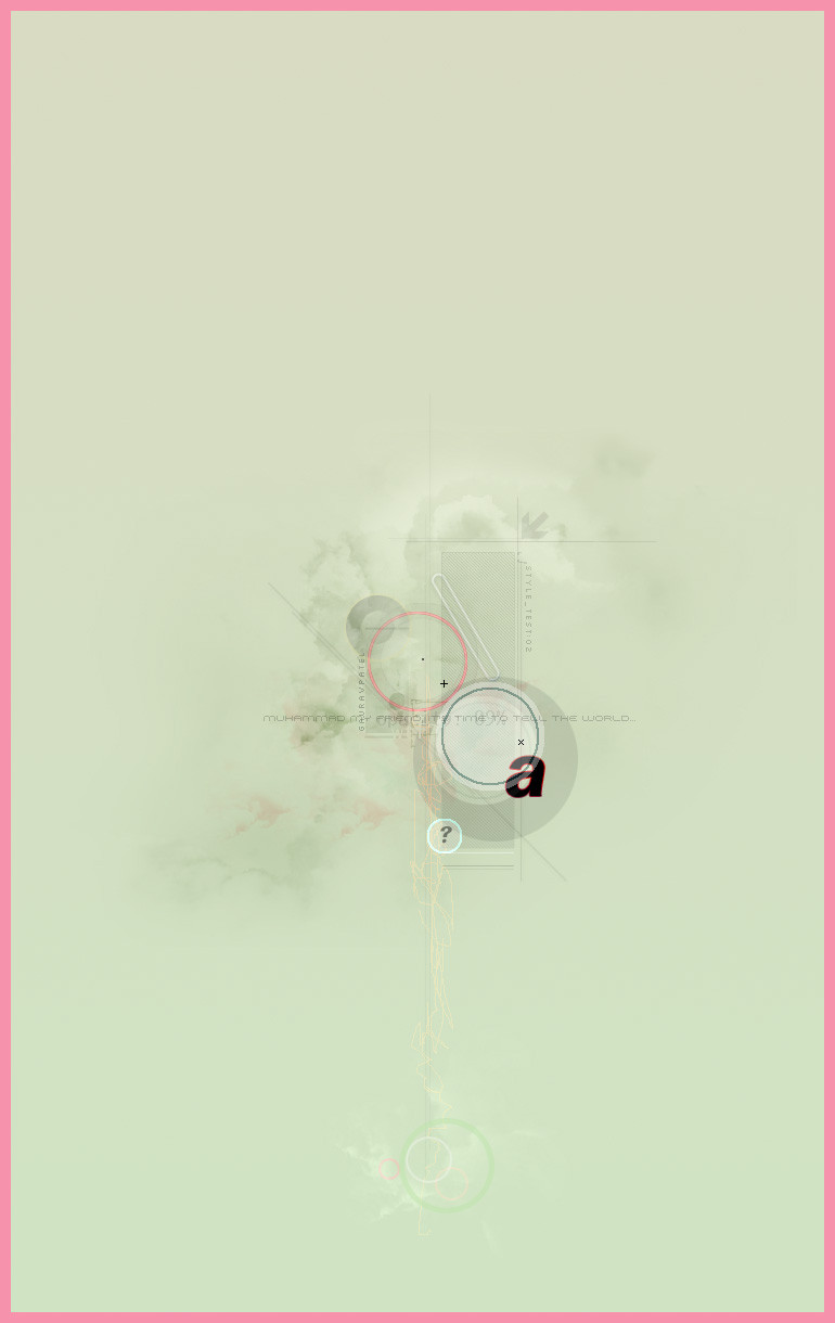
 gauravpatel — Arinso
Published: 2004-01-10 15:22:27 +0000 UTC; Views: 213; Favourites: 2; Downloads: 120
Redirect to original
Description
Another style experiment.-
Give your comments and criticism, and if you think I deserve it, add it to your favorites.
Related content


Comments: 22

You need to make some of these availiable for prints

👍: 0 ⏩: 1

They're not big enough for printing!
")
👍: 0 ⏩: 0

")


not to bad but i aint sure on the pink however the negative space works well again! u like to work big dont u lol its good!
👍: 0 ⏩: 0

I like the colours you chose for this. They go well together.
👍: 0 ⏩: 0


Very nice piece. I like the experimentation with colors I haven't seen used together. It seems to give this, what would have been, very subtle (also very good) piece a "punch".
👍: 0 ⏩: 0

Interesting indeed.
Experiment well done.
Creamy green with pinkish frame seem very tasteful.
Great detail in full-view. Well done. 
")


👍: 0 ⏩: 0

i love this style.....im not convinced about the pink border....but never mind...i hate pink
 (Smile)")
👍: 0 ⏩: 2
there s a touch of pink inside...i dont mind that..it blended well with the rest....
maybe that massive pink in the border distracted me a bit from the actual subject.
👍: 0 ⏩: 0
I thought the pink gave it a nice touch.
Oh well
")
👍: 0 ⏩: 0


Oh.. it's so prety X3 Kinda reminds me of tea ^^U
👍: 0 ⏩: 0

wow.. this is cool, hmm.. dunno what more to say.. just like these kinda pics..
👍: 0 ⏩: 0


")
the blue ring and the ring around the questionmark should be a bit smoother though... really good job overall!
👍: 0 ⏩: 0

wow i love this, there's something about the pink frame and that soft pastel green ......the light and smooth and sooo simple forms and shapes just make me go
i just love it! congrats 4 the nice work
keep it up

👍: 0 ⏩: 0