HOME | DD
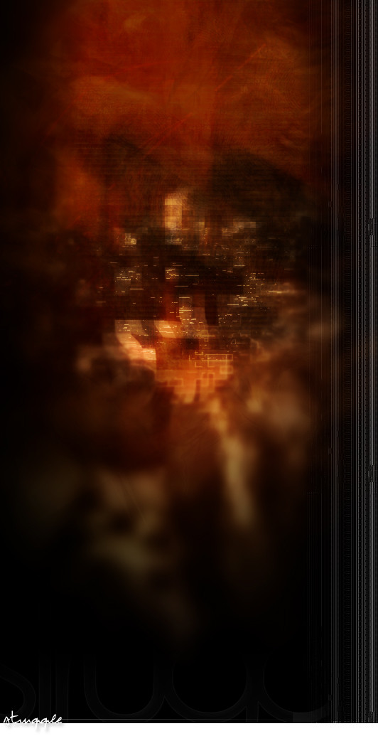
 gauravpatel — Struggle
Published: 2005-01-17 14:42:50 +0000 UTC; Views: 197; Favourites: 0; Downloads: 66
Redirect to original
Description
· Struggledimicatio -onis f. [a fight , struggle, battle].
Experimental.
Related content


Comments: 9


Interesting, very different. I realise this may have been your intention, but in my opinion there is too little to really look at. Mostly it's too blurred for any real shape to be recognised. As I mentioned, this may have been your intention, but personally it doesn't sit well with me. That's not to say I don't like it: as I said, I think it's very interesting and it's definately something a bit different from the ordinary. Overall, nice work
 (Smile)")
👍: 0 ⏩: 0


Loving the effects and tones here dude. I'd like to see morepixelation, would look pretty rad if done right.
👍: 0 ⏩: 0


Love the colors, love the lines and shading. The solid lines on the blurred soft background are just amazing and form this very interesting contrast. A very cool interpretation of struggle! I can see the light coming out while it is also too shy to reveal. The lines want to drag out the light but they can only leave on the surface....well done!
👍: 0 ⏩: 0

I like the choice of colours. The way you faded parts in the back and made the center more focused was a nice touch.
👍: 0 ⏩: 0