HOME | DD
 giadrosich — Tutorial: Part Two
Published: 2008-05-01 21:09:49 +0000 UTC; Views: 2970; Favourites: 17; Downloads: 0
Redirect to original
Description
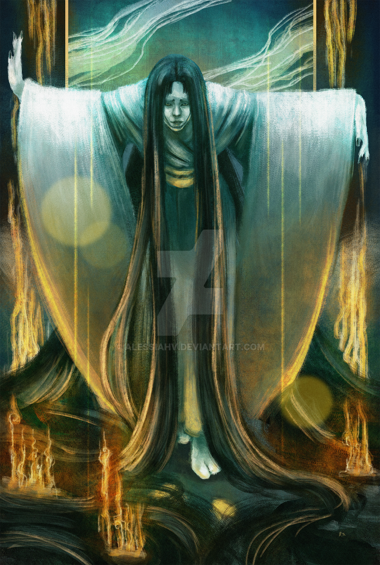
Original Size: 7.5x10Medium: Pencil
Copyright Notice: 2008 by Bob Giadrosich/Sharayah Press. All Rights Reserved. Unauthorized reproduction prohibited by law.
Tutorial: Part One
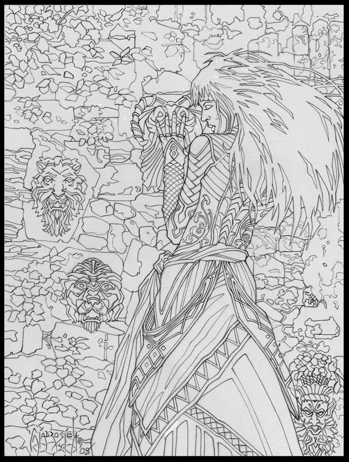
The reference has been selected, the storyline is developing, and now it’s on to the pencil stage.
Pencil Outline
I always work the same way. My pencils go through three stages, and for those who are interested in the actual drawing process, refer to my earlier tutorial of the "Dust of Dreams:"
Stage One: Blocking
Stage Two: Halfway
Stage Two: Completed
Stage Three: Finished Pencil
Read the description text of these four tutorial pages and you’ll have a fairly good idea of how I develop the pencil drawing in order to get it ready for ink.
What to Leave In…
As you can see, the drawing has changed dramatically from the initial concept sketch. I very rarely do any development sketches, preferring to mull over any modifications in my mind.
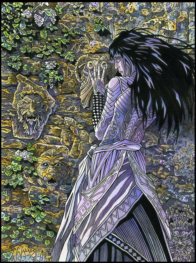
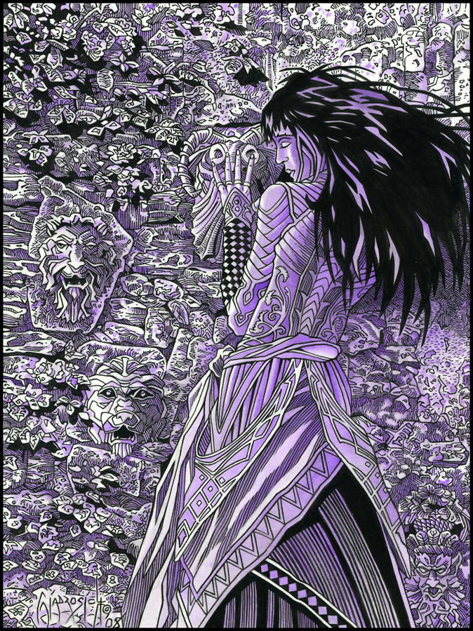
Because of my schedule, most of my board time is spent on the actual images. As I mentioned in the Sketch and Elements page, I decided I wanted her in a garden type setting, so I found the appropriate reference shots, and spent most of my time working with composition. Now she has a nice rock wall in the background, some leaves and flowers to give a little depth to an otherwise flat depth of field, and some carvings to lend visual interest (and some mystery) to the piece.
The biggest change, of course, is to the character herself. For some reason, I really like to draw braids (see Messenger , Shield Maiden , and more recently Weapon of the Spirit ), so if for no other reason than I do it on a fairly regular basis, I decided that this time I wanted to leave them out. I liked the sweep and motion of the concept sketch hair, so I incorporated the "feel" of the sketch into the finished drawing by giving her an unkept style, which looks great visually and gives a nod of acquaintance to my love for manga. I gave the hair a more abstract approach, which will set it apart from the detail of the background.
Composition
I’ve taken the various references and arraigned them into the composition. The focal point of the image will be the girls' face and hair, and then I want the viewer to notice the face underneath her hand, then the top stone carving, followed by the middle and bottom faces, move across the detail on her dress, spot the face on the bottom right, and then travel up her dress to come back where it started: her face. I’ll explain this a little further in the next submission as we view the composition with full detail.
Clothing
I enjoy designing clothing, preferring an ornate yet wearable style. The fun thing about fantasy illustration is the development of different cultures, each with its own look. This is always my starting point. From there, I try to imagine how the material would move in day-to-day living. Once again, I prefer to design in my head as I go along, adding or subtracting elements in the clothing as I see fit. I’ll dig out fashion photographs and mail order catalogues to see how various materials react to lighting and how it folds on the human body and then try to incorporate those elements into a cohesive design, adding decorative motifs to fit the flow of the material. Embellishments are added on a case by case basis with an eye towards making sure I don’t clutter up the final design. I try not to add detail for details sake, wanting each piece to work together and contribute to the overall lushness that I am trying to create.
Ultimately, I want a layered look which will invite the viewer to explore the work at leisure as their eyes travel over the finished composition.
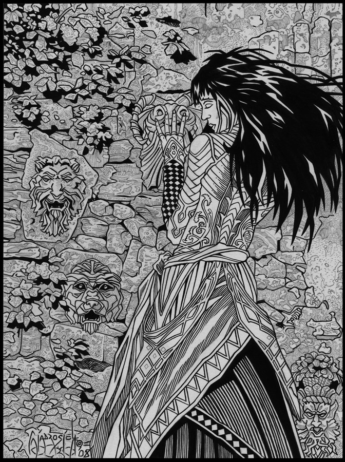
Line
This page represents the finished pencil line work, before the texture has been laid in. Prior to adding depth, I like to check the directional flow of the eye by shape alone, making sure that the lines hold up on a purely visual level. At this point, I need to be thinking two or three steps ahead so that everything will harmonize by the time I arrive at the inking stage. If I include too many texture lines, it will become a colored ink drawing. Because I am going to color it, I want there to be a synthesis between the color and the ink. In other words, I want the ink to define shape, but I want the color to define form, giving the drawing its third dimension, so to speak.
Next: Finished Pencil Texture
Related content


Comments: 8

Thanks, Carrie! I wouldn't want to be the one to cut the glass, though, lol!
")
👍: 0 ⏩: 1

Right... that's dangerous work hehe
👍: 0 ⏩: 0

Your lines are very clean: how do you get this without development sketches?
👍: 0 ⏩: 1
Sometimes, if a concept is particularly complex, I'll sit down and do some roughs, but usually I do most of the planning in my head. Because of time constraints, I have to cut corners where I can, and so over the years I've learned to adapt a sort of "mental shorthand" that I use to determine whether something will work or not.
Also, because I use a lot of reference, all I have to do is adapt a particular look into the finished pencil. Most times it works, sometimes it doesn't. My initial pencil (and the intermediate stage) is very, very light, becuase I erase often. It is only when I go in with the mechanical pencil that I do a fairly dark line. I'm constantly erasing, but I use a soft eraser so as not to disturb the surface of the paper.
👍: 0 ⏩: 1
Thank you for the explanation: I have spoken with some professional artists that always advise not to use the eraser, while I couldn't do without.
It's nice to know that an artist like you makes use of it.
 (Smile)")
👍: 0 ⏩: 1
It realy depends on what one is drawing, I suppose. I don't think I would erase if I was doing some type of life drawing or a refined sketch, but for the illustration work, getting any pencils off the page is essential for a clean reproduction. If I left the pencil there, it would look a little muddy. Some artists use a non-photographic blue in place of graphite. That way, they don't have to erase and can still leave the under drawing there. Because it won't be picked up by photography or scanners, it doesn't show in the reproduction.
Me, I gotta erase, lol!
👍: 0 ⏩: 1