HOME | DD
 giadrosich — Tutorial: Part Four
Published: 2008-05-13 04:22:00 +0000 UTC; Views: 2059; Favourites: 18; Downloads: 0
Redirect to original
Description
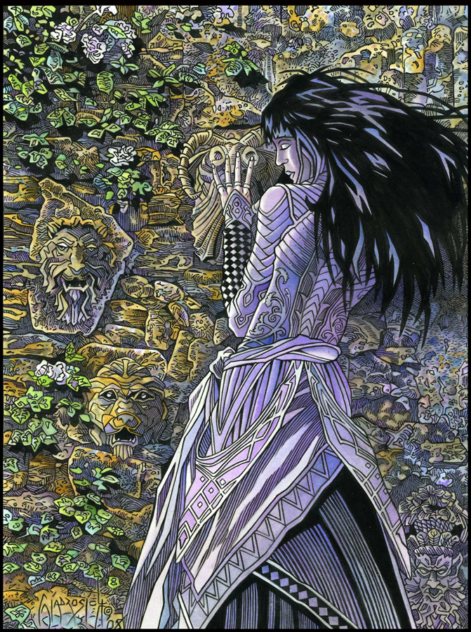
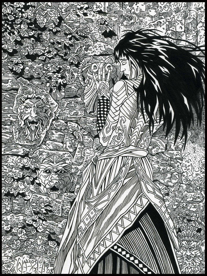
Original Size: 7.5x10Medium: Ink
Copyright Notice: 2008 by Bob Giadrosich/Sharayah Press. All Rights Reserved. Unauthorized reproduction prohibited by law.
Tutorial: Part One
Tutorial: Part Two
Tutorial: Part Three
Tools
When I ink, I use two tools. One is the brush, and the other one is what's commonly called a crow-quill (a fine point steel-nib). Both are dipped into a bottle of ink, and then the linework is laid down until it runs out and the tool is dipped once again. During the course of an image like Within I'll literally dip the brush or nib thousands of times! There are many more tools one can ink with, of course, from a ball-point pen to a Sharpe magic-marker, depending on the look one is after, but for me, I've found that I prefer the combination of brush and nib to get the desired affects.
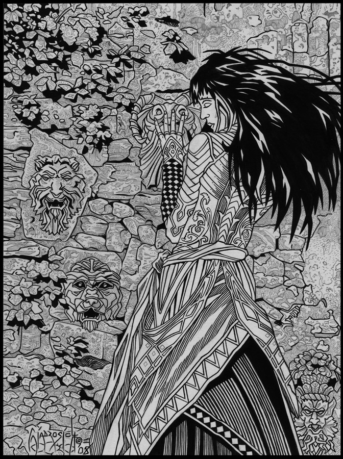
I've decided to show the inks in two stages. This first one (above) is to highlight the parts of the image that were done with brush. Depending on how fine I want the line to be, I utilize different size brushes, anywhere between a 10/0 (tiny, tiny) to a #2. My preferred size is a #1 or 0. A few years back I started buying Windsor and Newton Series 7 brushes (#1) because the tip maintains its fine point after repeated use. A little pricey, but worth it in the long run. That being said, I go through all types of brushes, from ultra cheap to rather expensive. Some of the cheap ones I’ve had to throw away almost immediately, so I guess the truism of "you get what you pay for" applies here, also. When some of my larger brushes loose their point, I'll save them to fill in larges areas of shadow. I rarely throw away a brush, as it can usually be put to good secondary use doing something.
Ink
For the ink itself, I prefer a brand manufactured by Higgins called Black Magic, which is a permanent, water-proof ink which dries to a nice opaque, non-sticky (or shiny) black. When I ink, in-between sessions I'll rest the cap on the bottle instead of screwing it back on tightly, as this allows the ink to thicken a bit, giving more of an opaqueness to the finish. When I am done with the inking session, I'll screw the lid on tightly to prevent spilling it. Lately, I've been adding a few drops of Yasutomo Sumi Ink to the Black Magic, and am pleased with the extra punch it has given to the finish.
I actually use two different bottles; one for my brush, and one for my nib. The brush ink is a little thicker and gives a better line. The nib ink is a little thinner, as the thick ink has a tendency to clog the nib and doesn't flow as well. One could say (rightly so) that I'm slightly obsessive about the whole procedure.
As with most things concerning artwork, what works best for you may be something completely different. Windsor & Newton makes a superior product, although it dries a little lite for my liking. If your ink gets too thick, add a few drops of water and stir. It should be fine after that. I'm constantly adding water or mixing ink from old bottles together, like some demented Chemist looking for the ultimate concoction; the perfect ink, if you will!
The Nature of Ink
The process of inking is almost anathema to the way that we see nature, in that there are very few lines present in nature itself. The human eye relies primarily on shadow, drawing upon the subconscious lessons we have learned since we were wee lads and lassies in order to tell the 3-dimensionality of objects. Size relationship and color intensity also aids in this process. The bigger an object is and the more the color stands out tells us that it is closer, while the smaller it is and the washing out of color (aerial perspective) tells our brain that the object is farther away.
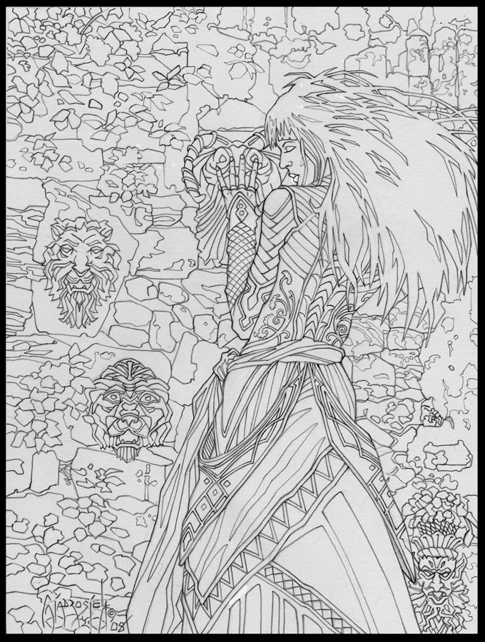
Inking seeks to define shape, texture, and form through line alone. However, there are tricks that we can employ which helps to fool the eye into seeing the objects naturally. The thicker the line, the closer the object is. The thinner the line, the farther away it becomes. A broken like will push something even farther back. Putting lines closer together will create a "grey", area, in contrast to lines spaced farther apart or solid black areas. The inker can use hatching (single stroke lines), or cross-hatching (lines which cross each other perpendicular), or cross-hatching lines horizontal, vertically, and then diagonally to darken an area without using a solid black.
That being said, I try to maintain a consistency among my linework in order to give the drawing a feeling of realism. Many times, I don't want one area to stand out over another (besides the focal point), but prefer to invite the viewer into the composition to explore the various aspects of the image at their own leisure.
One of the main purposes that I use ink for (besides the printability) is to clarify an illustration, and by that I mean to make the illustration more "readable," which allows the viewer to see (or not) the subject as opposed to the rest of the drawing. Using the principle of contrast, the artist can draw the viewer to the subject and guide their eye to various places of the image at different times. I touched upon the concept in Part Three where I stated for this piece; the first thing I wanted the viewer to notice was the girl's face/hair. By using the large black area for her hair (in contrast to the areas around it), the viewer is pulled to that part of the image. Mission accomplished.
I always brush the figures in my images, as well as what I feel are the "major" lines. Here, the outlines of the rocks, leaves, and shadows of the background are given a brush treatment in order to give them a little more definition. Again, this will help separate these elements a little more to aid the viewer to readily identify what, exactly, they are looking at.
Even though I work in a variety of mediums (graphite, watercolor, water-dyes, and oils), when all is said and done, I primarily identify myself as an inker. The first time I ever used ink, I fell completely head-over-heels with the medium. I started inking when a High School buddy gave me an old calligraphy set that he had, which included a crow-quill. I used that for seven or eight years until another friend who was a comic book artist suggested that I try a brush. I did, and have never set it aside.
To this day, I still get as much a thrill out of a well executed inkline as I did back then. Strange, but true.
Next: Finished Ink
Related content


Comments: 6

waahahh this is awesome, extremely helpful, but just a little off-putting with the amount of practise needed, shows me where im going wrong in some aspects and will prevent further unknown mistakes!
thanks a lot for the brush tips, as i tend to work very small and neatly but due to lack of money have only treated myself to a few tiny (and moderately priced) brushes - haha i used to use warhammer/games workshop brushes
i find it hard to find brushes under a no.1 though?!?
anyway brilliant, i will keep reading as soon as my brain processes everything iv just learned 
")
👍: 0 ⏩: 0

Besides the obvious advantage in inking large areas (like the character's hair here), why did you chose to ink some of the lines with a brush? I am really curious because I find inking pens and crow-quill so much easier to be controlled.
As usual, thank you for sharing
 (Smile)")
👍: 0 ⏩: 1

Pens and crow-quills are much easier to control, but I find that they lack the flexibility of the brush with its ability to go from thick to thin (or vise versa) with the pressure that one puts on the tip. Also, the brush lays down a much more organic looking line, giving the figure a greater sense of life.
The learning curve on a brush is around two weeks if used for a little everyday. By that time, you should have a good amount of mastery over the tool, and it will give you another option when you ink!
")
👍: 0 ⏩: 1
The learning curve on a brush is around two weeks if used for a little everyday. By that time, you should have a good amount of mastery over the tool, and it will give you another option when you ink!
I read an hint here
👍: 0 ⏩: 1


Truly a magnificent image, and beautifully done with a well controlled brush. I noticed you mentioned you prefer a non-shiny black. I've used Koh-i-noor Rapidograph ink mixed with Higgins, with good results, but it often results in a very glossy finish, almost like black lacquer. Why do you prefer a matte finish over glossy?
More questions come to mind: Does the sumi ink flow well through a nib? Have you used Raphael Kolinsky 8404 brushes? I found them to be quite superior in quality, and easy to control, but seldom would I dare to do linework like yours with a brush.
I love how smooth and tight your linework is using a brush; a skill of which I am quite envious. I must practice more!
Thank you for sharing this tutorial!
👍: 0 ⏩: 0