HOME | DD
 GoblinHood — robot story

Published: 2010-10-17 16:34:42 +0000 UTC; Views: 2068; Favourites: 50; Downloads: 35
Redirect to original
Description
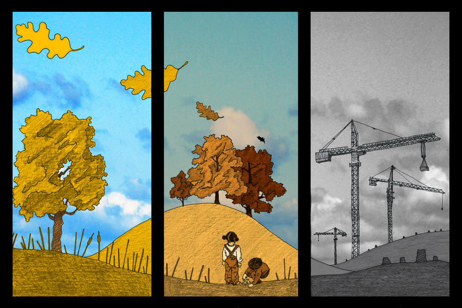
well, im working on a childrensbook story about a robot, i cant decide which kind of style i should use.(btw, i just forget the birds!)
Related content


Comments: 46

As a kid my favorite books were extremely illustrated. If I was a kid, yours would be my favorite for years to come.
👍: 0 ⏩: 1

hey thanks! im sure ill be doing as childrens book as one of my next projects with this robotguy!
👍: 0 ⏩: 0

How about you meet it half way? Mix the styles.
👍: 0 ⏩: 1
yea, that i should be trying this out, thank you!
 (Smile)")
👍: 0 ⏩: 0

I would use the right, personally, but they are both very exquisite.

👍: 0 ⏩: 0


The first is more childish so I dub that one ")
👍: 0 ⏩: 0

Not knowing the story this might not work but what if you started with one and faded into the other as things progressed?
My vote is for the one on the right if you have to choose one. Both really good, though!
👍: 0 ⏩: 1
sounds like a good idea to me, maybe i try this just for fun
👍: 0 ⏩: 0

The left is a great style for preschool kids because there's not too much information for them to visually process, and the character is cute, simple, and memorable. But for an age group beyond that I'd go for the second, because they'll be able to appreciate that artistic beauty more. I mean, I have two little cousins who are five and six, and they're gravitating to stuff like that now. :> You could combine them a little too - regardless of age kids like relating to a character and giving the character in the right image eyes could make it more appealing to little kids. Unless you're really good at giving the character personality in its movements, in which case it might not be necessary. Either way, beautiful job! I love both of them 8D (Though the second's my personal favorite)
Eugh, my comment is long D:>
👍: 0 ⏩: 1
wow, amazing comment. very many thanks!
sometimes i think i should do those two styles...coz all the meanings were going in the end on 50/50. thats also a good sign coz for sure i will not get "wrong" with anything!
 (Wink)")
👍: 0 ⏩: 1
No problem, I'm glad it was useful!
Ah, that is a good sign! 8D Best of luck to you, and I'm sure whatever you produce will be splendid. ;D
👍: 0 ⏩: 0


I love them both but I think the first pic is better suited for kids ^^
👍: 0 ⏩: 0


woooooow! I love this!
I like both, but most the right one
👍: 0 ⏩: 0

I like the second style, but it's a bit too 'complicated' or 'busy' for children.
The first style is also just a bit too simple...
Maybe combining the two styles in some way may get the desired result, but like someone said above, maybe showing more preview work will help you reach your decision...
I hope it helped...
👍: 0 ⏩: 0


Ich hab meinen ewig schlaflosen kleinen Cousin um Rat gefragt und er ist total eingenommen vom rechten - wobei, er ist schon 8, also weiß ich nicht, inwiefern das noch passt.

👍: 0 ⏩: 1
ja, sicher sind 8-Jährige auch eine shr gute Zielgruppe, dankö! ^^
👍: 0 ⏩: 0


What age group is this story for? For very little kids, I'd go with the left, maybe w/ even brighter colors. The right is a bit too desaturated to catch their attention.
OTOH, I think that a slightly older audience (6-10?) would think the detail of the right hand panel was cool.
My six year old says he likes the picture on the right better.
👍: 0 ⏩: 1
lovely comment! i prefer the suggestion of your daughter, hehe
...this book is likely for childrens who start reading such as 5-6 years old. so im very glad to get even a comment of your daughter...send her very many thanks! this is really helping.
👍: 0 ⏩: 1
Thanks, I'll let my son know his feedback was helpful.
👍: 0 ⏩: 0

och immer diese 50-50-dinger ^^
👍: 0 ⏩: 0

children love color and realistic i think the one on the right.

👍: 0 ⏩: 1
maybe i should even try to give it a lil bit more color, thanks for your comment
👍: 0 ⏩: 1
cant wait to see your new book.

👍: 0 ⏩: 0

The right one is definitley the MORE ARTISTIC ONE
but personaly i'd prefer the left one
It has another emotion-level ")
good luck^^
👍: 0 ⏩: 0

I like the right one better.
I believe that just because it's a children's book, it doesn't really mean that the art has to be done in a sketchy, doodle-y style. Hope that helped.
👍: 0 ⏩: 1
helped alot, but still opinions are around 50/50, i guess...
👍: 0 ⏩: 0

The right is really good - but given that it is a children's book, I'd look for something in the middle.
👍: 0 ⏩: 1
...so i take the black line? hehe!
👍: 0 ⏩: 1


if it would work, perhaps both: the painterly style for the backgrounds, and the shaky cute line-art for the characters and elements he interacts with.... I say this because both have benefits for this genre and the schism would help direct the eye, particularly young eyes; the painterly style has depth, but the line-art is more accessible and friendly. just an idea.
👍: 0 ⏩: 1
maybe i really should try to work something out between both of them, thank you!
👍: 0 ⏩: 0


umm..may be you should print a simple 3-4 page of demo and choose with your friends children?I liked sketchy one.
👍: 0 ⏩: 2
i will do that for sure, hope this will not end in a 50/50 decission
👍: 0 ⏩: 0
btw if my comment is offensive, I'm so sorry :/
👍: 0 ⏩: 1
no way, im glad you gave that comment, hehe
👍: 0 ⏩: 0
