HOME | DD
 gregoriousone — what would we give
Published: 2005-10-09 06:52:41 +0000 UTC; Views: 916; Favourites: 20; Downloads: 306
Redirect to original
Description
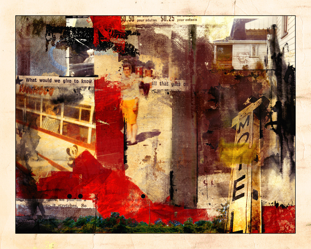
This image was created using nothing but sampled brushstrokes and bits and pieces from old paintings and drawings. I even managed to get my grandmother, part of her house and myself in this one. I think i peaked at around 35 layers.enjoy.
VIVA LA FULL VIEW!! VIVA LA FULL VIEW!!!
Related content


Comments: 65

thank you muchly for the kind words. it's always great to hear that some of my images bring about a stir of emotions or memories.
👍: 0 ⏩: 0

love the red in this piece...it really ties things together
there are truly no limits to digital collage..great work
👍: 0 ⏩: 1
thanks ryan.
I agree with you there really are no limits to digital collage. It's avoiding the digital traps that can be tricky at times!
👍: 0 ⏩: 0
lol. me too.
that coffin has to be cramped after being in there for 10 years.
👍: 0 ⏩: 1

well thats true! i was thinking maybee the bates motel would bee suitable!
👍: 0 ⏩: 1
please say hello to Master Bates when you come...
(im sorry, it's a cheap joke that i just couldnt resist)
👍: 0 ⏩: 0

thank you very kindly. i do so love my layers!
👍: 0 ⏩: 0
just touch your monitor mate.. that's as thick as it gets.. 35 digital layers.
👍: 0 ⏩: 1

Damn! I'm going to smash this thing!
👍: 0 ⏩: 1
careful now, no roughhousing.
👍: 0 ⏩: 0

I can't do digital art. All those layers...
So yeah, whenever I see something like this, done WELL, it just blows my mind away.

👍: 0 ⏩: 1
thanks for the kind words.
digital art really isnt that scary. think about how you paint, or dress, or heck even make a good soup or stew. it's all done in layers.. it's a little bit of this.. some of that.. lets add this in next, put that there.
👍: 0 ⏩: 0

you're hitting some kind of synthesis? i like it! the words and images creep back in but in a different way.
you'd better spend that free time doing this!
 (Smile)")
👍: 0 ⏩: 1
yep. i reckon with ya on that assement hoss.
👍: 0 ⏩: 0

you continue to make digital look undigital. rauschenbergish even. that's dang amazing g.
👍: 0 ⏩: 1
what can i say, im a traditional artist at heart. it's just easier to make the things i see in my head digitally.
👍: 0 ⏩: 1
i know you are. to be honest, i don't think i would be watching you if you were a digital artist at heart. don't get me wrong, i like some purely digital art out there, but i find a lot of it just missing something - the human touch i guess, as it seems to rely too much on program tricks. you take the program and make it yours.
👍: 0 ⏩: 1
it's very easy to fall into digital traps. Photoshop makes it quite easy to let it do the creating. I had a teacher tell me once long ago to never lets software do the work. it's a tool. just like your brushes, t-square, and x-acto knife.
thanks again for the kind words j.
👍: 0 ⏩: 1
smart teacher and student!
👍: 0 ⏩: 1
she was a most awesome teacher. I credit her with teaching me how to look through my artists/designers eyes.
👍: 0 ⏩: 0

why thank you very much.
👍: 0 ⏩: 1

Well i like your texture and compositions.
👍: 0 ⏩: 0

mm I can almost taste the red
It gives such movement through the piece by pushing into the perspectived (sp?! lol) image and it also echoes the motel "obelisk" on the right.
the only part that makes me wonder is the house on the top right above where it says motel.. whatssit doin?
--
Lets say it again..
Great Work!!

👍: 0 ⏩: 1
I hope the red doesnt leave a bitter aftertaste. that would suck.
that house in the upper right-hand corner. its chilling. hanging out waiting for something better to come along.
👍: 0 ⏩: 0

nice. my favorite thing about your artwork is that it never seems to end; there's always more to look at. and for that reason this one is going on my desktop.
👍: 0 ⏩: 1
thanks for the kind words. I love to create some depth in my work, to add many layers and let different things show through. I blame my colour &design 1 &2 teacher for that. She was big on creating layers and depth in work.
👍: 0 ⏩: 0

I love the colors. I wish I could do something like this.
👍: 0 ⏩: 1
thanks ethelind, very kind of you to say.
👍: 0 ⏩: 0

Very chaotic. I get a sense of frustration too.
Interesting work.
👍: 0 ⏩: 1
thanks mr wurx. there is indeed a lot of chaos in this piece. which actually was a god-send when i gave into it. I was trying to make something a bit more delicate and structured and i just couldnt make it happen. then i just started experimenting with random bits and piece and it came to life.
And yes i was very frustrated during the creation of this piece. the image itself was frustrating and there were some external things happening in my life that were very frustrating.
👍: 0 ⏩: 0


The startling topic you brought to this piece is absolutely mind-striking; the various elements and and thems mixed all toguther into it brings such thoughts. Great balance of colors and blended designs, and a unique choice of pictures.
👍: 0 ⏩: 1
thank you. i will confess that the topic came last. i was looking through my folders of scanned images and found that little sentence that ended up being the title and it just fit with everything tha was happening in the image. I wanted there to be a lot going on. I wanted choas, movement and something a bit more unstructured than i usually create.
im glad you enjoyed.
👍: 0 ⏩: 0

That is an amazing amount of layers. This reminds me of a dream or a flashback.
👍: 0 ⏩: 1
ya there was a lot that went into this piece a bit here and snippet there and yet it all works to together and has a cohesiveness to it.
👍: 0 ⏩: 0

thanks ms v. its actually some strips of red paper from a collage i made about 12 years ago.
👍: 0 ⏩: 1

I think I can see a tidbit of the Ruritana font (the red bit near the top of the border) or am I going crazy?
I like how you've incorporated your grandma.
It looks great but I think it looks slightly overworked. Too much going on.
Maybe that was your aim. I hope you don't mind me saying so.

👍: 0 ⏩: 1
that's not a bit of ruritana- it's actually from a set of brushes that were created using different ornaments used in typography and engraving.
it's not so much that it's overworked, it has a lot going on in it. The composition is much more jumbled. A lot of my works have a grid like design to them, I abandoned that in this image and wanted to create something a bit more abstract. I also wanted it to have great depth. The other thing that makes it look overworked is converting it for web publication. I design things at 300dpi using a full range of colours. When i convert it to be published on web, some of those colour nuances are lost.
👍: 0 ⏩: 1
Thanks for elaborating. You've cleared my misconception.
I assume a lot of those colour nuances would be lost. 300 ppi to 72 ppi is a great deal of information lost.

👍: 0 ⏩: 1
no problem.
I put just as much effort into colour and tweaking the overall tints and tones.
Unfortunately the web can only support so many colours.
thank god for dA's print service and my Canon Printer.
👍: 0 ⏩: 0
| Next =>