HOME | DD
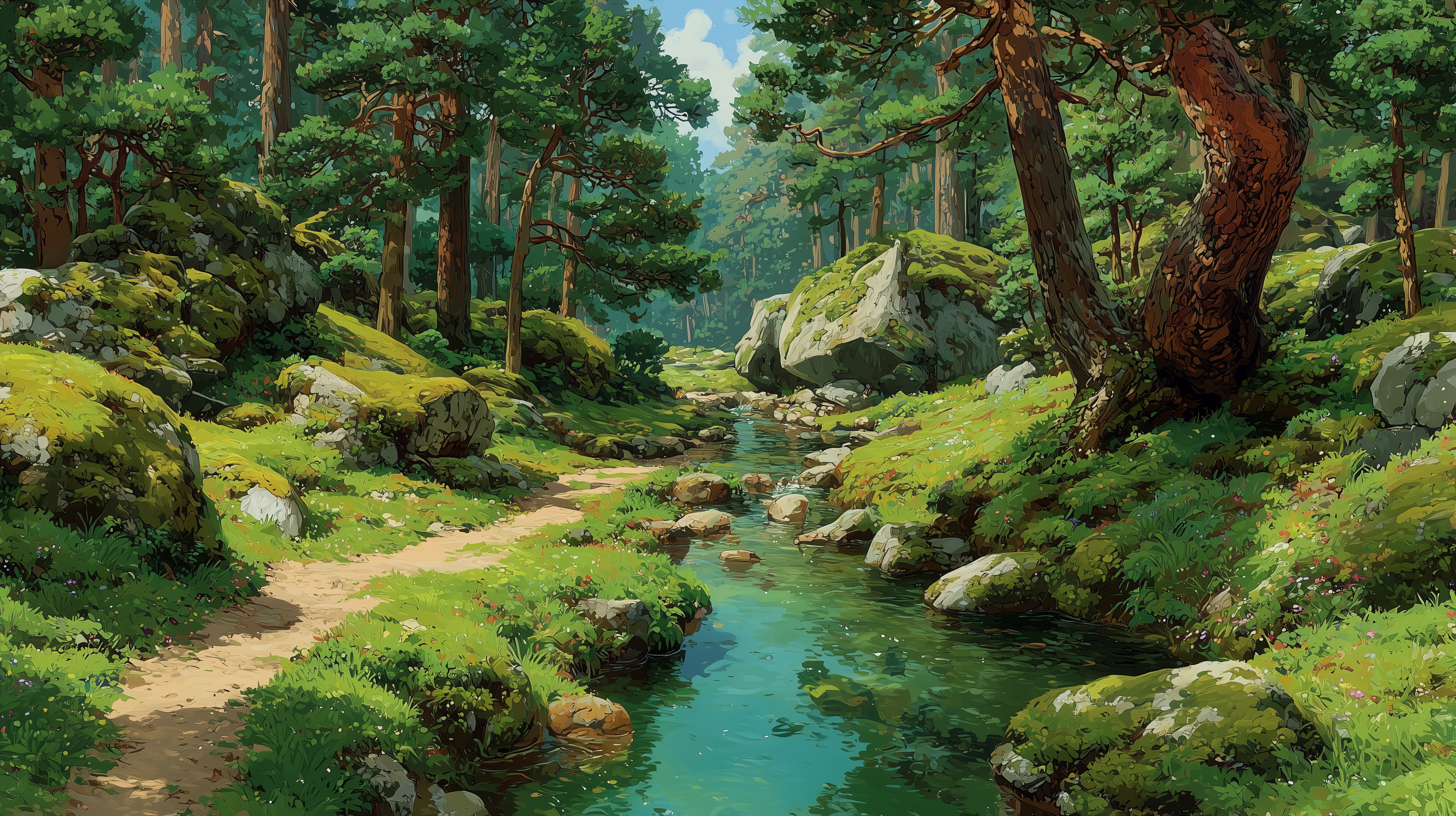
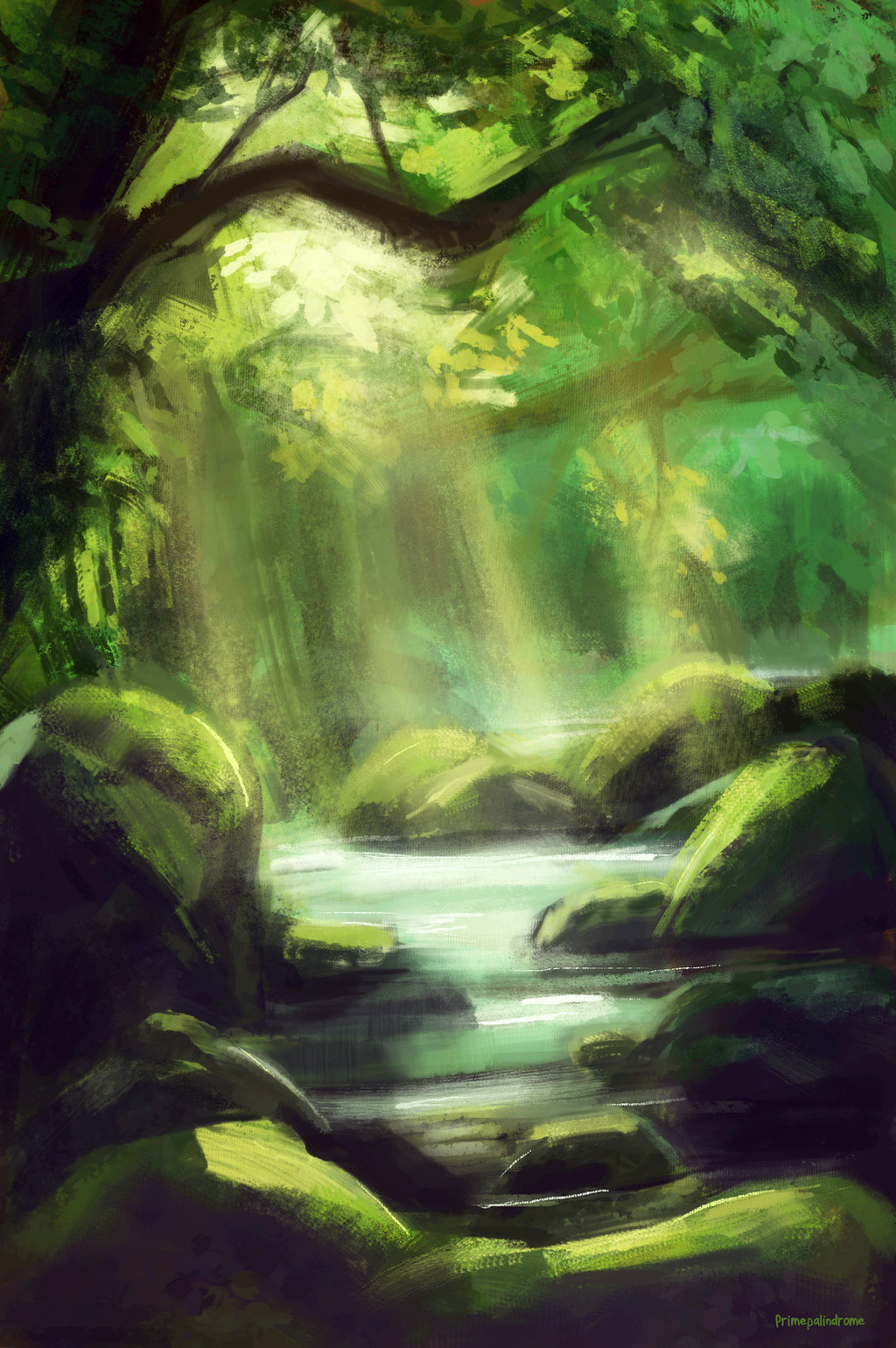
 grrroch — Draw This Again Contest - Forest Path

Published: 2012-09-08 19:04:21 +0000 UTC; Views: 25898; Favourites: 584; Downloads: 291
Redirect to original
Description
Here's my submission to the Draw This Again Contest.---
My art page: www.facebook.com/artoftomaszza…
My YouTube channel: www.youtube.com/user/grochziel…
Related content


Comments: 120

You did an awesome job with it! I admire anyone who can do a good background. (especially if the 'background' is the foreground lol)
👍: 0 ⏩: 0


have you thought of turning the new one into a Wallpaper?
👍: 0 ⏩: 1

Hmm, wallpaper? What kind of wallpaper You have on mind? Poster?
👍: 0 ⏩: 1
Oh sorry I meant a desktop background :3
👍: 0 ⏩: 1
Ah, I didn't thought about it tho way. If there will be a time to do it, then why not. :0
👍: 0 ⏩: 1

I more prefer older one because of colours) but new one has more character)) they both are cool)
👍: 0 ⏩: 1
Thank You very much! So, it seems I have to combine both in my future works.
👍: 0 ⏩: 0

Either way. Both pictures are great. 0v0
👍: 0 ⏩: 1
Thanks a lot, I appreciate it!
👍: 0 ⏩: 1

it seems your style and technique evolved far more than any skill level. both are lovely.
👍: 0 ⏩: 1
A lot of truth here, I have to focus more on fundamentals and colours. Thanks for Your comment!
👍: 0 ⏩: 1
yep~! the sketchy style in the first has an impressionistic feel, and the second is very story-book fantasy. i think you've got colors down, but the way you manipulate them to create an atmosphere seems shaky.
and no prob~
👍: 0 ⏩: 0

I love the first one, much better.. It looks like a painting I would pay good money for! ^-^
👍: 0 ⏩: 1
I am very glad You like it, thank You very much!
👍: 0 ⏩: 0

i actually like the first one better, it's sooo beautiful! the second one is good too, of course
👍: 0 ⏩: 1
Thank You very much! I noticed, that a lot of people here likes more the first one. I must focus more on fundamentals and colour in the future.
👍: 0 ⏩: 0

LOL! I prefer before
beautiful either way
👍: 0 ⏩: 1
I am glad You like it anyway! Thanks for the comment.
👍: 0 ⏩: 1

So in the time since the first painting did the forrest grow?
👍: 0 ⏩: 1
It looks that way in fact, but no, that wasn't my goal.
 (Wink)")
👍: 0 ⏩: 0

First is much better in EVERYTHING. The light, color and composition is definitely more fresh, realistic and keep forest atmosphere.
You don't need any textures if they ruin your precious art.
👍: 0 ⏩: 1
Not the first time I hear it. ")
👍: 0 ⏩: 0

I really like both, but the second creates quite a different mood. It looks like something straight out of a fairytale where the hero(ine) goes into that dark, deserted forest...
👍: 0 ⏩: 1
Fact, it's fairly different than the first one. Also in 'before' artwork, there is more light and shadow blocking, more perspective and naturality I would say, but the second piece is more in to detail. Thanks for Your comment!
👍: 0 ⏩: 0

I vote for the first one, it's much more fresh and vivid than the second, though both are very nice pieces of art
👍: 0 ⏩: 1
Thanks a lot and yes, the first one looks more naturally.
👍: 0 ⏩: 0

Both look so amazing, I wish there were places like this in my country, so magical and all~
👍: 0 ⏩: 1
I am sure there are! Thank You very much.
👍: 0 ⏩: 0

I think I appreciate the before picture more  (Smile)")
👍: 0 ⏩: 1
I totally forgot about it, while drawing the 'new' one. I am glad You like it, thank You!
👍: 0 ⏩: 0

I personally like the first one better, for its painted look.
👍: 0 ⏩: 1
Thank You! Well, yea, it looks more natural, than the second one.
👍: 0 ⏩: 1
the second one looks more...creepy and..whats the word... cartoonish? nah...idk. storybookish. Love them though <3 OwO
👍: 0 ⏩: 0

They're both gorgeous but I think the newer artwork has such a beautifully unique style. It's so different and wonderful~
👍: 0 ⏩: 1
Really nice to hear it, thank You kindly!
👍: 0 ⏩: 0

In terms of detail, the second one is much better. More texture put into the trunks, the branches in the foreground at the top, all that. If you look at it up close, you can clearly see the detail drawn into it, how much time was spent on it. And the detail continues into the background and foreground, it doesn't look like a background slapped onto a well-drawn middle ground. And the light at the end of the tunnel is quite striking! However, it looks a bit too symmetrical, not very natural. Also, there aren't any streaks of light, which are actually quite common in forests, even thick ones. And..., where are the leaves? ")
On the other hand, the original is very realistic, patches of light on the ground, lots of leaves, and very pretty shading on the leaves. If you step away, it looks like a photograph! Also, I see variation in the size of the tree trunks. And there is a clear art style, it's a bit like palette knife painting. however, all the detail is in the center of the scene; as you travel forwards or backwards into the painting you begin to lose detail. This puts emphasis on the center, but subtle detail would have been nice.
Basically, both have their merits and bad points. However, I do see a definite transition in art style, and I applaud you for not just staying the same. 
Personally, though, I like the first one. XD
👍: 0 ⏩: 0

Well, I am glad, You like it. I wonder, if people would still say that, if artworks were reversed. Thanks for the comment a lot.
👍: 0 ⏩: 0

i love both of them! i dont care what other people say, you still had a huge improvement on the second one!
👍: 0 ⏩: 1
| Next =>