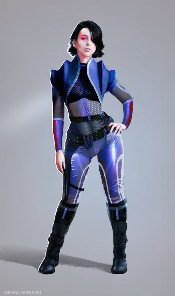
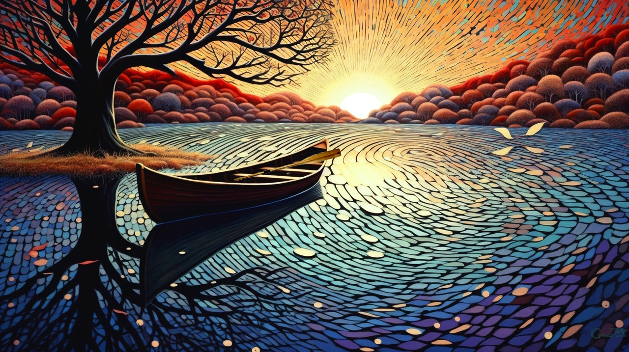
HOME | DD
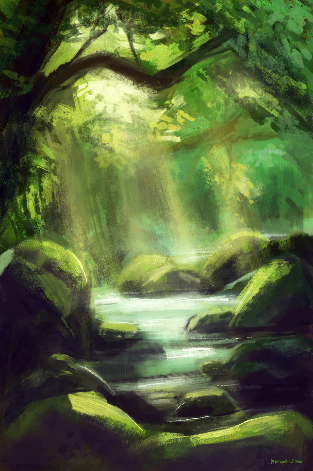
 grrroch — Draw This Again Contest - Forest Path

Published: 2012-09-08 19:04:21 +0000 UTC; Views: 25892; Favourites: 584; Downloads: 291
Redirect to original
Description
Here's my submission to the Draw This Again Contest.---
My art page: www.facebook.com/artoftomaszza…
My YouTube channel: www.youtube.com/user/grochziel…
Related content


Comments: 120

Haha, thank You for that motivational comment! I appreciate it!
👍: 0 ⏩: 1

yep! ( reminder: sometimes i am too overpositive on some things!LOL)
👍: 0 ⏩: 1
I will have that on mind!
👍: 0 ⏩: 1
but the first one is more realistic, as i keep looking at it.... *sweat drop.* and yep!
👍: 0 ⏩: 1
Yea, I regret this, how I drew a 'new' one a little now. @_@ But yet still good news about the first one!
👍: 0 ⏩: 1

I believe that the first is better. I feel the trees have an odd texture and the branches are too linely. Also the path is a bit too symmetric on either side.
👍: 0 ⏩: 1
Well, I agree partly. In the first artwork, there is better, 'realistic' composition and depth. Now I see, that the second is too symmetrical. Thanks for Your comment!
👍: 0 ⏩: 1
They're still both very beautiful pieces of art. We all have growing to do but you certainly have showed some improvement and that you can take critique well. Nice job  (Smile)")
👍: 0 ⏩: 0

Actually the first one is defiantly better. On the second one the perpektive is very weird, u didn't invest as much time in the branches, to be honest they don't even look like twigs it's just brown streaks.
👍: 0 ⏩: 1
I am glad, You like the first one also. And yes, the perspective in the second piece is too symmetrical and isn't that realistic and natural as in the first artwork. Thanks for the comment a lot.
👍: 0 ⏩: 0

Compositionally the first one is much better with better perspective and loose-ness.
👍: 0 ⏩: 1
The composition in fact is better in the first one, but when it comes to detail, I have concentraded definitely more on it in the second artwork and that was for the most part a goal for me here. Thanks for Your comment!
👍: 0 ⏩: 0

I love the improvement between the two. There is much more detail in the second one with the lines and texture. I also think it's somewhat neat how in the "Before" picture, you drew the trees with very thin trunks and in the "After" picture, the trees have "grown" into these strong, thick tree trunks as if showing your growth as an artist as well.
👍: 0 ⏩: 1


both are amazing! adorable style

👍: 0 ⏩: 1
Thank You kindly! I'm glad You like it!
👍: 0 ⏩: 0

they are both too good to be true!!but the second one is abit more creepy
👍: 0 ⏩: 1
I even didn't notice that! ")
👍: 0 ⏩: 0
<= Prev |