HOME | DD
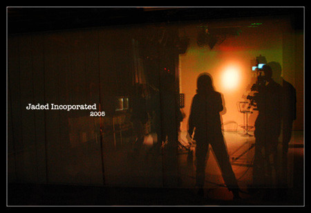
 Jadedinc — 200Five.
Published: 2005-11-25 11:17:09 +0000 UTC; Views: 130; Favourites: 0; Downloads: 45
Redirect to original
Description
My new ID for 2005, I know it's kinda late. Who cares.No editting besides the words and the border.
I think my reflection looks fat.
Related content


Comments: 14

The ID looks like it is professionaly done with a very creative flair. The silhouette effect in this ID adds a sense of style that adds more to the ID's orginality. Perhaps the one thing that needs improvement is the "transparent" orange rectangle that overlays the scene. It needs to blend in a little more better. Still, the IDs is good and a few fine-tuning will make it better.
👍: 0 ⏩: 0


great idea ... i like the concept
cu NecroMensRea
👍: 0 ⏩: 0

at first it looked crap ")
 (Smile)")
👍: 0 ⏩: 0


That is a very professional looking ID, I like it a lot
👍: 0 ⏩: 0

The lighting feels very warm, I don't know why, it just does. Also, the blur adds to this photo quite a bit, and makes it interesting to look at.
👍: 0 ⏩: 1

haha .. cause of the colour tones.. it was originally green lights but my lighting manager changed it to reds so i couldn't really do anything about it. But i guess the reds make it more dynamic.
👍: 0 ⏩: 0


