HOME | DD
 jadeedge —
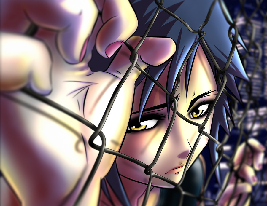
Quiet Desperation
by-nc-nd
jadeedge —
Quiet Desperation
by-nc-nd
Published: 2008-03-15 06:47:23 +0000 UTC; Views: 52608; Favourites: 3554; Downloads: 1006
Redirect to original
Description
Last new piece before Anime Boston.
Honestly... not my fav piece, but it's done and a learned a few new techniques to use on other stuff.
")
and the BG is not a photo. i made it with Manga Studios' awesome perspective rulers and lots of Blur fliters.
")
Critiques <3'ed
Related content


Comments: 366

OH MY GOD HOW CAN THIS NOT BE YOUR FAVE ITS FREAKIN AWSOME
it descibes every lowermiddle class citizen in the world...so close yet so far
👍: 0 ⏩: 0


like all of your stuff this is really amazing!!
awesome job...
👍: 0 ⏩: 0

this is amazing....i need to get and learn stuff from manga studios.
👍: 0 ⏩: 1

FYI... Manga Studio EX3 wont work on Vista.
(Just learned THAT one the hard way >_< )
👍: 0 ⏩: 2

Hopefully they'll come out with a patch to fix that.
Looks like a really nice art program.
")
👍: 0 ⏩: 0


It's perfect!
The colors and her expression are so good!!!!
Liked so much!!!!!!!!
👍: 0 ⏩: 0


I love the fence!
Her hands look kind of weird...
👍: 0 ⏩: 0

Beautiful. Her pinky finger seems to be overly fat, though. And maybe the rest, but otherwise I really like this. I love how smooth the painting is
👍: 0 ⏩: 0

I love it, glad you colored :3 loveeee it
👍: 0 ⏩: 0


Amazing piece of work! Lmao, it almost looks like shes missing a finger XD but its probably above all the other ones, and out of the shot.
Faved!
👍: 0 ⏩: 0

I absolutely love how you did the colors. The perspective and the emotion it creates is also very nice so I don't have much to say about that critique-wise. I do however have some issues with her right hand. Hopefully I will be able to explain clearly why I think so. I've always enjoyed seeing your art so hopefully my comments will be helpful.
Since I lacked a photo reference to explain this I tried using my own hand for comparison. First off, I want you to try turning your own right hand with the palm facing you. You should be able to rotate your wrist and arm to get the approximate same angle as in your picture.
First off is the thumb - the top joint of the thumb should be pointing towards the viewer, meaning it should hook around the chain link and be facing us. As it is right now, it doesn't appear to be an oppossable thumb. Her right hand thumb would have to be dislocated by 90 degrees to appear as it does now. (The thumb on the left hand, the one farther from the viewer, is correct, though it might be angled enough so that we should actually see the thumbnail on it).
Next up is the distance along the side of the palm of the right hand between the base of the thumb to the first joint of the pointer finger. This proportion on her right hand appears to be off. (This part of the left hand however seems fine). To get my right hand to look similiar I have to rotate it by 45 degrees to the left but that throws off how the other fingers are positioned. To fix this the side of the palm needs to have more length. Try moving the base of the thumb down a bit so that it connects to the hand at a much lower place then the other fingers. The triangle pattern on her palm might need to be a bit wider but that can be left to a matter of style.
Her right hand middle finger is off screen but I'm not sure if thats a problem or not. I have some chain link fencing at home so I can imagine how she has her fingers hooked into it but I'm not sure whether or not we should see the tip of her middle finger hanging down or not. Regardless, the spacing between the four fingers appears correct to me even though we don't see her middle finger.
Chain link does distort the hand a bit when you hold it like that but the fingers will only bend slightly towards one another and so I think that we should be seeing the pinky finger nail and more of the ring finger nail. Fingers don't naturally rotate from side to side much and should be a bit more orientated like the pointer finger.
Anyhow, I must commend you for attempting this piece. Hands are such a pain to draw so I appreciate how difficult and frustrating they can be to get right. Despite the details of the right hand, I still very much like this piece. There is a lot of emotion coming from it and the lighting/shading and colors look great to me. If you want me to try re-explaining my perceptions of her right hand I'll try my best.
👍: 0 ⏩: 0


oooh, nice job on it, although the hands look a little funky....or is that just me?
👍: 0 ⏩: 0

wow very amazing work 
👍: 0 ⏩: 0

lovely peice, but the right hand pinkie keeps getting my attention, probs already noticed it, so just ignore this comment if ya want
👍: 0 ⏩: 0

Keep up the great work, Jade! I love the perspective.
👍: 0 ⏩: 0

Very nice. I really like the perspective on this one.
👍: 0 ⏩: 0


The coloring for this is simply amazing, and the perspective is so awesome & complicated & it brings joy to my heart to see it look not bad.
My only thing would be with the hands....it looks like they've only got 4 fingers....I can understand the left one, since the finger could be hidden, but the larger right hand just looks....four finger like. I do understand that the perspective is weird-but-cool, and that would obviously lead to that problem, but it just bugs me little....
However, who knows, maybe she's so desperate because no one accepts her, the 9 fingered freak.
But anyways, fantastic job!
👍: 0 ⏩: 1
i made the mistake of cropping off too much off the top.
if you look at her other hand you can see the middle finger is above the other ones by one "link". i kinda copped out and chopped the perspective off to get a better feel for composition... and i'm feeling that she needed it now.
👍: 0 ⏩: 1
Ooooh, I see it now (I went back and looked at the picture just for this comment). And looking at the right hand, yeah, I can see how that was caused by cropping. But all in all, this pictures still pwns anything I've ever drawn, so I give your props for that.
👍: 0 ⏩: 0

it is absolutely gorgeous. Just one thing. that pinkie on her right hand looked really....large. I dunno....but other than that, absolutely beautiful
👍: 0 ⏩: 0


I preferred this one to the sketch that you did. You can see and feel the emotion more in this one then the first one.
👍: 0 ⏩: 0

Your work is beautiful, dude!  (Smile)")
The fingers on her right hand look a little funky, I think. The perspective on it gets a little hard to understand. I think it's more-or-less a matter of making her fingers less in-profile or in a sort of three-quarter view, if that makes any sense. I understand there's a forced perspective going on with the closest finger, but I can't quite get myself to understand it.
(Dude, it's hard to be critical of your work. It's always so beautiful!)
The thumb, however, is spot on, and her left hand is perfect. Her left shoulder also looks to be in awesome proportion.
And, as always, her face is beautiful.
👍: 0 ⏩: 1
yah... that right hand gave me trouble. i tried to get a reference for the hands and didn't find much.
so, i went with my gut aaaand that's why im not too crazy about this piece. i re-drew that hand about 6 times. >_<
oh well...
You gonna be at AB, Arch?
")
👍: 0 ⏩: 1
Yup! I didn't realize you managed to snag a spot in the alley. I shall try to visit ya'!
Sorry if I sounded harsh at all in my critique.
👍: 0 ⏩: 0

your colouring is perfect...I hope you go on with naruto boys collection
👍: 0 ⏩: 0


It's pretty and the expression is a little bit sad
I like it

👍: 0 ⏩: 0


Hmmm, the pinkyfinger looks a bit too fat I think. Otherwise it looks good
👍: 0 ⏩: 0


The lighting and emotion works so well together on this piece and the coloring is downright exceptional a true work of art
👍: 0 ⏩: 0


...Awesomesause. 
I agree with YoungoneX - the pinky on her right hand looks way off, but other than that... incredible piece of work!!
👍: 0 ⏩: 0


This is amazing. I love the colours and the perspective
👍: 0 ⏩: 0

I like the use of colors, especially the blending and the shade tones. The background is very nice; if I had looked enough, I would have believed it was real. This is something different from your usual fanart, and it's nice to see a variety from you.
👍: 0 ⏩: 0

I love it! The blur into the distance, the perspective and all the detail (just look at the shading on each of the links!) Really really great work!
👍: 0 ⏩: 0

mega props for attempting a chain-link fence! i never want to do that~ haha
or if i did it would just be
XXXXXX
👍: 0 ⏩: 1
ugh... its was such a pain to do. but i've found that putting more effort into the BG makes my work as a whole stand out more.
👍: 0 ⏩: 1
<= Prev | | Next =>